There are four reports in Happy Tracker and people regularly open the wrong one, then conclude the number is wrong. Each answers a genuinely different question, and knowing which is which saves a surprising amount of confusion.
Here is what each is for, what it deliberately will not tell you, and the one fact that ties all four together.
Summary — where did the hours go?
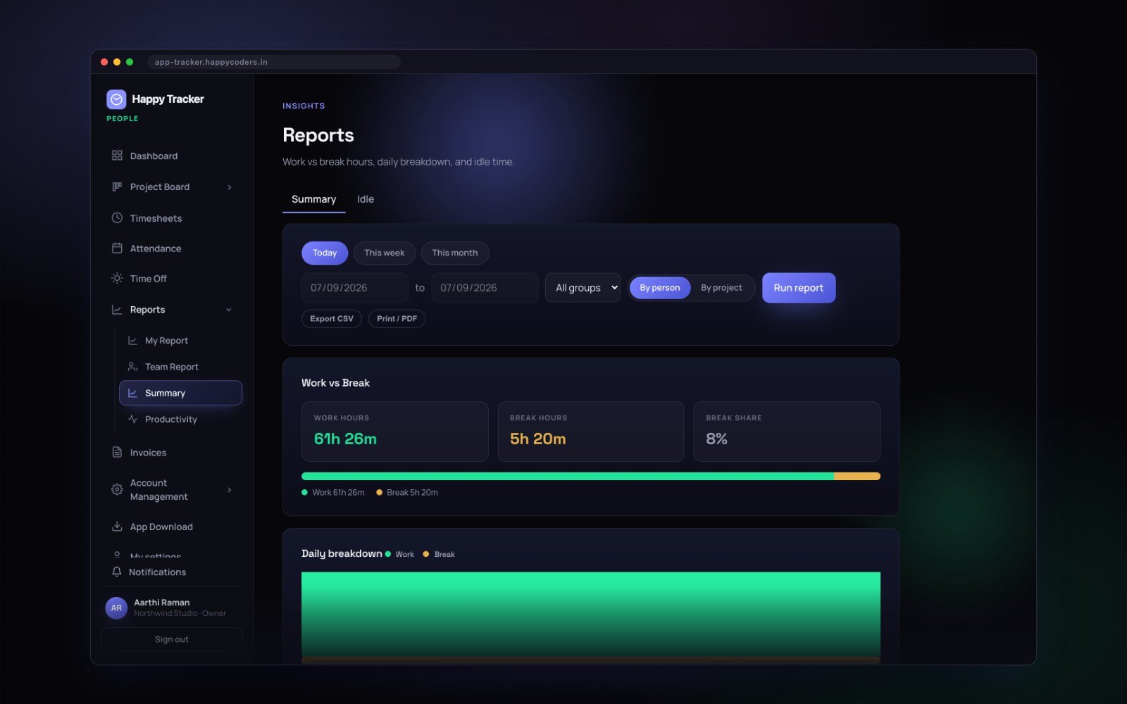
This is the report for hours, and for anything going to payroll or a client. Pick a date range, and cut it by person or by project.
The two charts
The ring at the top splits work against break for the whole range. Underneath, a bar per day shows the shape of the period — and the shape is often more informative than the total. A team that works flat every day looks very different from one that does nothing on Monday and twelve hours on Friday, and only one of those is sustainable.
The table
Person, share, work, break, billable and entries. Share is that person’s percentage of the whole range. Entries is how many separate clock-in sessions they had — a high number usually means somebody switching context all day, which is worth noticing.
The column worth watching
Billable. Only time on projects marked billable lands there, so worked hours minus billable hours is your internal load.
That number tends to grow quietly, and this is the only place you will see it before it shows up in the bank balance. Check it once a month; it takes ten seconds and it is the single most useful number on the page for anybody running an agency.
The Idle variant
Switch the report type from Summary to Idle and you get idle time across the range for the whole team. Use it to spot a pattern over a month, not to question somebody’s Tuesday afternoon. Idle time is normal; a sustained change in it is information.
Exporting
Export CSV gives you the table exactly as you are looking at it, filters and all — which is what you want for payroll or for sending to a client. Print or PDF gives you something presentable without further work.
My Report — how was my own week?
Everybody has this one, whatever their role, and it only ever shows your own work.
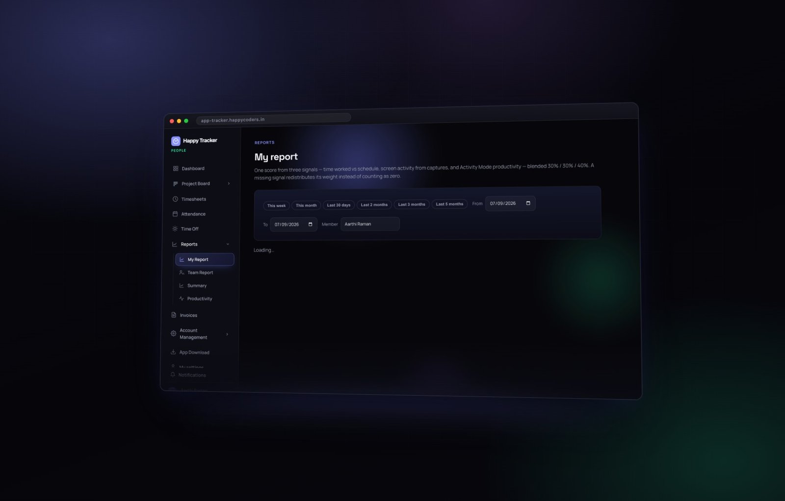
- Score trend — your own productivity score across the range.
- Where the time went — your hours split by category: coding, design, communication, browsing, meetings, other.
- Productivity by task — your tasks ranked by time spent, each with its score.
The category breakdown is the useful part for most people. A week that felt busy and shows sixty percent communication is a week that explains itself — and it is a far better thing to bring to a one to one than a vague sense of having been interrupted a lot.
A task with many hours and a low score is usually a task that needed meetings and waiting, not a task somebody did badly. Read it that way, including when the task is your own.
Team Report — how is the team doing?
Owners, admins and managers see this one. The team score trend, the spread across the team, and the leaderboard.
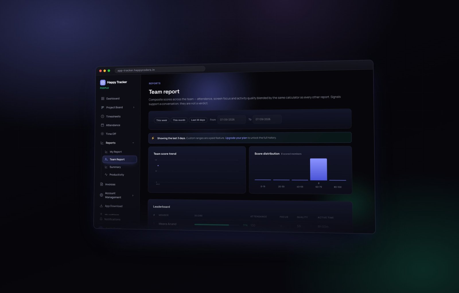
The four sub-scores are shown alongside the total rather than hidden behind it, because a total on its own cannot be acted on. Attendance is how consistently somebody turned up and tracked. Focus is how long they stayed in one application. Quality is the share of time in productive categories. Active time is the raw input time.
Score distribution
How the team is spread. A tight cluster means everybody is working in a similar way. A wide spread usually means the team is doing genuinely different kinds of work — not that half of them are slacking.
The attendance column
It comes straight from the attendance grid, so it already knows about approved leave and company holidays. Somebody on leave you granted is not punished here, which is worth knowing before you read anything into a low number.
Read this as the start of a conversation, not a verdict. Look for a change against somebody’s own normal, open it before a one to one, and do not read the ranking out in a group meeting. The fastest way to make a productivity score useless is to turn it into a public league table.
Productivity — what was actually worked on?
Where the team report is about scores, this one is about evidence.
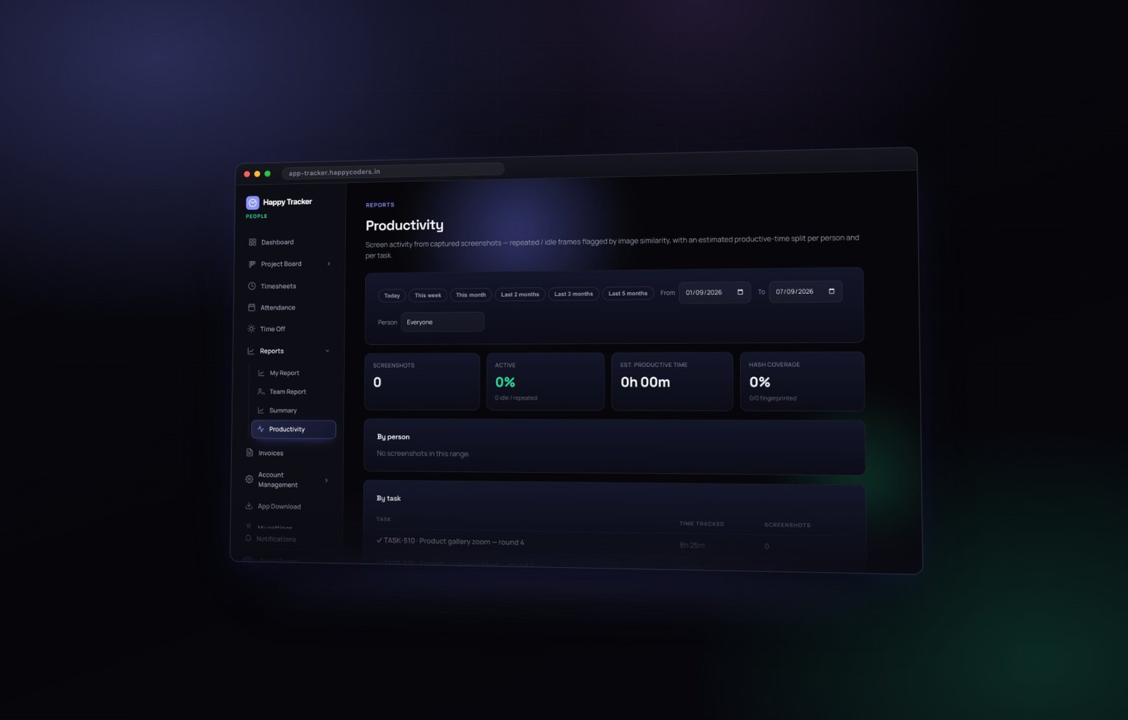
By person gives each member with their tracked time and share of the range — the quickest sanity check on the page. If somebody’s number looks wrong here, it will look wrong everywhere else too, and this is the fastest place to notice.
By task lists the work itself, with time tracked and the number of screenshots captured against it. This is the report to open when a client asks what the twenty hours on their project went into: it reads as a list of real tasks rather than a number, and each row can be opened to the captures behind it.
The ranges, and what limits them
The ranges here go further back than the other reports — up to five months. How far you can actually go depends on your plan’s activity retention: on a smaller plan the older ranges come back thin. That is a plan limit rather than missing data, and the page tells you when it applies.
Load more
The task list starts with the top ten. On a busy month there will be several pages, so either keep loading or narrow the range — narrowing is usually faster if you are looking for something specific.
One source underneath all four
Every one of these reports is built from the same tracked time. There is no second database, no separate ingestion, and nothing that can drift out of step with anything else.
That has one very practical consequence, and it is the most useful thing in this post.
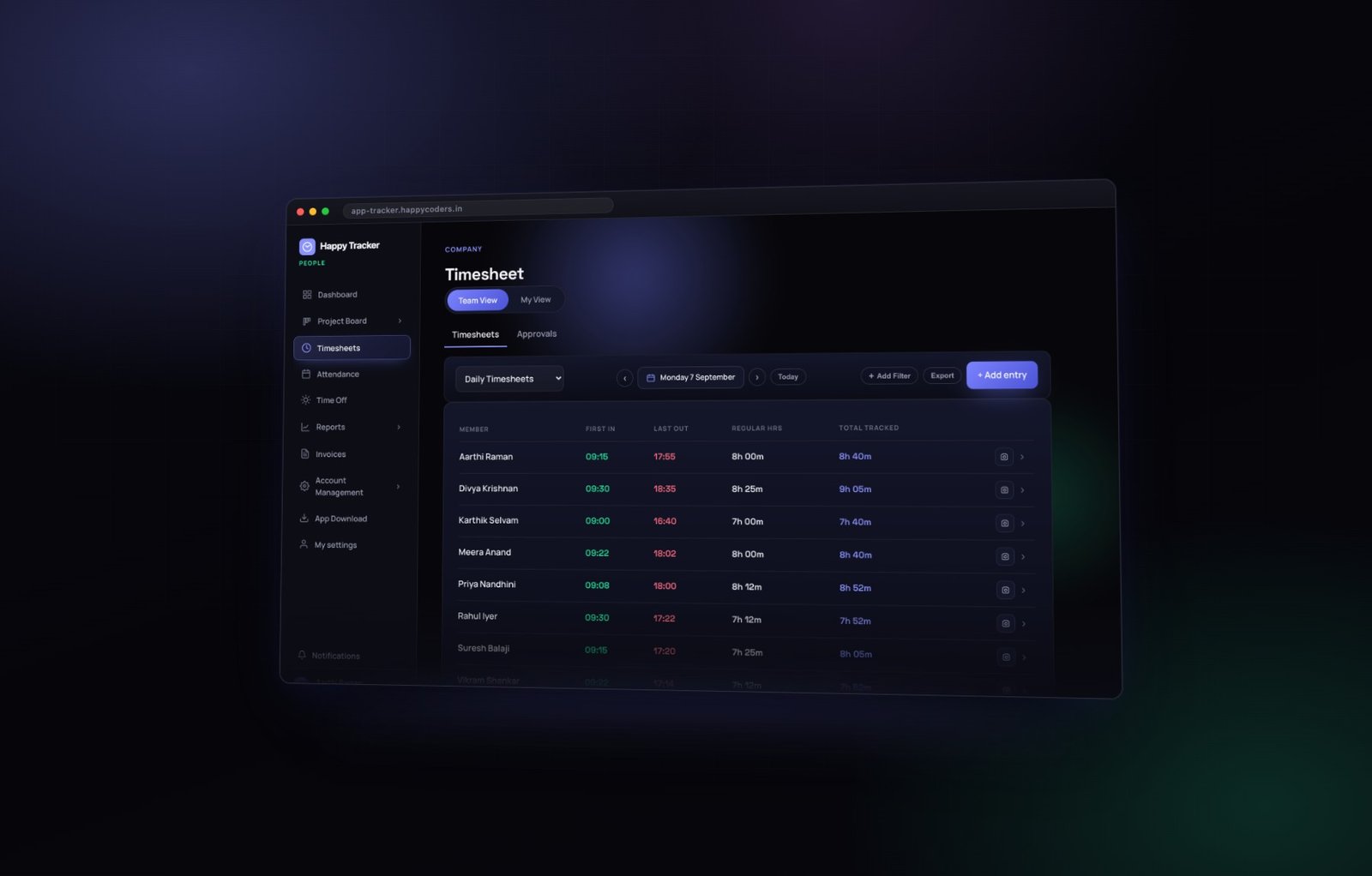
If a number looks wrong in a report, do not go looking for a bug in the report. Go to the time entry in the timesheet, fix it there, and every report follows automatically. The correction is logged with your name against it, so the fix is itself auditable.
Reading a report that surprises you
Sooner or later a report shows something you did not expect. Before concluding anything about a person, check four things in order — it is almost always one of them.
- The date range. Most surprising numbers are a range that is not what the reader thought it was.
- The filter. A group or project filter left on from last time will quietly change every number on the page.
- Approved leave and holidays. A person with low hours in a month may have been on leave you approved yourself.
- Plan retention. On a smaller plan, activity older than the retention window is gone, so an older range legitimately comes back thin.
Only after those four is it worth asking anybody anything. Going in the other order costs you credibility the first time the answer is “I was on leave”.
What none of the four reports can tell you
- Whether the work was any good. No amount of activity data speaks to quality of output.
- Whether it was the right work. Somebody can score well on a task that should have been cancelled.
- Why a number moved. The reports show what happened, not why. The why is a conversation.
- Anything about one afternoon. Every one of these is an instrument for ranges, not moments.
Which one to open
- How many hours, and against what? Summary.
- How was my own week? My Report.
- How is the team doing over a month? Team Report.
- What did the client’s twenty hours go into? Productivity.
- Why is this specific number wrong? Timesheets, not a report.
- Who was here on the fourteenth? Attendance, not a report either.
A monthly reporting routine
Four reports is three too many to open every week. Here is a rhythm that uses each one at the point it is actually useful.
Weekly, ten minutes
Approve last week’s timesheets. While you are there, glance at the gap between worked and total tracked, and at any entries added by hand. That is the whole weekly job.
Monthly, half an hour
Open Summary for the month, by project. Check the billable share. Export the CSV for payroll. Then open Attendance and scan for red cells that are not leave.
Before a one to one
Open Team Report, find the one person whose own numbers have changed, and go in with a question rather than a number.
When a client asks
Productivity, filtered to their project, by task. Send the task breakdown, not the screenshots.
Exporting, and what to send whom
- To payroll — the Summary CSV for the month, with regular and overtime hours separated.
- To a client — the task breakdown from Productivity, or the invoice itemised by task.
- To an auditor — approved timesheets, which are locked and therefore meaningful.
- To an employee — nothing. They already have My Report and their own timesheet, which is better than anything you could export for them.
Three mistakes worth avoiding
Reading a day as if it were a month
Every one of these reports is more reliable over a longer range. A single day tells you almost nothing about anybody, and acting on one is the fastest way to teach a team that the numbers are used against them.
Comparing people in different roles
A developer and an account manager will never produce similar focus or category profiles, and neither is doing anything wrong. Compare people to their own history.
Trusting a report over the timesheet
The timesheet is the source. If they disagree — which usually means somebody is reading a different date range than they think — the timesheet is right.
All four reports are included on every plan, including the free one for up to five users. Try them on your own team.