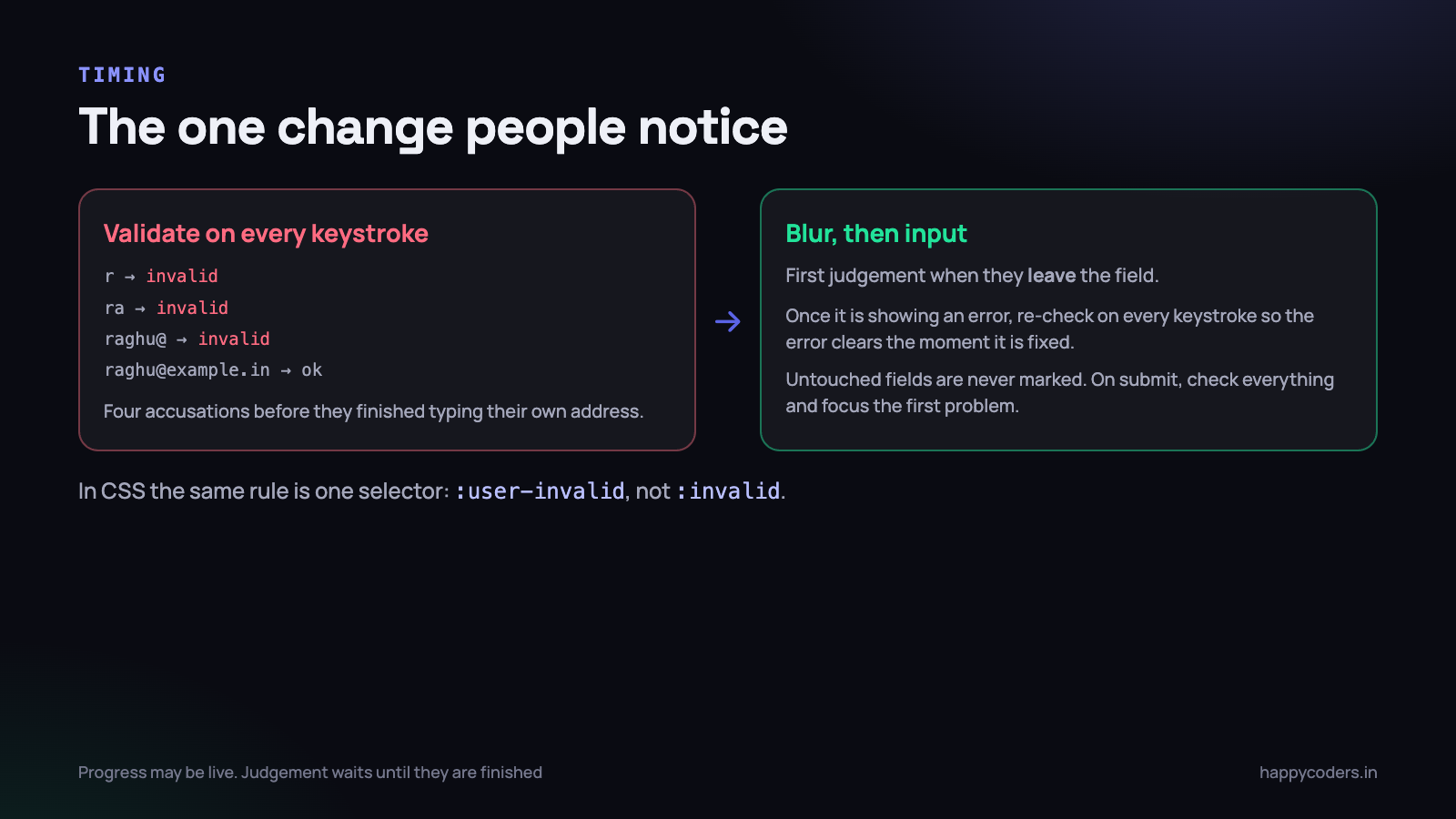
You have used the form. You start typing an email address, and by the third character the field turns red and tells you it is invalid. It is invalid because you have not finished typing it. You finish, the red goes away, and you have learnt that this form treats you as a suspect.
That is the failure mode of most hand-written validation: it is built to catch mistakes rather than to help somebody finish. The difference is almost entirely about timing and wording, not about the checks themselves. Here is how to build validation that assists, using a lot less code than the nagging version, plus the one rule you are not allowed to break.
Start with what the browser already gives you
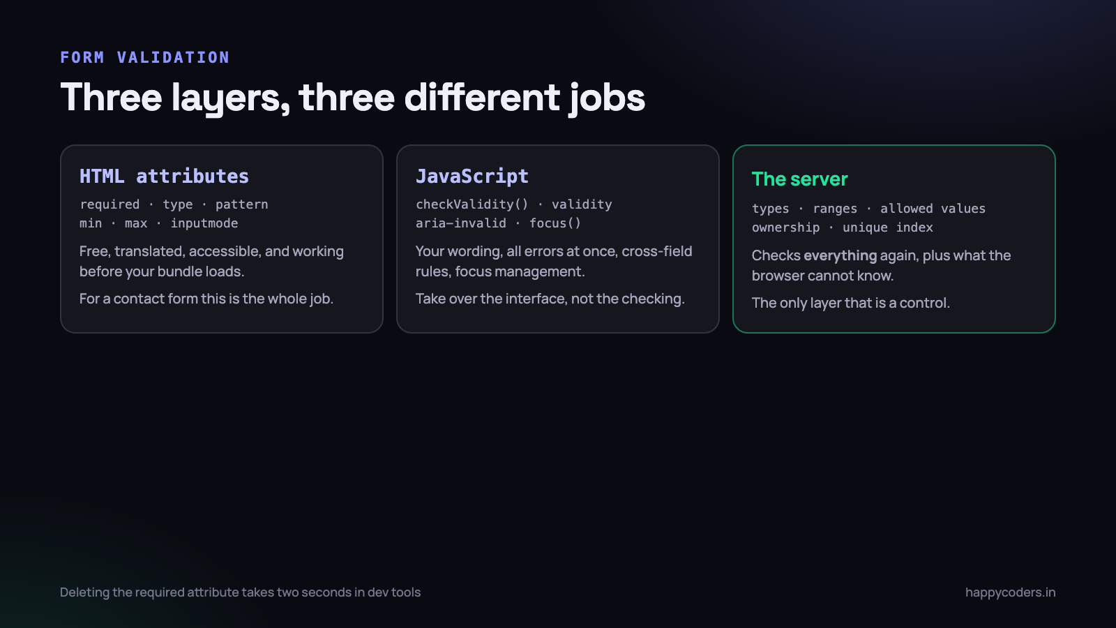
Before a single line of JavaScript, HTML has a validation engine built into it. It is standardised, it is translated into the user’s language, it works with screen readers, it works on a slow connection before your bundle has loaded, and it works if your JavaScript throws an error.
<label for="email">Work email</label>
<input id="email" name="email" type="email" required
       autocomplete="email" inputmode="email"
       aria-describedby="email-hint">
<p id="email-hint" class="hint">We send the invoice to this address.</p>

<label for="mobile">Mobile number</label>
<input id="mobile" name="mobile" type="tel" required
       pattern="[0-9]{10}" inputmode="numeric"
       autocomplete="tel-national"
       aria-describedby="mobile-hint">
<p id="mobile-hint" class="hint">10 digits, without +91.</p>

<label for="qty">Licences</label>
<input id="qty" name="qty" type="number" min="1" max="500" step="1" required>
Several things in there are worth more than they look. inputmode decides which keyboard a phone shows — a numeric keypad for a mobile number is a real improvement for the person typing, and it costs one attribute. autocomplete lets the browser fill known values, which removes typing and therefore removes mistakes. And type="email" gives you validation, a keyboard with an at-sign on it and, on many devices, a suggestion list.
The CSS selector that fixes the red-while-typing problem
:invalid matches from the moment the page loads, which is why a naive stylesheet paints every required field red before anybody has touched anything. :user-invalid matches only after the user has interacted with the field and left it. It is supported in every current browser and it solves the whole problem in CSS.
/* do not do this */
input:invalid { border-color: #d33; }

/* do this: only after they have engaged with the field */
input:user-invalid {
  border-color: #d33;
  background: #fff5f5;
}
input:user-valid {
  border-color: #2a9d6a;
}
For a simple form — a contact form, a newsletter signup, a booking enquiry — that is genuinely the whole job. Attributes for the rules, :user-invalid for the styling, and the browser refuses to submit. No JavaScript at all.
When JavaScript is actually needed
The built-in behaviour has real limits, and they are about presentation rather than about the checking. The browser shows one error at a time, in a bubble that disappears after a few seconds, positioned wherever it likes, in wording you cannot change, styled in a way you cannot touch.
Reach for JavaScript when you need one of these:
- Your own messages — specific, in your product’s language, next to the field and staying on screen.
- All the errors at once, so somebody who got four things wrong does not discover them one at a time.
- Rules that involve two fields — confirm password, end date after start date, at least one contact method.
- Rules the browser cannot know — is this email already registered, is this GST number real, is this coupon still valid.
- Normalising what people type — stripping spaces from a card number, upper-casing a PAN, accepting +91 in front of a mobile number.
- Focus management on submit, so the first problem is where the cursor goes.
The important part is how you take over. Do not reimplement the checks. Put novalidate on the form to suppress the browser’s bubbles, and then use the same validation engine through the constraint validation API:
<form id="signup" novalidate>const field = document.getElementById('email');
field.checkValidity(); // true / false, using the HTML attributes
field.validity.valueMissing; // required, and empty
field.validity.typeMismatch; // type="email" and not an email
field.validity.patternMismatch;// failed the pattern attribute
field.validity.rangeOverflow; // above max
field.validationMessage; // the browser's own wordingThis is the part most tutorials skip, and it removes a surprising amount of code. The rules stay declared in the HTML where anybody can see them, the browser still does the checking, and you only take responsibility for the user interface around it.
Timing: on blur, not on every keystroke
This is the single decision that separates helpful validation from nagging validation, and it is a small state machine rather than a preference.
- Never validate a field the user has not touched. An empty required field is not an error until they try to leave it or submit.
- Validate on
blur— when they leave the field. At that moment they have finished their attempt, so a judgement is fair. - Once a field has an error showing, switch that field to validating on
input. This is the step people miss, and it is the one that makes a form feel considerate: the error disappears the instant they fix it, rather than making them leave the field to find out. - On submit, validate everything, show every error, and move focus to the first one.
const form = document.getElementById('signup');
const fields = form.querySelectorAll('input, select, textarea');

fields.forEach(field => {
  // first judgement only when they leave the field
  field.addEventListener('blur', () => validate(field));

  // after it has failed once, keep up as they correct it
  field.addEventListener('input', () => {
    if (field.getAttribute('aria-invalid') === 'true') validate(field);
  });
});
Two exceptions where live feedback is genuinely helpful, because it is progress rather than judgement. A password strength meter that fills in as the rules are met, showing the rules before they type rather than after they fail. And a character counter on a field with a limit, which tells them where they stand instead of truncating silently.
A field that is validated on every keystroke is the commonest complaint people have about forms, and it is usually one line of code away from being fixed. If you change nothing else after reading this, change
inputtoblur.
Messages that say how to fix it
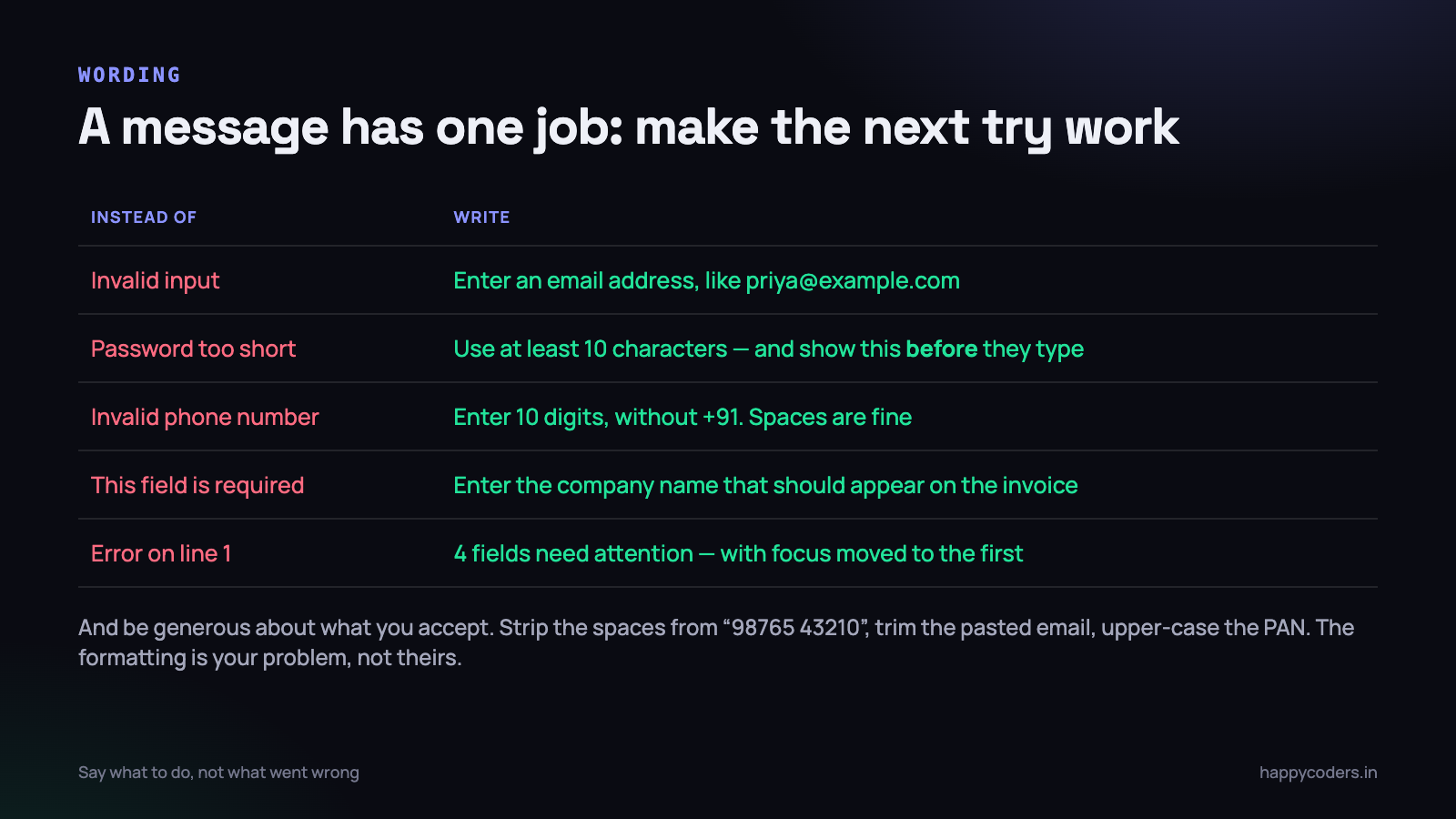
An error message has one job: make the next attempt succeed. “Invalid input” fails that test completely, and so does “This field is required” on a form with nine fields.
Three rules cover nearly every message you will ever write.
- Name the field, state the rule, show an example. Not “Invalid email” but “Enter an email address, like priya@example.com”.
- Say what to do, not what went wrong. “Password must be at least 10 characters” beats “Password too short”, because the first one contains the target.
- Show the rule before they fail it. A hint under the field costs nothing and prevents the error entirely. Password requirements hidden until after the first attempt are a design decision to waste somebody’s time.
And the rule underneath all of them: be generous about what you accept. The user typed something reasonable; the formatting is your problem, not theirs.
// accept what people actually type, then normalise it
const mobile = raw.replace(/[\s\-()]/g, '').replace(/^(\+91|91|0)/, '');
const valid  = /^[6-9][0-9]{9}$/.test(mobile);

const pan    = raw.trim().toUpperCase();
const panOk  = /^[A-Z]{5}[0-9]{4}[A-Z]$/.test(pan);

// an email check that does not reject real addresses
const emailOk = /^[^@\s]+@[^@\s]+\.[^@\s]+$/.test(raw.trim());
Rejecting “98765 43210” because of a space is the kind of thing that makes people abandon a form on a phone. Strip it and move on. The same goes for a trailing space on an email address pasted from an email client, which is one of the most common causes of a failed signup and one of the easiest to fix.
Do not write a clever email regex. The ones circulated online reject valid addresses — including plus-addressing, which people use deliberately, and newer domain endings. Check that there is an at-sign with something either side and a dot after it, and then confirm the address by sending mail to it, which is the only check that actually proves anything.
Accessibility: four things, none of them hard
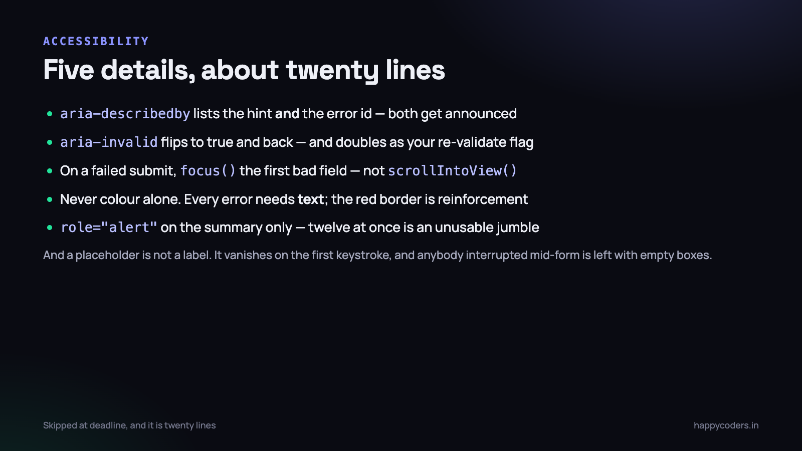
This is the section that gets cut when the deadline arrives, and it is about twenty lines. Without it, somebody using a screen reader submits a form, hears nothing, and has no way to discover that four fields were rejected.
Connect the error to the field
<label for="email">Work email</label>
<input id="email" name="email" type="email" required
       aria-describedby="email-hint email-error"
       aria-invalid="true">
<p id="email-hint" class="hint">We send the invoice to this address.</p>
<p id="email-error" class="error">Enter an email address, like priya@example.com</p>
aria-describedby can list several ids, so the hint and the error are both announced with the field. aria-invalid="true" tells assistive technology that this field is currently in an error state — and, usefully, it doubles as the flag your JavaScript uses to decide whether to re-validate on every keystroke.
Set aria-invalid to false or remove it when the field becomes valid. A form that permanently claims every field is invalid is worse than one that says nothing.
Move focus when submit fails
form.addEventListener('submit', e => {
  const bad = [...fields].filter(f => !validate(f));
  if (bad.length === 0) return;          // let it submit

  e.preventDefault();
  summary.hidden = false;
  summary.textContent = bad.length + ' fields need attention';
  bad[0].focus();                        // not just scrollIntoView
});focus(), not scrollIntoView(). Scrolling helps a sighted mouse user and nobody else. Moving focus puts the cursor in the field, announces the field and its error to a screen reader, and works for everybody. On a long form, focus a summary element with tabindex="-1" at the top instead, with links to each failing field.
Never use colour alone
A red border communicates nothing to a colour-blind user, and roughly one man in twelve is colour-blind. Every error needs text. An icon helps too. The border is reinforcement, not the message.
Announce changes politely
Give the error summary role="alert" so it is read when it appears. Use it once, on the summary, rather than on every individual message — twelve simultaneous alerts produce an unusable jumble. Individual field errors do not need it, because focus is already moving to the field.
One more that belongs here: a placeholder is not a label. Placeholder text disappears the moment somebody types, it fails contrast requirements in most designs, and it leaves anybody who was interrupted mid-form with a set of boxes and no idea what belongs in them. Use a real label, always.
Putting it together
The complete validate function, which is smaller than most people expect because the browser is still doing the checking:
const messages = {
  email:  { valueMissing: 'Enter your work email',
            typeMismatch: 'Enter an email address, like priya@example.com' },
  mobile: { valueMissing: 'Enter your mobile number',
            patternMismatch: 'Enter 10 digits, without +91' },
  qty:    { rangeOverflow: 'Maximum 500 licences. Contact us for more.' },
};

function messageFor(field) {
  const map = messages[field.name] || {};
  for (const key in map) {
    if (field.validity[key]) return map[key];
  }
  return field.validationMessage;   // the browser's wording as a fallback
}

function validate(field) {
  const errorEl = document.getElementById(field.id + '-error');
  const ok = field.checkValidity();

  field.setAttribute('aria-invalid', String(!ok));
  errorEl.textContent = ok ? '' : messageFor(field);
  errorEl.hidden = ok;
  return ok;
}
About thirty lines, and it covers a form of any size. The rules live in the HTML, the wording lives in one object you can hand to a translator, and the fallback means a field you forgot to write a message for still says something sensible instead of nothing.
Rules that involve two fields
The browser cannot help here, because every attribute describes a single input. Confirm password, end date not before start date, “give us either a phone number or an email” — all of these need a line of your own code, and all of them have the same two traps.
The first is attaching the check to the wrong field. If the rule is “the confirmation must match the password”, and somebody fills in the confirmation and then goes back and edits the password, the confirmation field is still showing a tick. Cross-field rules have to re-run when either field changes, not just the second one.
The second is putting the message in the wrong place. A date range error belongs next to the end date, because that is the field the person is most likely to want to change. If it appears next to the start date they will edit that instead, which was not the intention, and now both dates are wrong.
function validatePair() {
  const ok = end.value === '' || start.value === '' || end.value >= start.value;
  setError(end, ok ? '' : 'The end date must be on or after ' + start.value);
  return ok;
}

// either field changing re-runs the rule
start.addEventListener('change', validatePair);
end.addEventListener('change', validatePair);
Write cross-field rules as functions that return true or false and take no arguments, keep them in one list, and run that list on submit alongside the per-field checks. Scattering them through event handlers is how a form ends up with a rule that is enforced on the client in one place and nowhere else.
Checks that need the server, without making anybody wait
“Is this email already registered?” and “is this coupon valid?” can only be answered by your server, and the way that is usually built makes the form worse rather than better: a request on every keystroke, a spinner that flickers, and a submit button that is disabled while three requests are in flight.
Four rules keep it pleasant. Ask on blur, once, rather than while they type — and if you do want live feedback, debounce it so one request goes out after they stop. Never block the submit button on an asynchronous check; let them submit and handle the answer server-side. Show the result next to the field, in the same place as every other error, rather than in a toast that disappears. And treat a failed request as unknown, not as invalid — a dropped connection must not tell somebody their perfectly good email address is taken.
There is also a privacy consideration that is easy to miss. A signup form that says “this email is already registered” is telling anybody who asks whether a given person has an account with you. For a consumer product that is usually acceptable; for anything sensitive, accept the signup and send an email to the existing account instead.
What happens after they press submit
Validation does not end at the point the form passes. Three details decide whether the last two seconds feel finished or broken.
- Disable the button and change its label as soon as the submit starts. On a slow connection, nothing happening for four seconds means people press it again, and you get two enquiries, two orders or two payments.
- Never clear what they typed on a server error. Re-render the form with every value still in it. Losing eleven fields because the twelfth was rejected is the single most infuriating thing a form can do, and on a phone it is usually the end of the session.
- Put the server’s errors in the same place as the client’s — the same element, the same styling, the same focus behaviour. Two different error systems on one form means one of them will be the one nobody maintains.
The rule that is not negotiable
Everything you check in the browser must be checked again on the server. Not most of it. All of it.
Client-side validation is a convenience feature. It exists to save somebody a round-trip and to tell them what is wrong while they are still looking at the form. It is not a control, and it protects nothing, because the browser is not where your form is submitted from as far as an attacker is concerned.
- Removing an attribute takes two seconds. Open developer tools, delete
requiredor changemax="500"tomax="500000", submit. - Nothing has to use your form. One
curlcommand posts whatever it likes to your endpoint. - Your own mobile app or a partner integration hits the same endpoint with none of your JavaScript.
- A slow network can mean a real user submits before your script has loaded and attached its listeners.
The server has to check the same rules and several the browser cannot. Types and ranges. Allowed values for anything from a dropdown — a select element is a suggestion, not a constraint. Authorisation, which is the one that hurts: does this user actually own the invoice id they just posted? And uniqueness.
Uniqueness deserves a specific warning. “Check whether the email exists, then insert” has a race in it. Two requests a few milliseconds apart both pass the check and both insert. The only real defence is a unique index in the database; the query is for the friendly message, the constraint is for correctness.
And one more layer people forget: validating input is not the same as escaping output. A name field containing a script tag can be perfectly valid input and still break the page it is later printed on. That is a separate problem solved at output time, and validation does not cover it.
What to do on Monday morning
Take your most-used form — signup, enquiry, checkout — and spend an hour on it in this order.
- Search the validation code for
addEventListener(‘input’or a keyup handler. Change the first judgement toblur, and keepinputonly for fields already showing an error. This is the change people notice. - Replace
:invalidwith:user-invalidin the stylesheet so nothing is red before it has been touched. - Read every error message out loud. Any that does not contain the rule or an example gets rewritten. Ten minutes, and it reduces support messages.
- Add
aria-describedbyandaria-invalidto each field, and make a failed submit move focus to the first problem rather than scrolling to it. - Fill the form in on a phone, with one hand, on mobile data. Check the keyboard that appears for each field and add
inputmodeandautocompletewhere it is wrong. - Open the server-side handler and compare it against the browser rules, line by line. Anything checked in the browser and not on the server is a bug today, whether or not anybody has found it.
The last one is the only item on the list that is about correctness rather than kindness, and it is the one most likely to be missing. The other five are what turn a form people abandon into one they finish — and none of them require a validation library, a framework or more than an hour.