Most theming problems are the same problem wearing different clothes. A colour is written in ninety-three places. Dark mode is a second stylesheet that has drifted out of sync with the first. A client asks for their brand blue and it turns out there are four slightly different brand blues in the codebase, all of them committed deliberately by somebody who could not find the original.
CSS custom properties solve this completely, and they have been safe to use in production for years. What makes them worth the effort is not the syntax — it is that unlike a preprocessor variable, the browser still knows about them after the page has loaded, which is the difference between a theme you can switch and a theme you have to rebuild.
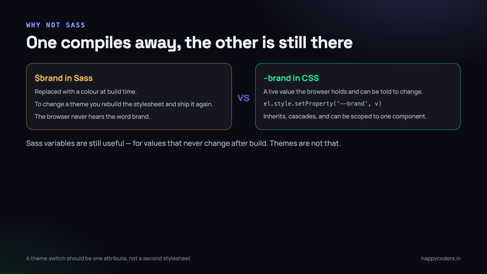
Why not just use Sass variables
Both let you write a colour once. The difference shows up the moment anything needs to change while the page is open.
A Sass variable is resolved when the stylesheet compiles. $brand: #2f6fed means that by the time a browser sees your CSS, the word brand does not exist anywhere. There is only a hex code, repeated in every rule that used it. To change the theme you have to rebuild and redeploy a stylesheet.
A custom property survives into the browser. --brand: #2f6fed is a real value the browser holds, inherits down the tree like any other property, and can be changed at any moment by JavaScript or by another CSS rule. Every element using var(--brand) updates immediately, including elements created after the change.
/* Sass: this is a build-time convenience */
$brand: #2f6fed;
.btn { background: $brand; }
/* the browser receives:  .btn { background: #2f6fed; } */

/* Custom property: this is a runtime value */
:root { --brand: #2f6fed; }
.btn { background: var(--brand); }
/* the browser receives exactly that, and can still change it */
Three consequences follow from that, and they are the whole argument.
- You can change a theme without shipping new CSS. One line of JavaScript, or one attribute on the root element, repaints the entire interface.
- They cascade and inherit. Redefine
--brandon a single card and everything inside that card uses the new value while the rest of the page is untouched. A Sass variable cannot be scoped to a DOM subtree, because it does not exist in the DOM. - They work with media queries and any other selector. The same token can hold different values under
prefers-color-scheme, at a breakpoint, or inside a container — without duplicating the rules that use it.
This is not an argument against Sass. Nesting, mixins, functions and build-time maths are all still useful, and a Sass variable is still the right tool for a value that genuinely never changes after build — a breakpoint used inside a media query, for instance, which custom properties cannot do anyway. Themes are not that kind of value.
Define a token set, not a list of colours
The most important decision in the whole exercise is naming, and it is the one most often got wrong. Name tokens after the job they do, never after the value they hold.
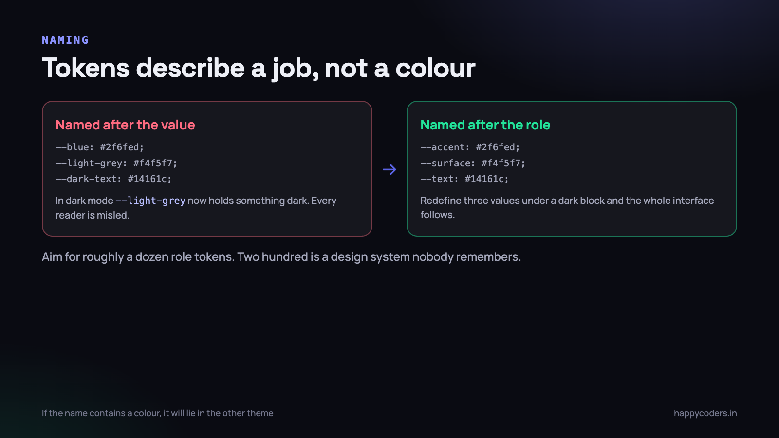
--light-grey is a reasonable name right up to the moment you add dark mode, at which point it holds a dark colour and every developer reading the code is being actively misled. --surface stays accurate in both themes, because the job did not change — only the value did.
/* The full light palette, on bare :root */
:root {
  /* surfaces, back to front */
  --bg:            #ffffff;
  --surface:       #f4f5f7;
  --surface-raised:#ffffff;

  /* text, by importance */
  --text:          #14161c;
  --text-muted:    #5c6070;
  --text-inverse:  #ffffff;

  /* lines and edges */
  --border:        #e2e4ea;

  /* meaning */
  --accent:        #2f6fed;
  --accent-text:   #ffffff;
  --success:       #0f8a52;
  --warning:       #b56a00;
  --danger:        #c1352b;

  /* not just colour */
  --radius:        10px;
  --gap:           16px;
  --shadow:        0 1px 3px rgba(20, 22, 28, .12);
}
Roughly a dozen role tokens covers a normal application. Two hundred tokens is not a design system, it is a second language nobody on the team will learn. Start small and add one when you genuinely need it twice.
Tokens are not only for colour. Radii, spacing, shadows and font sizes benefit just as much, and putting the border radius in one place is how you avoid the interface where five components each round their corners slightly differently.
Two layers, if the project is big enough
On a larger codebase, a second layer helps: primitives that name raw values, and semantic tokens that reference them. The components only ever use the semantic layer.
:root {
  /* layer 1: the palette. Named after what they are */
  --blue-500:  #2f6fed;
  --blue-600:  #1f56c9;
  --grey-50:   #f4f5f7;
  --grey-900:  #14161c;

  /* layer 2: the roles. Named after what they do */
  --accent:        var(--blue-500);
  --accent-hover:  var(--blue-600);
  --surface:       var(--grey-50);
  --text:          var(--grey-900);
}
This is worth doing when more than two or three people write CSS in the project. On a small site it is overhead, and one layer of well-named role tokens is plenty.
Light and dark from one stylesheet
Here is where the runtime nature pays for itself. Dark mode is not a second stylesheet and not a second set of component rules. It is a block that redefines about eight values.
/* Every component, written once, theme-agnostic */
body        { background: var(--bg); color: var(--text); }
.card       { background: var(--surface-raised);
              border: 1px solid var(--border);
              border-radius: var(--radius);
              box-shadow: var(--shadow); }
.btn        { background: var(--accent); color: var(--accent-text); }
.btn-quiet  { background: transparent; color: var(--accent); }
Not one of those rules mentions a colour, a theme or a media query. They never need to change again. The dark theme is a diff against the light one.
@media (prefers-color-scheme: dark) {
  :root:not([data-theme="light"]) {
    --bg:             #0d0f14;
    --surface:        #151821;
    --surface-raised: #1b1f2a;
    --text:           #e8eaf0;
    --text-muted:     #9ca1b3;
    --border:         #272b36;
    --accent:         #6b9bff;   /* lifted: #2f6fed is too dark on dark */
    --shadow:         0 1px 3px rgba(0, 0, 0, .5);
  }
}
Two details in there are not obvious. The accent is a different, lighter blue — a colour with enough contrast on white usually has too little on near-black, and reusing it produces a button nobody can read. And the shadow is redefined too, because a subtle grey shadow is invisible on a dark surface; on dark themes shadows need to be much darker or replaced by a border.
The three theme states, and the one everybody forgets
This is where most implementations break, and the bug is subtle enough to ship. There are three states, not two.
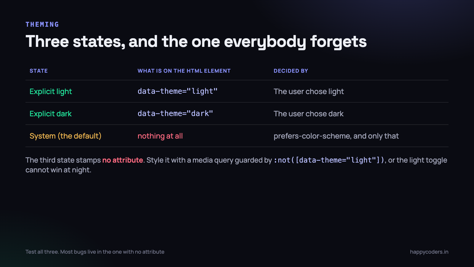
- Explicit light. The user chose light. The root element carries
data-theme="light". - Explicit dark. The user chose dark. The root element carries
data-theme="dark". - System. The user has expressed no preference, which is the default for almost everybody. The root element carries nothing at all, and the theme is decided entirely by
prefers-color-scheme.
The third state stamping no attribute is the whole difficulty. A naive implementation writes [data-theme="dark"] rules and a media query, and then discovers that a user on a dark machine who explicitly chose light still gets a dark page, because the media query has no idea a choice was made.
The pattern that handles all three needs exactly three blocks, in this order.
/* 1. The complete light palette, on bare :root.
      Every token has a value here. This is the definition. */
:root {
  --bg:      #ffffff;
  --surface: #f4f5f7;
  --text:    #14161c;
  --accent:  #2f6fed;
}

/* 2. System dark — but only if light was not explicitly chosen */
@media (prefers-color-scheme: dark) {
  :root:not([data-theme="light"]) {
    --bg:      #0d0f14;
    --surface: #151821;
    --text:    #e8eaf0;
    --accent:  #6b9bff;
  }
}

/* 3. Explicit dark, so the toggle wins on a light machine too */
:root[data-theme="dark"] {
  --bg:      #0d0f14;
  --surface: #151821;
  --text:    #e8eaf0;
  --accent:  #6b9bff;
}
The :not([data-theme="light"]) in block two is what makes the toggle work in both directions. Without it, choosing light on a dark machine does nothing, because the media query still applies and sits later in the cascade than nothing at all.
Yes, the dark values appear twice. That is the honest cost of supporting three states in pure CSS, and it is why the token list should be short. Keep the two dark blocks adjacent in the file so it is obvious they must agree, or generate them from one source if you have a build step.
Test all three states explicitly. Set your operating system to dark, then choose light in the app; set it to light, then choose dark; then clear the choice. Most theming bugs live in the combination nobody tried.
The switch itself
Applying a theme is one attribute. Remembering it is a line of storage. Not flashing the wrong theme on load is the part that needs care.
function setTheme(theme) {          // 'light' | 'dark' | 'system'
  const root = document.documentElement;
  if (theme === 'system') {
    root.removeAttribute('data-theme');   // back to state three
    localStorage.removeItem('theme');
  } else {
    root.setAttribute('data-theme', theme);
    localStorage.setItem('theme', theme);
  }
}
Removing the attribute for the system option matters. Writing data-theme="system" creates a fourth state that none of your CSS matches, and the page falls back to light on a dark machine.
The flash is the other half. If the theme is applied after the page renders, a dark-mode user sees a white screen for a fraction of a second on every navigation. Fix it with a tiny inline script in the head, before any stylesheet — render-blocking is exactly what you want here.
<script>
  // Inline in <head>, before the stylesheet. Four lines, no flash.
  try {
    var t = localStorage.getItem('theme');
    if (t) document.documentElement.setAttribute('data-theme', t);
  } catch (e) {}
</script>
There is more on the timing of this in our post on building a dark mode toggle, including what to do about images and charts that need to change with the theme.
Scoping variables to a component
Because custom properties inherit, you can redefine one anywhere and everything below it follows. This is the feature a preprocessor simply cannot offer, and it makes component variants trivial.
.card {
  --card-pad: 20px;
  --card-bg:  var(--surface-raised);

  padding: var(--card-pad);
  background: var(--card-bg);
  border-radius: var(--radius);
}

/* A variant changes the inputs, not the rules */
.card--compact { --card-pad: 12px; }
.card--danger  { --card-bg: color-mix(in srgb, var(--danger) 8%, var(--surface-raised)); }

/* An entire region on a different palette */
.panel-inverted {
  --surface-raised: #1b1f2a;
  --text:           #e8eaf0;
  --border:         #272b36;
}
That last block is the one worth remembering. Everything inside .panel-inverted — cards, buttons, text, borders, components you have not written yet — renders on the dark palette without a single extra rule, because they all read the same tokens. A footer or a hero section on the opposite theme becomes three lines instead of a duplicate set of every component style.
calc, color-mix and fallbacks
Custom properties are values, so they compose with everything else CSS can do.
:root {
  --gap: 16px;
  --accent: #2f6fed;
}

.stack   { gap: var(--gap); }
.stack-l { gap: calc(var(--gap) * 2); }
.inset   { padding: calc(var(--gap) / 2) var(--gap); }

/* Derive a tint and a hover state instead of hand-picking them */
.alert  { background: color-mix(in srgb, var(--accent) 10%, var(--bg)); }
.btn:hover { background: color-mix(in srgb, var(--accent) 85%, black); }
color-mix removes a lot of tedium. Hover states, subtle tints and disabled variants all derive from the one token, which means changing the brand colour changes them too instead of leaving five hand-picked shades behind.
Fallbacks are the second argument to var(), and they matter for anything optional.
/* If --card-bg is not set anywhere above, use --surface */
background: var(--card-bg, var(--surface, #f4f5f7));
Be aware of what an undefined property actually does, because it is not what most people expect. It does not fall back to the browser default — it makes the whole declaration invalid at computed-value time, which for an inherited property means it inherits, and for others means it takes the initial value. For background-color that initial value is transparent, which is why a single misspelled token name can make a card look like it has no background rather than the wrong one.
Reading and writing them from JavaScript
The runtime part again. Two methods cover everything you will need, and both are ordinary DOM calls rather than anything theme-specific.
// Write: scope it wherever you like
document.documentElement.style.setProperty('--accent', '#e0581f');
cardEl.style.setProperty('--card-pad', '8px');

// Read the computed value (note the trim — it comes back with whitespace)
const accent = getComputedStyle(document.documentElement)
  .getPropertyValue('--accent')
  .trim();

// Remove an inline override and fall back to the stylesheet
document.documentElement.style.removeProperty('--accent');
This is what makes per-customer branding practical. A white-label product can read one hex code from the organisation record, set three tokens on the root element at load, and the entire interface — every button, badge, focus ring, hover state and derived tint — is on brand without a build step or a second stylesheet.
It is also how you feed CSS into things CSS does not control. A chart library that needs colours as JavaScript values can read the tokens rather than keeping its own copy, which means the chart follows the theme automatically instead of staying blue when everything else goes dark.
Where custom properties do not work
Three limits, all of which people hit within the first week and then waste an hour on.
- Not in media query conditions.
@media (min-width: var(--bp))does not work and will not. Breakpoints have to be literal values, which is one of the few places a Sass variable is still genuinely the better tool. - Not as part of a property name or a url. You cannot build
border-#{...}-width, andurl(var(--path))is unreliable. Tokens are values, not text substitution. - Not animatable by default. A transition on
--accentdoes nothing, because the browser treats a custom property as an untyped string and cannot interpolate it. Registering it with@propertyand a type fixes that, and is genuinely useful for gradient and angle animations.
@property --angle {
  syntax: '<angle>';
  initial-value: 0deg;
  inherits: false;
}
/* Now this actually animates, instead of snapping */
.spinner { background: conic-gradient(from var(--angle), var(--accent), transparent);
           transition: --angle .4s linear; }
On performance: changing a token on :root invalidates style for everything that reads it, which on a large page is real work. It is not something to do on every frame of a scroll handler. Toggling a theme, applying a brand colour, or changing a variant — all fine, and all things that happen a handful of times in a session.
The mistake that breaks everything
One error accounts for more broken themes than the rest combined: defining a colour only inside a media query.
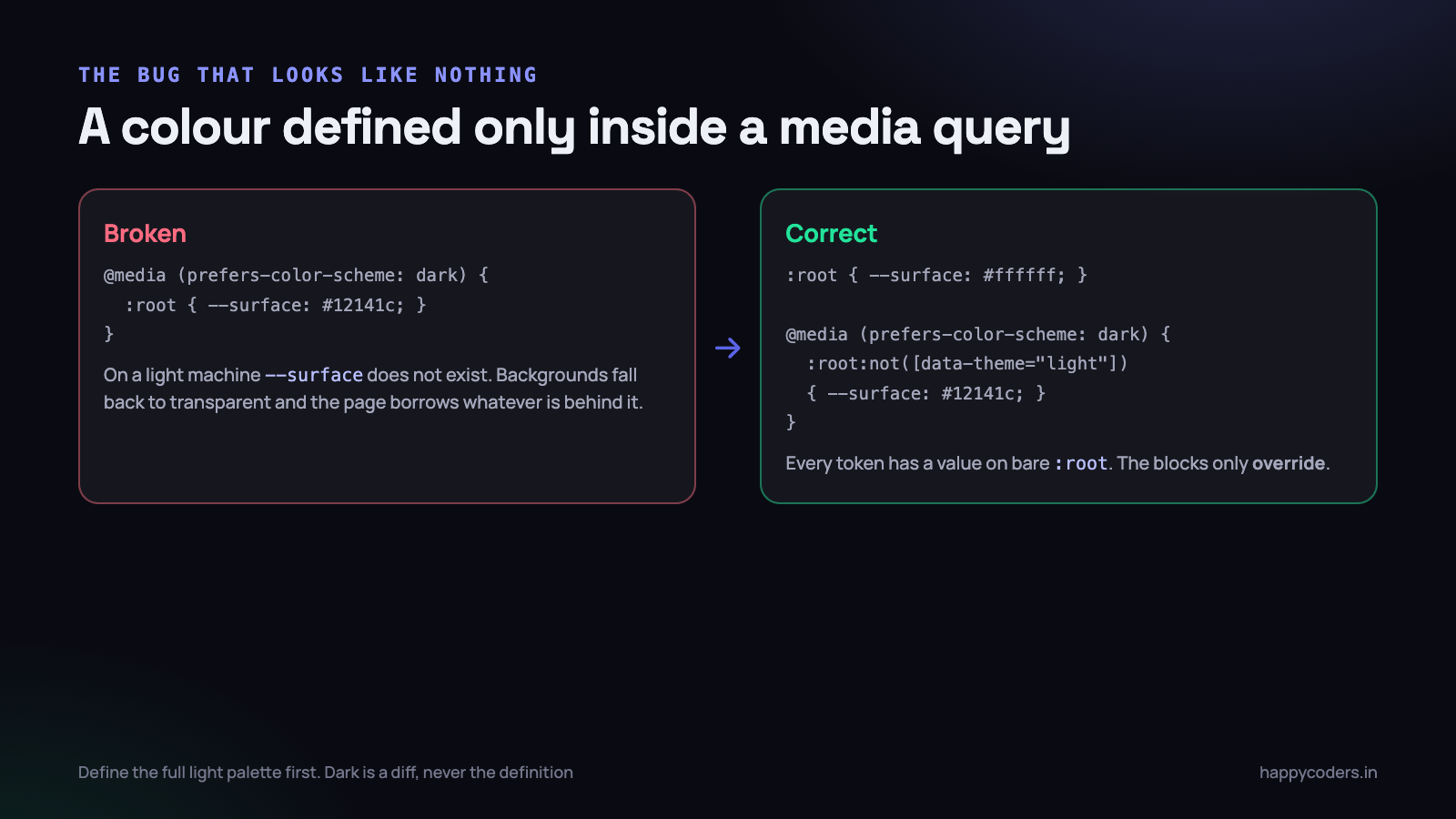
/* Broken: --surface does not exist on a light machine */
@media (prefers-color-scheme: dark) {
  :root { --surface: #151821; }
}
.card { background: var(--surface); }   /* transparent in light mode */
This is easy to do while adding dark mode to a site that did not have it, because you are working in the dark block and the page looks correct on your machine. It looks correct to everybody on the team, if they all use dark mode. It ships, and then a client opens it on a laptop set to light and half the interface has no background.
The rule that prevents it: every token gets its value on bare :root. Media queries and theme attributes only ever override. If a token appears for the first time inside a conditional block, that is a bug regardless of how the page looks right now.
Two related errors worth naming while you are checking.
- A transparent body background. Set
background: var(--bg)onbodyexplicitly. A page that does not paint its own background inherits the browser or host’s colour, which will not match your theme. - Forgetting
color-scheme. Addingcolor-scheme: light darkto:roottells the browser to render form controls, scrollbars and the native autofill background in the matching theme. Without it you get a beautiful dark interface with white scrollbars and a bright blue autofilled input.
Contrast is not automatic
One warning about dark themes generally. Inverting a palette does not preserve accessibility. A grey that reads comfortably as muted text on white is often below the 4.5:1 contrast ratio when it becomes light grey on near-black, and pure white text on pure black is uncomfortable to read for long because of the halation effect around the letters.
Check the dark palette with a contrast tool the same way you checked the light one. In practice that usually means muted text is lighter than the mathematical inverse suggests, the background is a very dark blue-grey rather than #000000, and body text is around #e8eaf0 rather than pure white.
What to do on Monday morning
This is a gradual migration, not a rewrite. It works file by file and there is no point at which the site is half broken.
- Grep your stylesheets for hex codes and count the distinct values. Most projects find between forty and a hundred, and about a dozen of them are the same three colours with small variations.
- Write the token block first — twelve role-named tokens on bare
:root, light values only. Do not touch dark mode yet. - Replace colours one component at a time, starting with whichever file you open most often. Nothing changes visually, which is how you know you are doing it right.
- Add
color-scheme: light darkto:rootand see how much of the dark theme the browser gives you for free. - Write the dark block with the
:not([data-theme="light"])guard, and the explicit dark block next to it. - Test the three states, in both operating system settings. This is fifteen minutes and it is where the bugs are.
- Search for any token defined only inside a media query. Every one is a bug waiting for a user on the other theme.
The payoff is not that the site has dark mode. It is that six months later, when a client asks for their brand colour to be a slightly different blue, the change is one line in one file, and every button, link, focus ring, tint and hover state in the product moves with it.