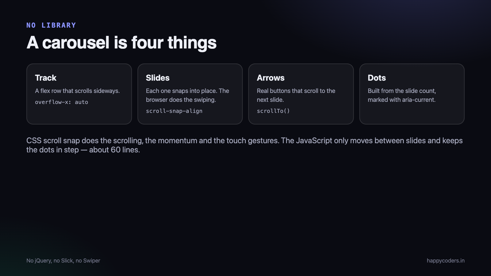
Most carousels on the web are a library, a stylesheet and a jQuery dependency, for a component that is a row of images and two buttons. Modern CSS does the hard part — the scrolling and the snapping — and the JavaScript that is left is about sixty lines.
This is a complete, working carousel with arrows, dots, keyboard support, touch swiping and no dependencies. If you already use Slick slider and it works for you, there is nothing wrong with that; this is for the cases where you would rather not ship a library for one component.
The markup
<div class="carousel" data-carousel>
<div class="carousel__track" data-track>
<img class="carousel__slide" src="1.jpg" alt="Beach at sunset">
<img class="carousel__slide" src="2.jpg" alt="Market street">
<img class="carousel__slide" src="3.jpg" alt="Temple gopuram">
</div>
<button class="carousel__btn carousel__btn--prev" data-prev aria-label="Previous image">‹</button>
<button class="carousel__btn carousel__btn--next" data-next aria-label="Next image">›</button>
<div class="carousel__dots" data-dots></div>
</div>The CSS that does the real work
Scroll snap is what makes this feel like a carousel rather than a scrolling div. The browser handles the momentum, the touch gestures and the snapping, on every platform, with no JavaScript at all.
.carousel { position: relative; }

.carousel__track {
  display: flex;
  gap: 12px;
  overflow-x: auto;
  scroll-snap-type: x mandatory;   /* snap to each slide */
  scroll-behavior: smooth;
  scrollbar-width: none;           /* Firefox */
}
.carousel__track::-webkit-scrollbar { display: none; }

.carousel__slide {
  flex: 0 0 100%;                  /* one slide per view; use 50% for two */
  scroll-snap-align: center;
  border-radius: 12px;
  object-fit: cover;
  width: 100%;
}

.carousel__btn {
  position: absolute; top: 50%; transform: translateY(-50%);
  border: 0; border-radius: 50%; width: 44px; height: 44px;
  background: rgba(0,0,0,.55); color: #fff; font-size: 24px; cursor: pointer;
}
.carousel__btn--prev { left: 8px; }
.carousel__btn--next { right: 8px; }

.carousel__dots { display: flex; gap: 8px; justify-content: center; margin-top: 12px; }
.carousel__dot  { width: 8px; height: 8px; border: 0; border-radius: 50%;
                  background: #ccc; padding: 0; cursor: pointer; }
.carousel__dot[aria-current="true"] { background: #333; width: 22px; border-radius: 4px; }

@media (prefers-reduced-motion: reduce) {
  .carousel__track { scroll-behavior: auto; }
}
Two things there are worth noticing. flex: 0 0 100% decides how many slides are visible — change it to 50% or 33.333% and everything else still works. And the reduced-motion query turns off smooth scrolling for people who have asked their system for less animation.
The JavaScript
function createCarousel(root) {
  const track = root.querySelector('[data-track]');
  const slides = [...track.children];
  const dotsBox = root.querySelector('[data-dots]');
  let index = 0;

  const goTo = (i) => {
    index = Math.max(0, Math.min(i, slides.length - 1));
    track.scrollTo({ left: slides[index].offsetLeft - track.offsetLeft });
    update();
  };

  const update = () => {
    root.querySelector('[data-prev]').disabled = index === 0;
    root.querySelector('[data-next]').disabled = index === slides.length - 1;
    [...dotsBox.children].forEach((d, i) =>
      d.setAttribute('aria-current', String(i === index)));
  };

  // dots
  slides.forEach((_, i) => {
    const dot = document.createElement('button');
    dot.className = 'carousel__dot';
    dot.setAttribute('aria-label', `Go to image ${i + 1}`);
    dot.addEventListener('click', () => goTo(i));
    dotsBox.append(dot);
  });

  root.querySelector('[data-prev]').addEventListener('click', () => goTo(index - 1));
  root.querySelector('[data-next]').addEventListener('click', () => goTo(index + 1));

  // keyboard
  root.addEventListener('keydown', (e) => {
    if (e.key === 'ArrowLeft')  { goTo(index - 1); e.preventDefault(); }
    if (e.key === 'ArrowRight') { goTo(index + 1); e.preventDefault(); }
  });

  // keep the dots right when the user swipes or scrolls by hand
  let raf;
  track.addEventListener('scroll', () => {
    cancelAnimationFrame(raf);
    raf = requestAnimationFrame(() => {
      const mid = track.scrollLeft + track.clientWidth / 2;
      index = slides.findIndex(s => s.offsetLeft - track.offsetLeft + s.offsetWidth > mid);
      if (index < 0) index = slides.length - 1;
      update();
    });
  });

  update();
}

document.querySelectorAll('[data-carousel]').forEach(createCarousel);
Touch swiping needs no code at all — it is the browser’s own scrolling, which is why it feels right on a phone. The scroll listener exists only to keep the dots in step when somebody swipes instead of using the arrows.
Autoplay, if you must
Autoplay is worth thinking twice about: it moves content away from people who are still reading it, and it is a common accessibility complaint. If you need it, it must pause on hover and on focus, and stop entirely when the user has asked for reduced motion.
const reduce = matchMedia('(prefers-reduced-motion: reduce)').matches;
if (!reduce) {
  let timer = setInterval(() => goTo(index === slides.length - 1 ? 0 : index + 1), 5000);
  const stop = () => clearInterval(timer);
  root.addEventListener('mouseenter', stop);
  root.addEventListener('focusin', stop);
}
Loading the images without hurting the page
A carousel is usually near the top of a page, which makes it the component most likely to slow the page down. Three attributes fix most of it.
<!-- first slide: visible immediately, load it early -->
<img class="carousel__slide" src="1.jpg" alt="Beach at sunset"
     width="1200" height="675" fetchpriority="high">

<!-- the rest: not visible yet, let the browser defer them -->
<img class="carousel__slide" src="2.jpg" alt="Market street"
width="1200" height="675" loading="lazy" decoding="async">widthandheighton every image reserve the space before the file arrives, so the page does not jump.loading="lazy"on everything except the first slide. The first one is visible, so lazy-loading it only delays it.fetchpriority="high"on the first image tells the browser this is the one that matters.
If the images are large photographs, serve smaller versions to phones with srcset. A 2000px-wide hero image downloaded on a 400px screen is the single most common waste on an Indian mobile connection.
Two problems that appear later
The carousel is inside a tab or a modal that starts hidden
A hidden element has no width, so offsetLeft and offsetWidth are zero and the first goTo() scrolls nowhere. Call the setup — or just goTo(0) — after the tab or modal becomes visible, not on page load.
The window is resized, or the phone is rotated
Slide positions are measured in pixels, so they change when the layout does. One listener keeps it honest:
let resizeTimer;
addEventListener('resize', () => {
  clearTimeout(resizeTimer);
  resizeTimer = setTimeout(() => goTo(index), 150);   // re-align to the current slide
});
The timeout matters. Resize fires continuously while a window is being dragged, and re-scrolling on every event makes the carousel fight the user.
Several carousels on one page
The last line of the script already handles this — querySelectorAll('[data-carousel]') sets up each one independently, and every variable lives inside the function, so two carousels on the same page never interfere. Nothing is stored globally, which is the usual cause of the second carousel controlling the first.
Accessibility, in five lines of effort
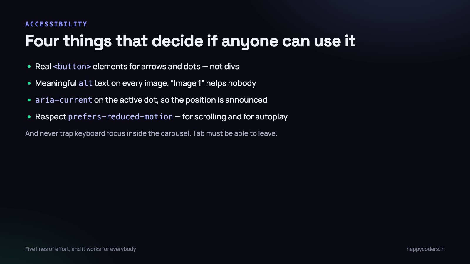
- Real
<button>elements for arrows and dots, not divs. They are focusable and announce themselves. - Describe every image with meaningful alt text. “Image 1” helps nobody.
- Say which dot is current with
aria-current, as the code above does. - Respect reduced motion for both the scroll behaviour and any autoplay.
- Never trap keyboard focus inside the carousel. Tab must move out of it.
When a library is still the right answer
This approach covers most real uses: a hero slider, a product gallery, a logo row, a testimonial strip. Reach for a library when you need infinite looping in both directions, coverflow-style 3D effects, or synchronised thumbnail strips — those are genuinely fiddly and a well-tested library will do them better than a weekend of your time.
For everything else, sixty lines and no dependency is faster to load, easier to restyle, and cannot break when a plugin updates.
Showing more than one slide, responsively
Almost every real carousel shows one slide on a phone and two or three on a laptop. With this approach that is a media query and nothing else — the JavaScript does not change, because it scrolls to whichever slide is next regardless of how many are visible.
.carousel__slide { flex: 0 0 100%; }                    /* phones */

@media (min-width: 640px)  { .carousel__slide { flex: 0 0 calc(50% - 6px); } }
@media (min-width: 1024px) { .carousel__slide { flex: 0 0 calc(33.333% - 8px); } }
The calc() subtracts a share of the gap so the last slide does not spill past the edge. With a 12px gap and three slides, each slide gives up 8px.
One consequence to be aware of: with three slides visible, the arrows still move one slide at a time, which is usually what people expect. If you want them to move a whole page, multiply the index by the number visible — but test it on a phone, because “a page” is one slide there and jumping three feels broken.
Keeping the dots right without doing maths on every scroll event
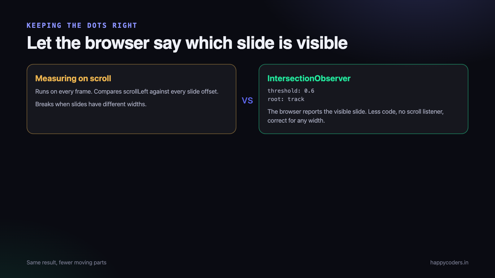
The scroll handler earlier recalculates which slide is centred on every frame. It works, and there is a cleaner way that the browser optimises for you: let IntersectionObserver tell you which slide is in view.
const io = new IntersectionObserver((entries) => {
  entries.forEach((entry) => {
    if (entry.isIntersecting) {
      index = slides.indexOf(entry.target);
      update();
    }
  });
}, { root: track, threshold: 0.6 });      // 60% visible counts as "the current slide"

slides.forEach((s) => io.observe(s));
This removes the scroll listener entirely. It is less code, it does not run on every frame, and it behaves correctly when slides are different widths — which the measuring version does not.
Infinite looping, and why libraries exist
“Go past the last slide and come back to the first” sounds like one more line. It is not, and this is the honest reason to reach for a library.
With native scrolling there is no such thing as scrolling past the end. The usual technique is to clone the first and last slides, put the clones at the opposite ends, and silently jump the scroll position when the user reaches one. Done badly it flickers; done well it involves disabling smooth scrolling for exactly one frame, and it interacts awkwardly with the dots, with keyboard focus and with screen readers, which now see duplicated content.
If looping is a genuine requirement, use a maintained library and let somebody else own those edge cases. If it is a nice-to-have, disabling the arrow at each end — as the code above does — is honest, obvious to the user, and free.
Four problems that only appear on real devices
- The horizontal scrollbar on the whole page. A slide at
100vwis wider than the visible area when a scrollbar is present. Use100%of the track, not100vw. - iOS momentum overshooting the snap. Rare, and fixed by using
scroll-snap-type: x mandatoryrather thanproximity, which is what the CSS above does. - Right-to-left layouts. In an RTL language,
scrollLeftcounts the other way. If you support Arabic or Urdu, test it — the arrows will feel reversed if you do not. - Images of different heights. Slides jump as you move between them. Give the slide a fixed
aspect-ratioand letobject-fit: covercrop.
A carousel is often the wrong component
Worth saying plainly at the end of a tutorial about building one: study after study of hero carousels finds that almost nobody sees slide two. If the content matters, a carousel is a way of hiding most of it.
Carousels earn their place where the user is expected to browse — a product gallery, a photo set, a testimonial strip they can flick through. They are a poor choice for your main marketing message, where a single clear image and a single call to action will do better every time.
If you are building one because a client asked for a slider, build this one: it is sixty lines, it has no dependency, and it will still work in three years when the library you would have used has had four breaking releases.
Captions over the image
Most real carousels need a line of text on each slide. The temptation is to put it in the alt attribute; that is for screen readers, not for display. Wrap each slide instead:
<figure class="carousel__slide">
  <img src="1.jpg" alt="Team working at the Thoothukudi office" width="1200" height="675">
  <figcaption>Our Thoothukudi office, 2026</figcaption>
</figure>
.carousel__slide { position: relative; flex: 0 0 100%; scroll-snap-align: center; margin: 0; }
.carousel__slide figcaption {
position: absolute; left: 0; right: 0; bottom: 0;
padding: 28px 20px 16px; color: #fff; font-size: 15px;
background: linear-gradient(transparent, rgba(0,0,0,.75));
}The gradient matters more than it looks: white text directly on a photograph is unreadable over a light area, and a gradient fixes every photo at once without editing any of them.
A vertical carousel
The same component turns vertical by changing the axis. Nothing in the JavaScript changes except which scroll property you set.
.carousel__track--vertical {
  flex-direction: column;
  overflow-x: hidden;
  overflow-y: auto;
  height: 420px;
  scroll-snap-type: y mandatory;
}
Use scrollTop and offsetTop in place of scrollLeft and offsetLeft, and the arrows become up and down. Vertical works well for testimonial strips and news lists, where horizontal scrolling feels wrong on a desktop.
Does anybody actually use it?
Before adding features to a carousel, find out whether visitors touch it at all. It is three lines, and the answer changes what you build next.
let interacted = false;
['click', 'keydown', 'touchstart'].forEach((ev) =>
  root.addEventListener(ev, () => {
    if (interacted) return;
    interacted = true;
    gtag?.('event', 'carousel_used', { slides: slides.length });
  }, { once: false, passive: true })
);
In our experience the number is lower than anyone expects — which is an argument for putting the important slide first rather than for building a better carousel.
Slides and search engines
One advantage of this approach that is easy to miss: the slides are plain <img> tags in the HTML. A crawler sees all of them, with their alt text, exactly as it sees any other image on the page.
Carousels built by JavaScript that inject slides after load are a different matter — whether they are indexed depends on how the crawler renders the page, and the answer changes. If the images matter for search, put them in the markup and let CSS arrange them, which is what this component does.
The same applies to lazy loading. loading="lazy" is understood by crawlers; a custom “load when scrolled” script may not be.
The whole component, in one place
To recap what has been built: markup of a track and slides, about forty lines of CSS in which scroll snap does the scrolling and the snapping, and about sixty lines of JavaScript for the arrows, the dots, keyboard support and keeping the state in step.
No dependency, nothing to update, and it will behave the same in five years. Copy the three blocks into your project, change flex: 0 0 100% to suit your layout, and it is finished.
If you later need looping, coverflow effects or synchronised thumbnails, swap in a maintained library at that point — with the markup already in this shape, most libraries will take it over with a single initialisation call.
Testing it before it ships
A carousel is one of the few components where a five-minute manual test finds nearly every bug, because the failure modes are visible rather than logical.
- Resize the window from wide to narrow while on the third slide. The alignment should follow.
- Tab through the page. Focus should reach the arrows and the dots, and should be able to leave again.
- Use only the keyboard to move between all slides.
- Swipe on a real phone, not the browser’s device emulator. Momentum behaves differently.
- Turn on reduced motion in your system settings and confirm the scrolling stops animating.
- Load it on a slow connection with the network panel throttled, and check the layout does not jump as images arrive.
The last two are the ones skipped most often, and between them they cause most of the complaints a carousel ever receives.
Frequently asked questions
Does scroll snap work everywhere?
It is supported across all current browsers. On anything very old it degrades to an ordinary horizontally scrolling row, which still works — the images are still reachable, they just do not snap.
How do I show two or three slides at once?
Change one value: flex: 0 0 50% for two, 33.333% for three. Use a media query to show one on phones and more on desktop.
Why does my carousel jump when images load?
Because the browser does not know how tall the images are until they arrive. Put width and height attributes on each <img>, or give the slide a fixed aspect-ratio in CSS.