A modal looks like the simplest component there is: a box on top of a dimmed page. It is also the component most often built badly, because the visible part is five lines of CSS and everything that makes it actually work is invisible.
Here is the whole thing in plain JavaScript — and then the native element that does most of it for you, which you should probably use instead.
What a modal has to do
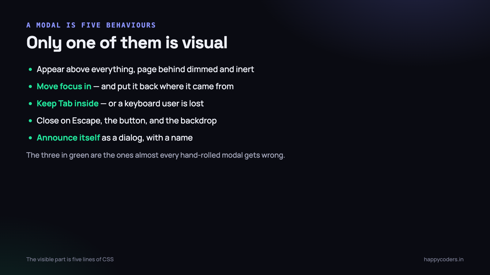
Before any code, the list. A modal that misses any of these is broken for somebody.
- Appear above everything, with the page behind dimmed and inert.
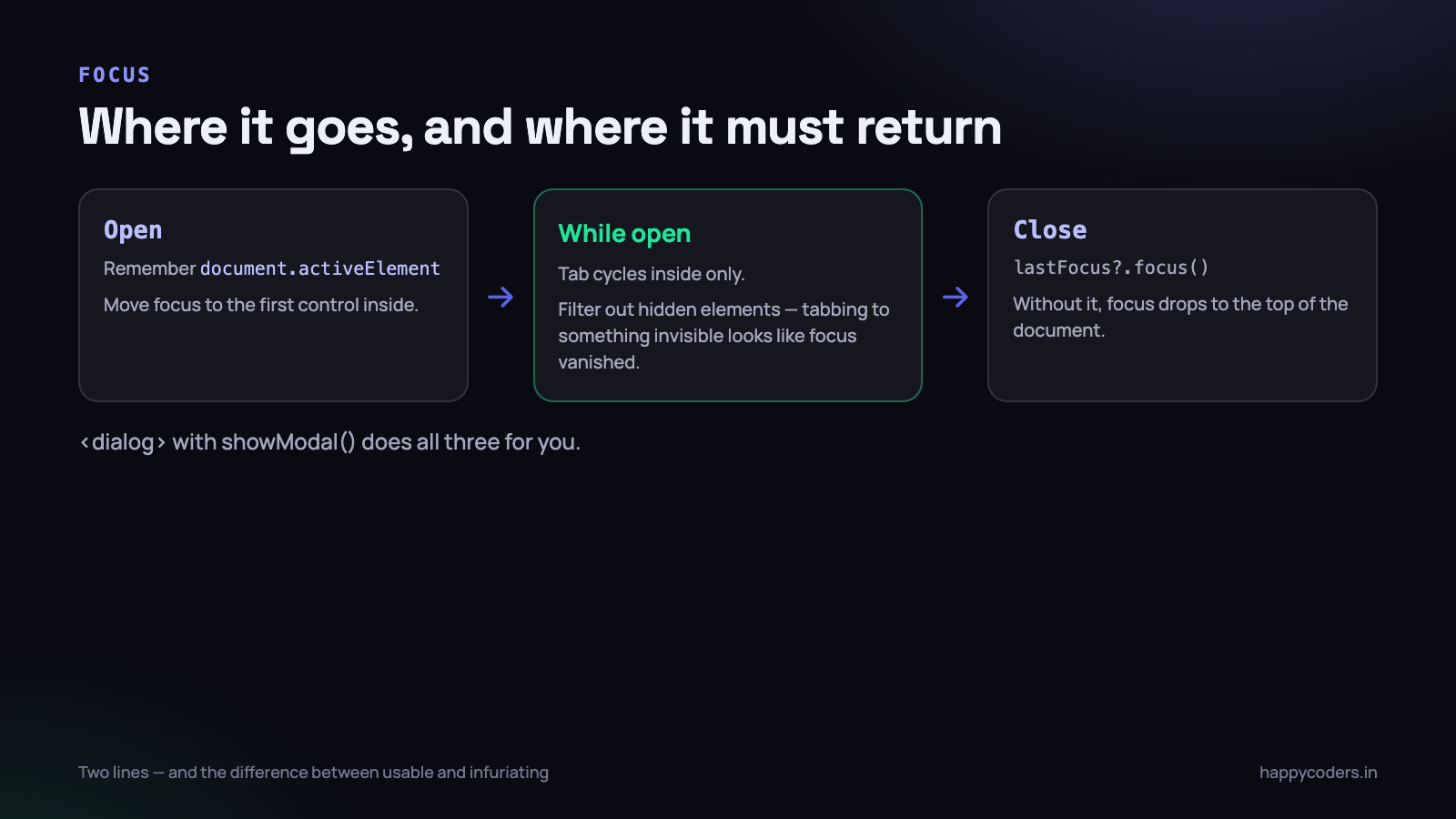
- Move focus into itself when it opens, and put it back where it came from when it closes.
- Keep Tab inside it. If focus escapes to the page behind, a keyboard user is lost with no way back.
- Close on Escape, on the close button, and on a click outside — unless it is a confirmation that must be answered.
- Stop the page behind from scrolling, and put the scroll position back afterwards.
- Announce itself to a screen reader as a dialog with a name.
Items 2, 3 and 6 are the ones almost every hand-rolled modal gets wrong, and they are the ones that decide whether the component is usable by somebody not using a mouse.
The markup
<button id="open">Open dialog</button>

<div class="overlay" id="overlay" hidden>
  <div class="modal" role="dialog" aria-modal="true" aria-labelledby="modal-title">
    <h2 id="modal-title">Delete this project?</h2>
    <p>This removes the project and its 42 time entries. It cannot be undone.</p>
    <div class="actions">
      <button class="secondary" data-close>Cancel</button>
      <button class="danger" id="confirm">Delete</button>
    </div>
  </div>
</div>
Three attributes are doing real work here:
role="dialog"tells assistive technology what this is.aria-modal="true"tells it that the rest of the page is unavailable.aria-labelledbypoints at the heading, so the dialog is announced with a name rather than as “dialog”.
Use the hidden attribute rather than a class for the closed state. It is semantic, it hides the content from assistive technology as well as visually, and it removes a whole category of bug where something is invisible but still focusable.
The CSS
.overlay {
  position: fixed;
  inset: 0;
  background: rgba(10, 12, 20, .6);
  display: grid;
  place-items: center;
  padding: 20px;
  z-index: 100;
}
.overlay[hidden] { display: none; }   /* [hidden] loses to display:grid without this */

.modal {
  background: #fff;
  border-radius: 14px;
  padding: 28px;
  width: 100%;
  max-width: 460px;
  max-height: 85vh;
  overflow-y: auto;
  box-shadow: 0 24px 60px -20px rgba(0, 0, 0, .45);
}

@media (prefers-reduced-motion: no-preference) {
  .overlay { animation: fade .16s ease-out; }
  @keyframes fade { from { opacity: 0 } }
}
Three details worth pointing at. .overlay[hidden] { display: none } is required because display: grid beats the browser default for [hidden] — without it the modal never hides, and this catches people out constantly.
max-height: 85vh with overflow-y: auto means a long dialog scrolls inside itself rather than growing past the bottom of the screen where the buttons cannot be reached. And the animation is inside a prefers-reduced-motion query, because for some people motion causes actual nausea.
The JavaScript
const overlay  = document.getElementById('overlay');
const modal    = overlay.querySelector('.modal');
let lastFocus  = null;

const FOCUSABLE = 'a[href], button:not([disabled]), input:not([disabled]), ' +
                  'select:not([disabled]), textarea:not([disabled]), [tabindex]:not([tabindex="-1"])';

function openModal() {
  lastFocus = document.activeElement;          // remember where we came from
  overlay.hidden = false;
  document.body.style.overflow = 'hidden';     // stop the page behind scrolling

  const first = modal.querySelector(FOCUSABLE);
  (first || modal).focus();
}

function closeModal() {
  overlay.hidden = true;
  document.body.style.overflow = '';
  lastFocus?.focus();                          // put focus back
}

function trapFocus(e) {
  if (e.key !== 'Tab') return;

  const items = [...modal.querySelectorAll(FOCUSABLE)].filter(el => el.offsetParent !== null);
  if (!items.length) return;

  const first = items[0];
  const last  = items[items.length - 1];

  if (e.shiftKey && document.activeElement === first) {
    e.preventDefault(); last.focus();
  } else if (!e.shiftKey && document.activeElement === last) {
    e.preventDefault(); first.focus();
  }
}

document.getElementById('open').addEventListener('click', openModal);

overlay.addEventListener('click', e => {
  if (e.target === overlay) closeModal();      // only the backdrop, not the modal
});

overlay.addEventListener('click', e => {
  if (e.target.closest('[data-close]')) closeModal();
});

document.addEventListener('keydown', e => {
  if (overlay.hidden) return;
  if (e.key === 'Escape') closeModal();
  trapFocus(e);
});
That is the complete component. A few lines deserve explanation because they are the ones that are usually missing.
Remembering where focus came from
Without it, closing the modal drops focus to the top of the document. A keyboard user who opened a dialog from a button halfway down a long page is returned to the beginning and has to tab back. It is two lines and it is the difference between usable and infuriating.
Only the backdrop closes it
Click events bubble. Without this check, clicking anything inside the modal — including selecting text — closes it. The check says: only close if the click landed on the backdrop itself.
Skipping elements that are not visible
The focusable-elements query finds hidden elements too — a collapsed section, a button inside a hidden tab. Tabbing to something invisible looks to the user like focus has vanished. Filtering by offsetParent !== null removes anything not currently rendered.
The document-level keydown listener
Listening on the modal only works if focus is inside it. Listening on the document means Escape works even if focus has slipped somewhere unexpected, and the overlay.hidden guard makes it a no-op the rest of the time.
The native element that does most of this
Modern browsers have <dialog>, and it handles focus, Escape, the backdrop and the top layer for you.
<dialog id="dlg">
  <h2>Delete this project?</h2>
  <p>This removes the project and its 42 time entries.</p>
  <form method="dialog">
    <button value="cancel">Cancel</button>
    <button value="delete" class="danger">Delete</button>
  </form>
</dialog>

<script>
  const dlg = document.getElementById('dlg');
  document.getElementById('open').onclick = () => dlg.showModal();
  dlg.addEventListener('close', () => {
    if (dlg.returnValue === 'delete') deleteProject();
  });
</script>
showModal() gives you, for free: focus moved into the dialog, focus trapped inside it, focus restored on close, Escape closing it, the rest of the page made inert, and rendering in the browser’s top layer so z-index stacking problems disappear.
Two things it does not do. It does not close on a backdrop click — add that yourself — and it does not lock body scroll:
dlg.addEventListener('click', e => {
  const r = dlg.getBoundingClientRect();
  const inside = e.clientX >= r.left && e.clientX <= r.right &&
                 e.clientY >= r.top  && e.clientY <= r.bottom;
  if (!inside) dlg.close();
});

dlg.addEventListener('close', () => { document.body.style.overflow = ''; });
// and set overflow:hidden when you call showModal()
Style the backdrop with the ::backdrop pseudo-element, which is a real element you can transition.
Use <dialog> unless you have a specific reason not to. The hand-written version above is worth understanding because it shows you what the browser is doing, and because you will meet codebases full of hand-rolled modals that need fixing.
When not to use a modal at all
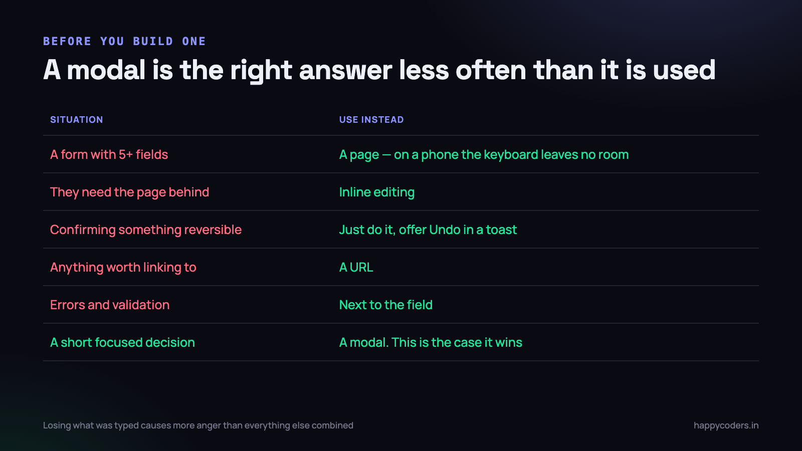
The best modal is frequently the one you did not build. Modals interrupt, they are awkward on phones, and they hide the thing the user was looking at — often the very thing they needed in order to answer.
- A form with more than about five fields. On a phone, with the keyboard open, there is almost no room left. Use a page.
- Anything the user needs to refer back to. If they must read the table behind to fill in the dialog, you have made the task harder than it was.
- A confirmation for something reversible. Do it, then offer Undo in a toast. It is faster for the user and safer for you, because Undo also covers the accidental confirmations that people click through without reading.
- Anything that should be linkable. If somebody might want to send a colleague a link to it, it needs a URL, and a modal does not have one unless you give it one.
- Errors and validation. Show them next to the field. A modal that says “something went wrong” and then disappears is the least useful error message there is.
The cases where a modal genuinely wins are narrow: a short, focused decision where the surrounding page is irrelevant or would distract. Confirming a destructive action, picking one item, a two-field quick add.
The things that annoy users, in order
These are behaviour problems rather than code problems, and they are the reason people say they dislike modals.
Losing what was typed
A user fills in six fields, accidentally clicks outside, and the dialog closes taking everything with it. This single behaviour causes more anger than every other item here combined.
The fix: if the form has been edited, do not dismiss on backdrop click or Escape. Ask. Or, better, keep the values so reopening restores them — users forgive an extra click far more readily than lost work.
No visible way out
Every modal needs a close affordance that is obviously a close affordance, in the place people look for it. A dialog whose only exit is a hidden Escape key traps people who do not know it works.
Appearing without being asked for
A newsletter dialog three seconds after arrival, or an exit-intent popup. These convert a little and cost more than they return in how the product feels. They are also the reason browsers and users have grown hostile to modals in general.
Stacking
A confirmation on top of a form on top of a detail view. Each layer is a thing the user has to unwind, and on a phone there is no visual indication of how deep they are. If you find yourself needing three levels, the flow is wrong, not the component.
Making it reusable
One modal is sixty lines. Five modals written five times is a maintenance problem and a guarantee that at least one of them has a broken focus trap. The fix is not a library; it is one function.
function createDialog(el) {
  let lastFocus = null;

  function open() {
    lastFocus = document.activeElement;
    el.hidden = false;
    document.body.style.overflow = 'hidden';
    (el.querySelector(FOCUSABLE) || el).focus();
  }

  function close() {
    el.hidden = true;
    document.body.style.overflow = '';
    lastFocus?.focus();
    el.dispatchEvent(new CustomEvent('dialog:close'));
  }

  el.addEventListener('click', e => {
    if (e.target === el || e.target.closest('[data-close]')) close();
  });
  document.addEventListener('keydown', e => {
    if (el.hidden) return;
    if (e.key === 'Escape') close();
    trapFocus(e, el);
  });

  return { open, close };
}

// one line per dialog after that
const confirmDelete = createDialog(document.getElementById('overlay'));
The important part is that the behaviour lives in one place. When somebody reports that Escape does not work on one screen, you fix it once rather than finding four copies with four small differences.
The same argument applies to <dialog>: even with the native element doing the hard parts, wrap the backdrop click and the scroll lock in one helper so every dialog in the product behaves identically. Consistency is a feature — a user who learns that clicking outside cancels should never find a screen where it does not.
Mistakes to avoid
- Building it as a
<div>with a click handler. The trigger must be a real<button>or it cannot be reached by keyboard. - Forgetting
.overlay[hidden] { display: none }. The most common reason a modal will not close. - Setting
body { overflow: hidden }and losing the scroll position on iOS. If it matters, recordwindow.scrollYbefore opening and restore it after. - Nesting modals. Almost always a sign the flow needs rethinking. If you must, keep a stack and only let the top one respond to Escape.
- Autofocusing a destructive button. Focus the safe option, or the heading. Somebody pressing Enter out of habit should not delete a project.
- Closing on backdrop click for a confirmation. If the answer matters, make them choose. Reserve backdrop dismissal for informational dialogs.
One detail that breaks on phones
Setting body { overflow: hidden } stops the page behind from scrolling on a desktop. On iOS Safari it often does not, and worse, it can throw the page back to the top when the modal closes — so the user dismisses a dialog and finds themselves at the start of a list they had scrolled a long way down.
The reliable approach is to record the position, pin the body, and put it back:
function lockScroll() {
  const y = window.scrollY;
  document.body.style.position = 'fixed';
  document.body.style.top = `-${y}px`;
  document.body.style.width = '100%';
  document.body.dataset.scrollY = y;
}

function unlockScroll() {
  const y = document.body.dataset.scrollY || '0';
  document.body.style.position = '';
  document.body.style.top = '';
  document.body.style.width = '';
  window.scrollTo(0, parseInt(y, 10));
}
It is more code than it should need, and it is the difference between a dialog that feels native on a phone and one that feels broken. Test it on a real device rather than in the browser’s device emulator — this is one of the behaviours the emulator gets wrong.
The other phone-specific trap is the on-screen keyboard. When it opens it shrinks the visible area, and a dialog sized with max-height: 85vh can end up with its buttons underneath the keyboard. Using 85dvh instead — dynamic viewport height — fixes it in current browsers, and is worth switching to wherever you size against the viewport.
Test it in four ways
- Keyboard only. Unplug the mouse. Open it, tab all the way round twice, press Escape. Focus should never leave the dialog, and should come back to the trigger.
- With a long body. Put forty paragraphs in it. The dialog should scroll inside itself and the buttons should stay reachable.
- On a phone. With the on-screen keyboard open, if there is a text field. This is where most modals fall apart.
- With a screen reader. VoiceOver on a Mac takes two minutes to try. It should announce the dialog by its title, not as an unnamed region.
Browser support, briefly
The <dialog> element and showModal() are supported in every current browser — Chrome, Edge, Firefox and Safari all shipped it some years ago now, and ::backdrop came with it. In practice the only reason to avoid it in 2026 is a requirement to support genuinely old browsers, and if you have that requirement you already know.
If you do need a fallback, the pattern that works is to use the native element and progressively enhance: check typeof dlg.showModal === 'function' and fall back to the hand-written overlay above when it is missing. That way the modern path stays simple and the old code is the exception rather than the default.
The short version
- Use
<dialog>andshowModal(). Add backdrop-click and scroll lock yourself. - If you hand-roll it: remember the focus, trap Tab, restore focus, Escape on the document.
- Check
e.target === overlayso inside clicks do not close it. - Add
.overlay[hidden] { display: none }. role="dialog",aria-modal,aria-labelledby.- Never autofocus the destructive button.
- Test with the keyboard before you ship.
About sixty lines, and almost none of them are about how it looks. That ratio is the whole lesson: the visual part of a modal is the easy part, and the rest is what decides whether it works for everybody.
If you are building UI components from scratch, we have a companion piece on building an image carousel in JavaScript without a library — same approach, same attention to the keyboard.