Accessibility gets treated as a compliance project: large, legal, expensive, something to do before an audit. That framing is why most sites never start. The reality on a normal business website is far smaller. A handful of mistakes account for the overwhelming majority of real problems, they are all in code you already own, and fixing them takes an afternoon rather than a quarter.
What follows is that afternoon. No standards vocabulary you do not need, no overlay widgets, and nothing that requires a specialist. Just the things that actually stop somebody from finishing a task on your site.
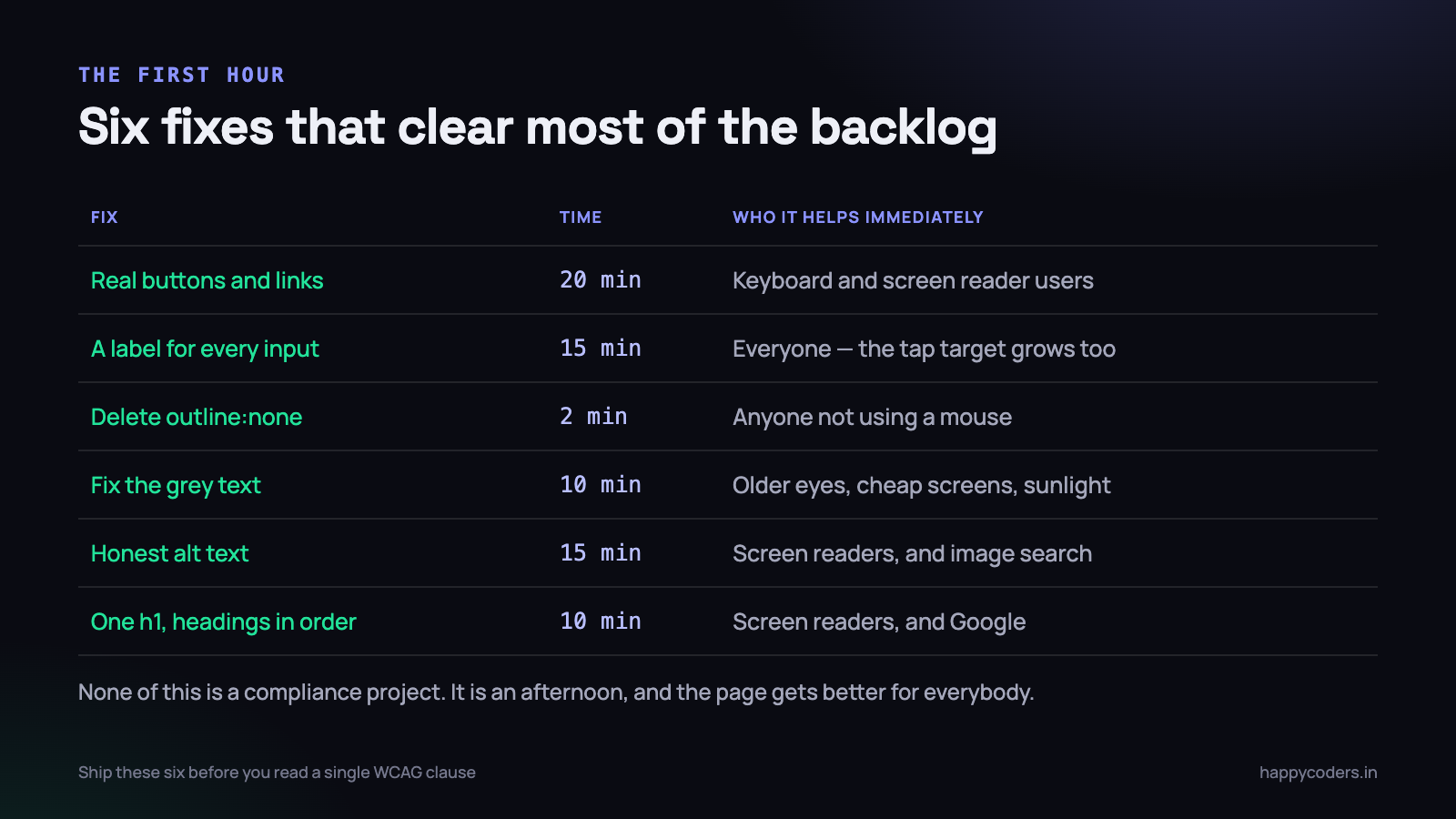
Use the element that already does the job
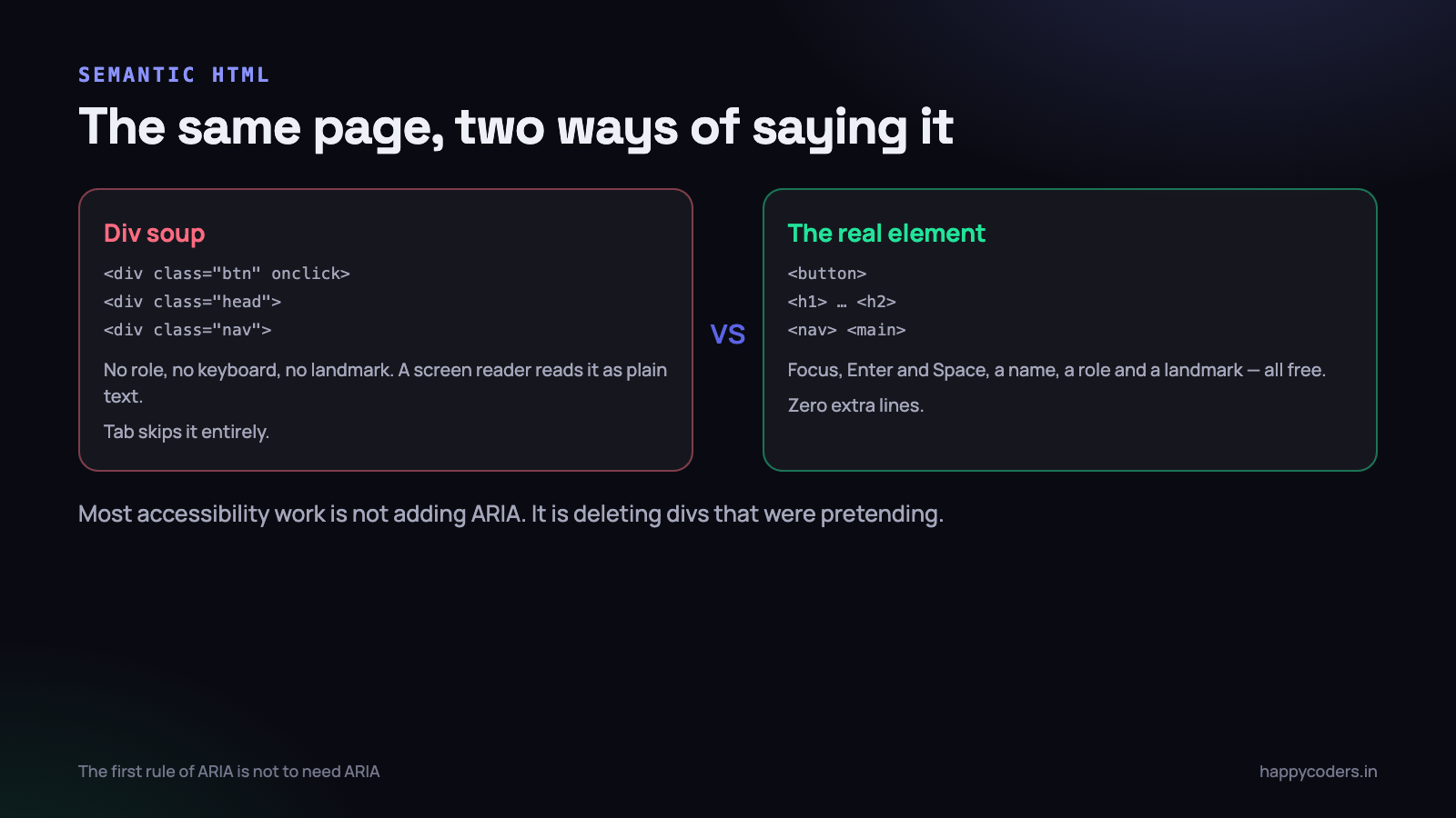
Here is the single highest-leverage idea in the whole subject. A browser already knows what a button is. It knows a button can be focused, that it responds to Enter and Space, that it should be announced as a button, and that it belongs in the tab order. All of that arrives free the moment you type <button>.
Write <div class="btn" onclick="save()"> and none of it arrives. The div is not focusable. Tab walks straight past it. A keyboard user cannot reach it at all, and a screen reader announces the word “Save” as ordinary text with no hint that anything will happen if you interact with it.
<!-- Cannot be reached by keyboard. Announced as plain text. -->
<div class="btn" onclick="deleteInvoice(42)">Delete</div>

<!-- Focusable, keyboard-operable, announced as a button. Same styling. -->
<button type="button" class="btn" onclick="deleteInvoice(42)">Delete</button>

<!-- If it navigates, it is a link, not a button -->
<a href="/invoices/42">View invoice</a>
The same applies across the board. <nav>, <main>, <header> and <footer> create landmarks that a screen reader user can jump between, which is how they skip your navigation on every page. Headings in order give them an outline of the page, in the same way a sighted person scans it in two seconds.
People often reach for ARIA at this point — role="button", tabindex="0", a keydown handler for Enter and Space. That is four lines to reproduce what one tag gives you, and the reproduction is usually incomplete. The first rule of ARIA is not to need ARIA.
A quick way to see how bad it is: run
document.querySelectorAll(’div[onclick], span[onclick]’).lengthin the console on your own site. Every result is a control that a keyboard user cannot operate.
Labels: five minutes, and the whole form improves
An input with no label is a box with no name. A screen reader reads “edit text, blank” and the user has to guess from context that this is where the GST number goes.
The fix is the for attribute matching the input’s id. That is it.
<!-- Placeholder as a label: unlabelled, and the hint vanishes as you type -->
<input type="email" placeholder="Email address">

<!-- Properly labelled -->
<label for="email">Email address</label>
<input type="email" id="email" name="email"
       autocomplete="email" required>

<!-- Hint text, connected so it is actually announced -->
<label for="gst">GSTIN</label>
<input type="text" id="gst" name="gst"
       aria-describedby="gst-help" inputmode="text">
<p id="gst-help">15 characters, as printed on your registration certificate.</p>
There is a side effect worth mentioning to anybody who resists this on design grounds: a connected label makes the label itself clickable, which enlarges the tap target. On a phone, that is a measurable improvement in form completion for everybody, not only for screen reader users.
Placeholders are the common trap. They look tidy in a mockup, they are not labels, their contrast is usually far too low, and they disappear the moment the user starts typing — so anybody who is interrupted mid-form comes back to a row of boxes with no idea what goes in them.
Alt text that says something
Three rules cover almost every image on a normal site.
- If the image carries information, describe the information. Not “chart.png”, not “graph”, but “Monthly revenue, rising from ₹2.1 lakh in April to ₹3.4 lakh in August.” Say what a sighted reader gets from looking at it.
- If the image is decorative, say so explicitly with
alt="". An empty alt tells the screen reader to skip it entirely. Leaving the attribute off altogether is worse — some readers then announce the filename, so your user hears “hero dash banner dash final dash v three dot jpg.” - If the image is inside a link, describe the destination, not the picture. The alt text on a logo that links home should be “Happy Coders home”, not “logo”.
Skip “image of” and “photo of” — the screen reader already announces that it is an image. And a product photo on an e-commerce page needs the product name and the distinguishing detail, because that alt text is also what Google Images reads.
Keyboard navigation and the focus ring you deleted
Somewhere in almost every CSS file in the world there is a rule like this:
/* This line has broken more sites for keyboard users than any other */
*:focus { outline: none; }
It was added because the default outline looked untidy on a mouse click. What it actually does is remove the only visual indication of where the keyboard is. For a person navigating by Tab, that is the equivalent of hiding the mouse cursor.
The modern fix keeps the page tidy and the ring visible where it matters, because :focus-visible only applies when the browser thinks a focus indicator is needed — keyboard, not mouse.
/* Remove the ring for mouse clicks, keep it for keyboard users */
:focus:not(:focus-visible) { outline: none; }

:focus-visible {
  outline: 3px solid #1a5fd0;
  outline-offset: 2px;
  border-radius: 3px;
}

/* On a dark or coloured background, use a two-tone ring so it is
   visible against both */
.btn-primary:focus-visible {
  outline: 3px solid #fff;
  box-shadow: 0 0 0 6px #1a5fd0;
}
Two more keyboard rules that break real pages. First, tab order follows the order of the HTML, not the visual order produced by CSS. If you have reordered columns with flexbox order or grid placement, check that tabbing still moves in a sensible direction — it very often does not.
Second, never use positive tabindex values. tabindex="3" pulls that element to the front of the tab order for the entire page, ahead of the browser chrome and everything else, and the resulting order is almost impossible to reason about. The only values you ever need are 0 (put this in the natural order) and -1 (focusable by script only, not by Tab).
Colour contrast, with numbers
Contrast is the one area where opinion is not required, because there is a ratio and you can measure it. Open DevTools, click a colour swatch in the Styles panel, and the contrast ratio is shown against the computed background, with a tick or a cross.
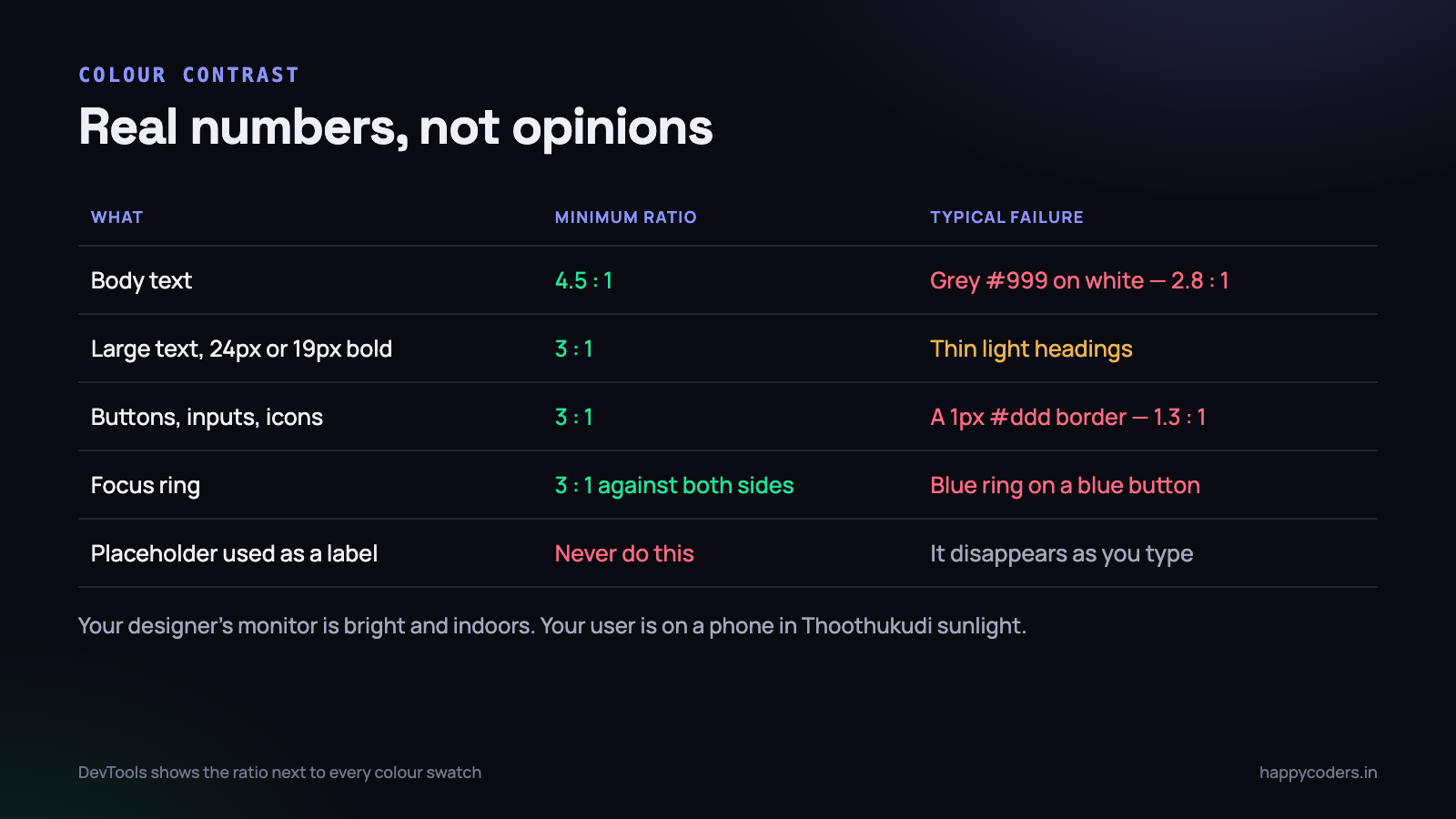
- Normal body text needs 4.5:1. The very common
#999on white is 2.85:1 and fails.#767676is the lightest grey that passes on white. - Large text needs 3:1 — large meaning 24px, or 19px if bold. This is why a thin light-grey heading often fails when the body text beneath it passes.
- Interface components need 3:1 for their boundary. A 1px
#dddborder around an input is about 1.3:1, which means the field is effectively invisible to a lot of people. - Focus indicators need 3:1 against what is behind them, on both sides of the ring.
Two related habits. Never use colour as the only signal — a red border on an invalid field means nothing to a colour-blind user, so pair it with an icon or, better, a message. And check your disabled states: they are deliberately low contrast, which is fine, but if your “primary” button is only slightly darker than your disabled one, nobody can tell them apart.
Forms that announce their errors
Client-side validation is where accessibility quietly fails, because the error appears visually and nothing tells a screen reader that anything happened. The user presses Submit, hears silence, and presses Submit again.
Three things fix it. Mark the field invalid, connect the message to the field, and put the message in a live region so it is announced when it appears.
<label for="phone">Mobile number</label>
<input type="tel" id="phone" name="phone"
       inputmode="numeric" autocomplete="tel"
       aria-describedby="phone-err" aria-invalid="true">
<p id="phone-err" class="error" role="alert">
  Enter a 10-digit mobile number without the country code.
</p>
// on failed validation
function showError(input, message) {
const err = document.getElementById(input.id + '-err');
err.textContent = message; // setting text fires the live region
input.setAttribute('aria-invalid', 'true');
}
function clearError(input) {
document.getElementById(input.id + '-err').textContent = '';
input.removeAttribute('aria-invalid');
}
// and after a failed submit, send focus to the first bad field
form.addEventListener('submit', (e) => {
const bad = form.querySelector('[aria-invalid="true"]');
if (bad) { e.preventDefault(); bad.focus(); }
});That last block matters more than it looks. Moving focus to the first invalid field means the error is read out, the user is already in the box they need to fix, and on a phone the keyboard opens in the right place. If you are building validation from scratch, our walkthrough of JavaScript form validation covers the surrounding logic.
One more: write error messages that say what to do. “Invalid input” is useless to everybody. “Enter a date in the future” is useful to everybody.
An accessible modal, in full
Modals are where hand-built components go wrong most often, because there are four separate obligations and it is easy to implement two of them.
- Move focus into the dialog when it opens — to the first control, or to the dialog itself.
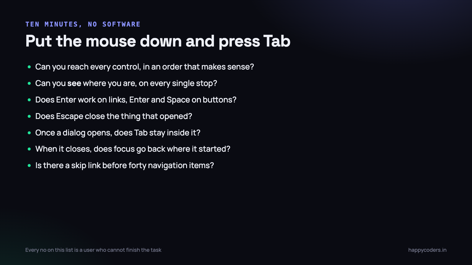
- Keep focus inside while it is open. Tabbing past the last control must return to the first, not wander into the page behind.
- Close on Escape, as well as on the close button.
- Return focus to the element that opened it. Without this, the user is dumped at the top of the document and has to find their place again.
The good news is that the browser now does all four. The <dialog> element with showModal() traps focus, handles Escape, applies the backdrop, and makes the rest of the page inert — and it is supported everywhere that matters.
<dialog id="confirm">
  <h2>Delete this invoice?</h2>
  <p>INV-2026-0184, ₹48,000. This cannot be undone.</p>
  <form method="dialog">
    <button value="cancel">Cancel</button>
    <button value="delete" class="danger">Delete</button>
  </form>
</dialog>

<script>
const dlg = document.getElementById('confirm');
let opener = null;

function openConfirm(btn) {
  opener = btn;
  dlg.showModal();                 // focus trap + Escape + backdrop, free
}

dlg.addEventListener('close', () => {
  if (dlg.returnValue === 'delete') doDelete();
  if (opener) opener.focus();      // the one part you still do yourself
});
</script>
If you are maintaining an older hand-rolled implementation, the focus-return step is the one most commonly missing, and it is three lines. Our modal without a library post covers the structure in more depth.
Testing it, in ten minutes
Automated tools catch perhaps a third of real problems. They are still worth running — Lighthouse is already in your DevTools and axe DevTools is a free extension — because the third they catch is cheap to fix. But the other two-thirds need a person.
The keyboard pass, five minutes
Put the mouse away. Load your most important page — the checkout, the contact form, the booking screen — and complete the task using only Tab, Shift+Tab, Enter, Space and the arrow keys. Note every place you get stuck, every place you cannot see where you are, and every control you simply cannot reach.
The screen reader pass, five minutes
You do not need to learn a screen reader properly. You need ten minutes with one to hear what your page sounds like.
- On a Mac, VoiceOver is built in: Cmd+F5 to start, Ctrl+Option+Right Arrow to move through the page, Ctrl+Option+U for the rotor, which lists headings and links.
- On Windows, NVDA is free: Insert+Down Arrow reads from here, H jumps between headings, Tab moves between controls.
- On a phone, TalkBack or VoiceOver is genuinely the fastest way to feel the problem — swipe right to move forward, double-tap to activate.
Listen for three things. Does every control announce a name, and is that name the visible text? Are the headings in an order that makes sense as an outline? Does anything get announced as “clickable, blank”? That last one is your div soup, saying hello.
Two things that break in single-page apps
If your front end is React, Vue or anything else that swaps content without a page load, there are two problems that simply do not exist on a server-rendered site, and both are invisible until you listen.
The first is route changes. A normal navigation resets focus to the top of the document and the screen reader announces the new page title. A client-side route change does neither — the URL updates, the content replaces itself, and the screen reader carries on reading from wherever it was, in content that no longer exists.
// on every route change
function onRouteChange(title) {
  document.title = title + ' | Happy Coders';

  // move focus to the new page heading so it is announced
  const h1 = document.querySelector('main h1');
  if (h1) {
    h1.setAttribute('tabindex', '-1');   // focusable by script only
    h1.focus();
  }
}
The second is content that appears without a user action — a search result count, a toast confirming the invoice was saved, a validation summary. Visually it is obvious. To a screen reader it is silent, unless it is inside a live region.
Use aria-live="polite" for anything informational, so it is announced after the current sentence finishes, and role="alert" only for things the user must know immediately. The region must already be in the DOM when the page loads; adding an element that already contains text will not announce anything, because the screen reader watches for changes inside a region it is already observing.
Who this is actually for
It helps to be concrete about the audience, because “accessibility” is an abstract word and the people behind it are not.
- People using a screen reader because of blindness or low vision. This is the group everybody pictures, and it is the smallest of these.
- People who cannot use a mouse — from tremor, RSI, arthritis, or a temporary injury. They navigate everything by keyboard, so every unreachable div blocks them completely.
- People with low vision who zoom to 200%, or who cannot separate your grey text from your white background. This is a very large group and it grows with the age of your customer base.
- People who are colour-blind — roughly one man in twelve. Any status you communicate by red and green alone is unreadable to them.
- Everybody, sometimes. Bright sunlight outside an office in Thoothukudi, a cracked screen, one hand on a bus, a slow connection where the image never loads and only the alt text arrives.
That last line is the honest argument. The features you build for the first four categories are used by everyone, on the days when conditions are bad. Nobody ever complained that a button was too easy to reach.
Why this is also an SEO and usability win
It is worth being blunt about the business case, because “we should be accessible” loses to a deadline every time, and the overlap with things the business already wants is almost total.
- Semantic structure is what search engines parse. Headings in order, landmarks, and descriptive link text are exactly what a crawler uses to understand a page. A screen reader and a crawler are both reading the document without seeing it.
- Alt text is image search. The same sentence that helps a blind user is the only text Google has for that image.
- Descriptive links beat “click here”. Screen reader users often browse by pulling up a list of the links on a page; a list of nine items all reading “read more” is useless. Search engines treat link text as a signal about the destination.
- Contrast and tap targets are mobile conversion. A form that is hard to read in sunlight or hard to tap accurately on a phone loses customers who have perfect vision.
- Keyboard support is power-user support. The people who use your admin panel eight hours a day will notice immediately.
And one practical point for anybody selling to larger organisations or to government in India: procurement questionnaires increasingly ask about accessibility, and an honest answer backed by a short list of what you have done is worth a great deal more than a plugin that claims to fix it at runtime.
Be wary of the overlay widgets that promise instant compliance from one script tag. They cannot repair the underlying HTML, they frequently interfere with the screen reader the user already has configured, and they are actively disliked by the people they claim to help. Fix the markup instead.
On Monday morning
Pick your single most important page — whichever one leads to money — and do three things before lunch.
First, search your CSS for outline: none and replace it with the :focus-visible block above. It is a two-minute change and it immediately restores the ability to see where you are on the page.
Second, tab through that page from top to bottom and write down everywhere you get stuck. Anything you cannot reach is a div pretending to be a button; converting it is usually a one-line change.
Third, open the form on that page and make sure every input has a real <label for>. If some use placeholders as labels, fix those too. That is your hour. It will not make the site perfect, and it will fix more real problems than the audit you have been postponing for a year.