Most arguments about Grid and Flexbox are arguments about nothing. They are not competitors, they were not designed to replace each other, and almost every real page uses both — often within two levels of the same component. The question is never which one is better. It is which one is right for the box you are styling at this moment.
There is a single rule that answers it, and once it is in your head the decision stops taking any time at all. This post gives you the rule, four worked examples you will recognise from real work, and the specific mistakes that make people conclude CSS layout is difficult when it has not been for years.
The rule: one direction, or two
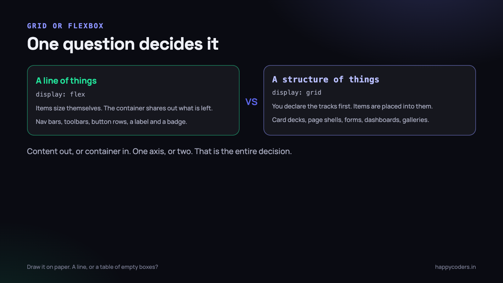
Flexbox lays things out along a line. Grid lays things out into a structure. That is the whole rule. If you are arranging items in a row or in a column — one axis — that is Flexbox. If you need rows and columns to line up with each other at the same time — two axes — that is Grid.
There is a second, more practical way to say the same thing, and it is the one that tends to stick. Flexbox is content out: the items decide how much room they need, and the container distributes what is left. Grid is container in: you declare the tracks first, and the items are placed into them whether they like it or not.
So the real question to ask yourself is: do I care where the boundaries are? A navigation bar does not care — the links are whatever width their text needs. A pricing table cares very much, because the second column of every row has to start at the same place. The first is Flexbox. The second is Grid.
A quick test that works surprisingly often. Draw the component on paper. If you find yourself drawing a line and putting things on it, use Flexbox. If you find yourself drawing a table of boxes before you put anything in them, use Grid.
Worked example one: a navigation bar
A logo on the left, some links in the middle, a button on the right. Everything vertically centred, evenly spaced, and it should wrap sensibly on a phone. This is the archetypal Flexbox job, because nothing in it needs to line up with anything on another row.
.nav {
  display: flex;
  align-items: center;   /* vertical centring, one line */
  gap: 24px;
  flex-wrap: wrap;
  padding: 16px 24px;
}

/* push everything after the logo to the right */
.nav .logo {
  margin-inline-end: auto;
}
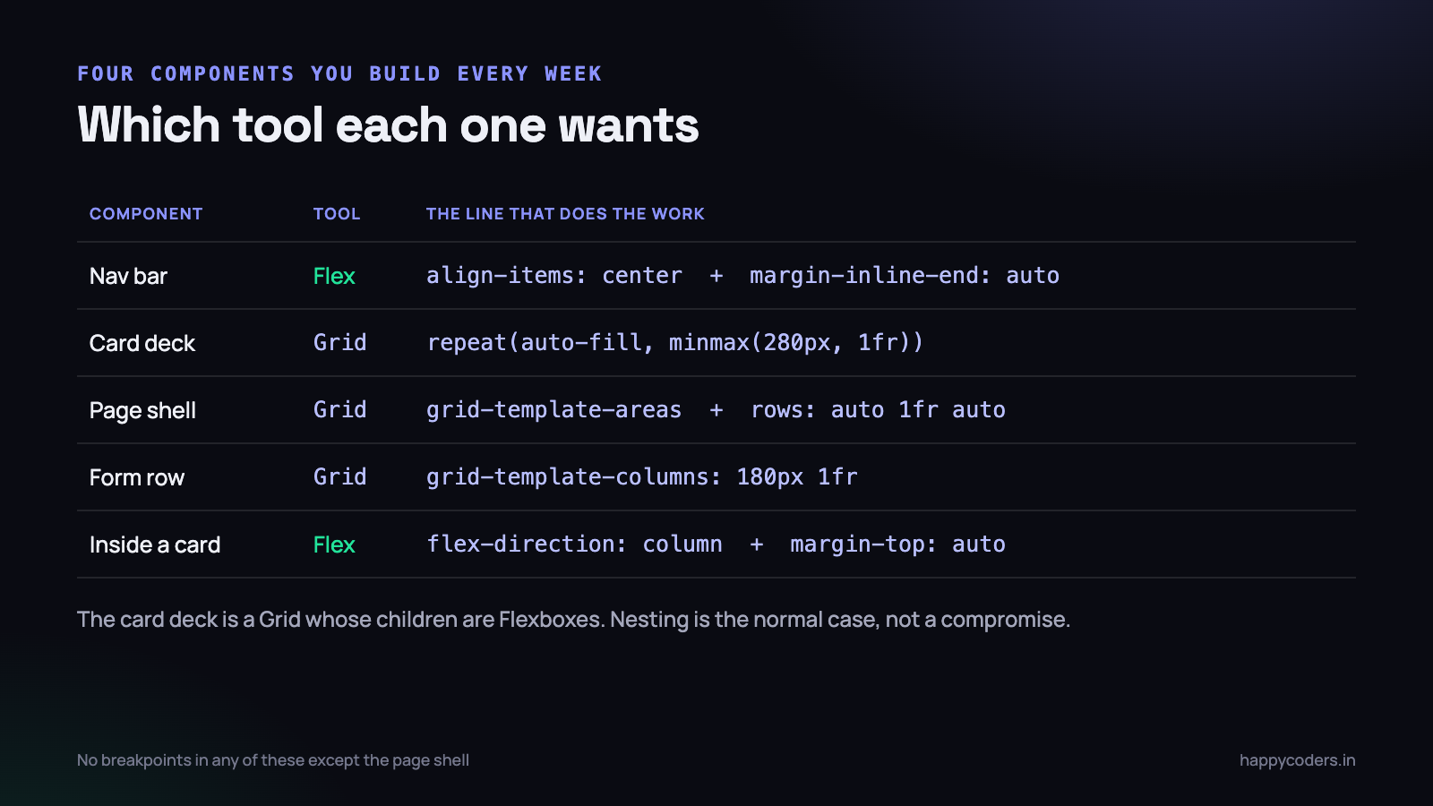
Two things worth noticing. align-items: center vertically centres items of different heights against each other — a 40px logo, an 18px link and a 44px button all sit on the same optical line without a single pixel value from you. And margin-inline-end: auto on the logo pushes every remaining item to the right, which is the cleanest way to split a flex row into left and right groups. No spacer div, no absolute positioning.
Could you build this with Grid? Yes, and people do, usually with grid-template-columns: auto 1fr auto. It works. It is also more code, it breaks the moment somebody adds a fourth item, and it declares a structure that this component does not have. Flexbox is the right tool because the nav genuinely is a line of things.
Worked example two: a deck of cards
Now the opposite. Twelve project cards, three across on a desktop, two on a tablet, one on a phone, with equal gaps and equal column widths. This is the case people reach for Flexbox on out of habit, and it is the case where it quietly falls apart.
.cards {
  display: grid;
  grid-template-columns: repeat(auto-fill, minmax(280px, 1fr));
  gap: 24px;
}
Three lines, no media queries, and it is genuinely responsive: the browser fits as many 280px-minimum columns as will go, then shares the leftover space equally between them. At 1200px you get four columns. At 900px, three. On a phone, one. You never wrote a breakpoint.
Here is the Flexbox version people write instead, and what goes wrong with it:
/* the version that looks fine until it does not */
.cards { display: flex; flex-wrap: wrap; gap: 24px; }
.cards .card { width: 33.33%; }
It overflows immediately. Three items at 33.33% plus two 24px gaps is wider than the container, so you get two per row with a hole on the right. The fix people apply is width: calc(33.33% - 16px), which works for exactly three columns and has to be recalculated by hand for every breakpoint. Then the last row — with two cards in it — leaves an awkward gap, and somebody adds an invisible spacer element to fix that.
None of this is Flexbox being bad. It is Flexbox being asked to hold a structure it was never meant to know about. The cards are a grid. Use Grid.
auto-fill or auto-fit
The one detail worth knowing in that snippet. auto-fill keeps the empty columns; auto-fit collapses them so the remaining items stretch to fill the row. With four cards on a very wide screen, auto-fill leaves them at their natural width with space on the right, and auto-fit stretches them into enormous cards.
For a card deck that can be almost any length, auto-fill is usually what you want, because a search result page that returns one item should not show one card three metres wide. Switch to auto-fit when you know the count is small and fixed.
Worked example three: the page shell
Header across the top, sidebar down the left, main content, footer at the bottom, footer stuck to the bottom of the viewport on short pages. This used to be the layout that generated the most Stack Overflow questions on the internet. It is now nine lines.
.shell {
  display: grid;
  min-height: 100dvh;
  grid-template-columns: 260px 1fr;
  grid-template-rows: auto 1fr auto;
  grid-template-areas:
    "header header"
    "side   main"
    "footer footer";
}

.shell > header { grid-area: header; }
.shell > aside  { grid-area: side;   }
.shell > main   { grid-area: main;   }
.shell > footer { grid-area: footer; }

@media (max-width: 800px) {
  .shell {
    grid-template-columns: 1fr;
    grid-template-areas:
      "header"
      "main"
      "side"
      "footer";
  }
}
Named areas are worth the extra few characters for one reason: the CSS contains a picture of the layout. Somebody joining the project six months later reads those four lines and knows what the page looks like without opening it. Line numbers — grid-column: 1 / 3 — do the same job and communicate nothing.
Note the mobile block. The sidebar moves below the main content on a phone by reordering the area names, and nothing else changes. No duplicated markup, no order values scattered across four rules. The source order of the HTML stays sensible for screen readers and keyboard users, which matters more than it sounds.
The 1fr in the middle row is what pins the footer to the bottom. The header and footer rows are auto — as tall as their content — and the middle row takes everything that is left, which on a short page is a lot. The old flexbox sticky-footer trick, and the even older one with a negative margin, can both be deleted.
Worked example four: a form row
Labels in a column, fields in a column, help text under the field but aligned with it, and every row lining up with every other row. This is a two-axis problem hiding in something that looks like a list, which is why hand-built forms so often have labels that drift out of alignment as soon as one of them wraps to two lines.
.form {
  display: grid;
  grid-template-columns: 180px 1fr;
  gap: 18px 20px;       /* row gap, column gap */
  align-items: start;
}

.form > label { padding-top: 10px; }   /* optical alignment with the input */

/* a field that should span the whole width */
.form > .full { grid-column: 1 / -1; }

@media (max-width: 640px) {
  .form { grid-template-columns: 1fr; }
  .form > label { padding-top: 0; }
}
The alignment is now structural rather than accidental. A label that wraps to two lines does not push its own input out of line with the one above, because the column width is declared once on the container. And grid-column: 1 / -1 is the idiom worth memorising: it means “from the first line to the last”, so a full-width text area spans the row without you counting columns.
On mobile the whole thing becomes a single column with one declaration. Stacked labels above fields is the correct mobile form layout anyway, so this is not a compromise.
They nest, and that is the normal case
The framing of Grid versus Flexbox falls apart the moment you look at a real component, because a real page is a Grid of things, several of which are Flexboxes, one of which contains another Grid.
Take the card deck from earlier. The deck is a Grid. Each card inside it is a flex column, so that the footer of the card sits at the bottom regardless of how long the title is:
.cards { display: grid; grid-template-columns: repeat(auto-fill, minmax(280px, 1fr)); gap: 24px; }

.card {
  display: flex;
  flex-direction: column;
  gap: 12px;
}

.card .meta {
  margin-top: auto;      /* pin to the bottom of the card */
  display: flex;         /* and the meta row itself is a line */
  align-items: center;
  gap: 8px;
}
Three layout contexts, each one doing the thing it is good at, and about ten lines in total. margin-top: auto inside a flex column is the vertical version of the nav bar trick — it absorbs all the free space above it, which pushes the element to the bottom. It is how you get a row of cards whose “last updated” lines all sit at the same height even though the titles are different lengths.
If you find yourself reaching for
position: absolute; bottom: 0inside a card, stop. It is nearly alwaysmargin-top: autoin a flex column, and the auto-margin version does not need the parent to have a fixed height.
gap deleted an entire category of hack
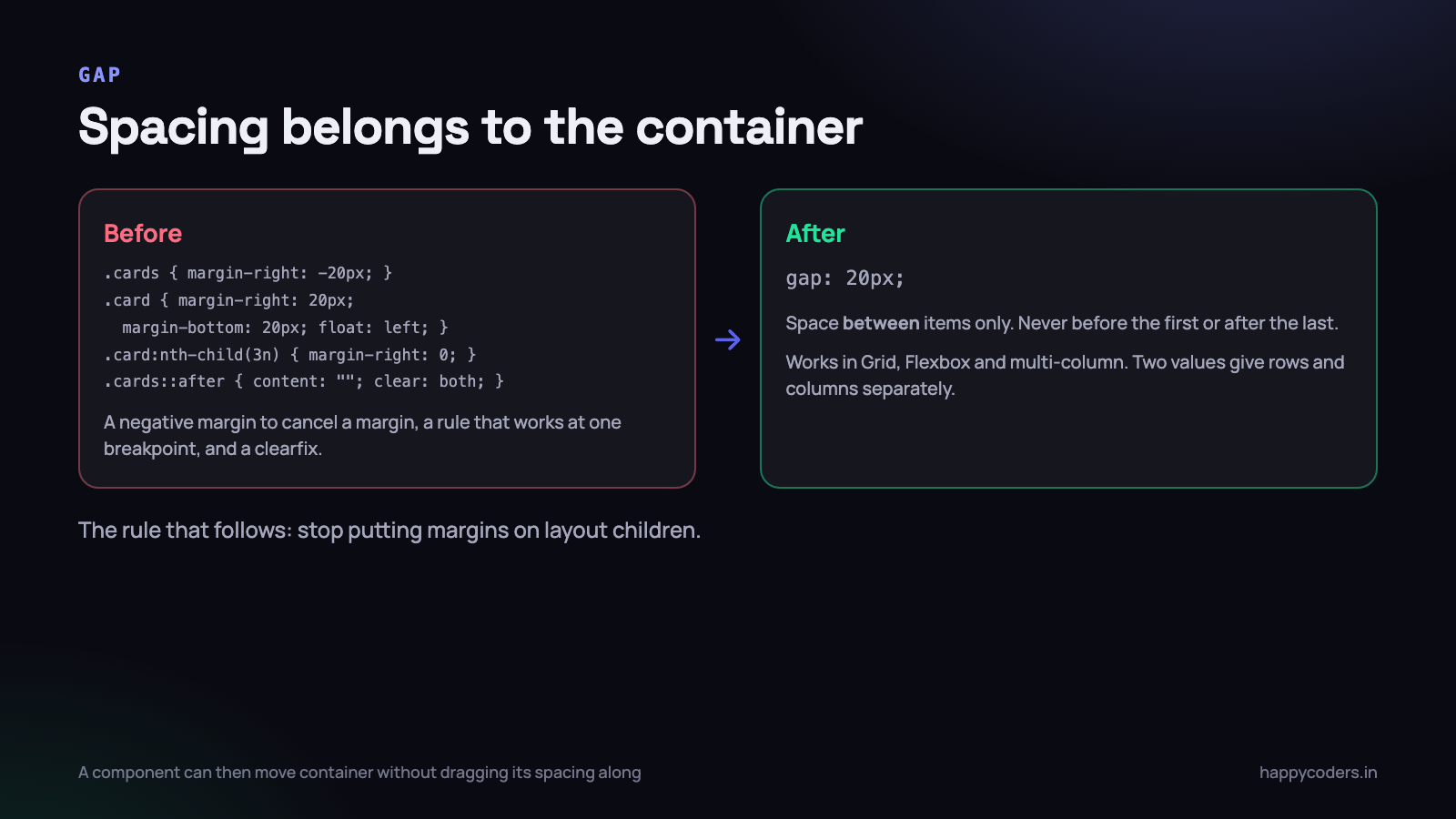
It is worth pausing on gap, because if you learnt layout before about 2021 you may still be writing the workaround for it out of muscle memory. This is the old way to space a grid of cards:
/* the hack we all wrote for years */
.cards { margin-right: -20px; }
.card  { margin-right: 20px; margin-bottom: 20px; float: left; }
.card:nth-child(3n) { margin-right: 0; }
.cards::after { content: ""; display: table; clear: both; }
Negative margin on the container to cancel the trailing margin on the last item, a nth-child rule that only works at one breakpoint, and a clearfix. Every one of those lines exists because there was no way to say “put twenty pixels between these things and nowhere else”.
Now there is. gap: 20px puts space between items only — never before the first or after the last — and it works in Grid, in Flexbox and in multi-column. Two values give you row and column spacing separately: gap: 24px 16px is 24px between rows and 16px between columns.
The practical consequence is a rule you can apply immediately: stop putting margins on layout children. Spacing between siblings belongs to the parent, as a gap. It removes the last-child problem, it removes the collapsing-margin problem, and it means a component can be dropped into a different container without dragging its old spacing along with it.
The mistakes that cost an afternoon
Using Grid for a row of buttons
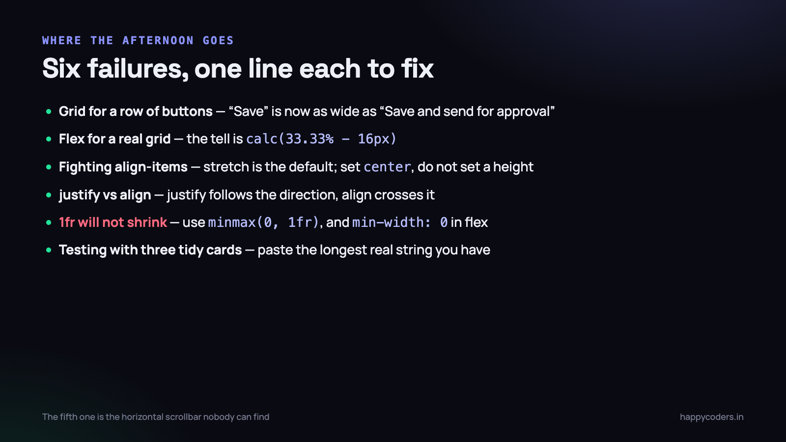
Once Grid clicks, there is a phase where it gets used for everything, including things that are plainly a line. A row of three buttons written as grid-template-columns: repeat(3, 1fr) forces all three to the same width, so “Save” becomes as wide as “Save and send for approval”. Then somebody adds a fourth button and edits the CSS. In Flexbox with a gap, each button is the width of its own label and a fourth one needs no CSS change at all.
Using Flexbox for something that is really a grid
The reverse, and the more expensive one. The tell is percentage widths with calc() subtracting gap values, or a rule that targets nth-child to fix the end of a row, or an empty element added so that the last row looks right. Every one of those is the layout telling you it wants tracks.
Fighting align-items instead of setting it
The single most common Flexbox confusion. A flex container stretches its items to equal height by default — align-items: stretch is the initial value. So you put a button in a flex row and it comes out full height, and it looks like a bug.
It is not a bug, and the fix is not height: 40px on the button. It is align-items: center on the container, or align-self: center on that one item if the others should keep stretching. Setting a height to defeat stretch is the beginning of a long afternoon, because it breaks the moment the text wraps.
Confusing the two axes after changing direction
justify-content works along the main axis; align-items works across it. Change flex-direction to column and those two swap meaning, which is why a column that was centred horizontally suddenly is not. Say it once and remember it: justify follows the direction, align crosses it.
Grid does not have this problem in the same way, because it has both at once: justify-* is always the inline (horizontal) axis and align-* is always the block (vertical) one. place-items: center sets both, and is the shortest honest way to centre something in CSS.
The overflow bug nobody can find
This one is worth the price of the article. A grid column defined as 1fr will not shrink below the size of its content, because 1fr means minmax(auto, 1fr) and auto in that position means “at least min-content”. Put a table, a pre block, a long URL or an unbroken transaction id inside it, and the column pushes wider than the container. The whole page gets a horizontal scrollbar, and nothing in your CSS mentions a width.
/* the fix, and it is not optional on any column that holds user content */
.shell { grid-template-columns: 260px minmax(0, 1fr); }

/* the flexbox equivalent of the same bug */
.flex-child { min-width: 0; }

/* and for the content itself */
.cell { overflow-x: auto; }
The Flexbox version of the same bug is why min-width: 0 appears in so many stylesheets with no comment next to it. A flex item also refuses to shrink below its content’s minimum size unless you tell it otherwise. If a layout is mysteriously wider than the viewport on one page and not on others, this is the first thing to check — look for the longest unbroken string on the page.
Not testing with real content
Most layouts are built with three cards of similar length and break on the fourth, which has a title of eleven words and no description. Before calling a component done, put the longest realistic string you have into every slot, then the shortest, then an empty one. Indian client data in particular will find your assumptions: long organisation names, addresses that run to four lines, and names that are one word.
What you can stop worrying about
Both specifications are supported by every browser anybody is running, including the ones on the cheap Android handsets your Indian customers actually use. Grid crossed the line in 2017; gap in Flexbox was the last piece and landed in Safari in 2020. Unless you are contractually required to support Internet Explorer 11 — and if you are, that is a commercial conversation, not a technical one — you can use all of this today with no fallback.
Two newer pieces are worth knowing about but not depending on yet. subgrid lets a child grid inherit its parent’s tracks, which finally solves the card-header-alignment problem properly. Container queries let a component respond to the width of its container rather than the viewport, which is the correct way to make a card behave differently in a sidebar. Both have good support now; both are worth designing so that their absence degrades to something acceptable rather than something broken.
A reference you can keep on one line
- A line of things — nav bars, button rows, a label and a badge, tag lists, toolbars. Flexbox.
- A structure of things — card decks, page shells, forms, dashboards, image galleries, any table-like layout. Grid.
- Items decide their own size — Flexbox. The container decides — Grid.
- You need a wrapping row where the last row is ragged — Flexbox with
flex-wrap. That ragged last row is the one thing Grid cannot do naturally. - You need columns to line up across rows — Grid, always.
- Centring one thing in a box —
display: grid; place-items: center;and stop thinking about it.
And when you genuinely cannot decide, it does not matter. A tab strip built either way will look identical and nobody will ever notice. Spend the deliberation on the layouts where it does matter — anything where two rows have to agree with each other.
What to do on Monday morning
Open the stylesheet for the component that annoys you most — everybody has one — and do these four things in order. It is an hour of work and it usually deletes more CSS than it adds.
- Search for
calc(in your layout rules. Nearly everycalc(33.33% - 16px)is a Flexbox pretending to be a Grid. Replace that component withgrid-template-columns: repeat(auto-fill, minmax(Npx, 1fr))and delete the breakpoints it needed. - Search for
margin-rightandmargin-bottomon layout children. Move the spacing to agapon the parent and remove the:last-childandnth-childrules that existed to undo it. - Add
minmax(0, 1fr)to any grid column that holds content you did not write — user names, notes, pasted references, API output. This prevents a horizontal scrollbar you will otherwise debug in six months on a customer’s screenshot. - Paste your worst real data into the component and look at it on a 360px-wide phone. Fix what breaks now, while the code is still in your head.
That is the entire discipline. The rule takes five seconds, the examples cover most of what you will build, and the mistakes above account for the large majority of the time people lose to CSS layout.
If you are building front-end pieces without pulling in a framework, the same approach applies to a modal dialog and a dark mode toggle — small amounts of standard CSS and JavaScript, and no dependency to update.