Dark mode looks like a boolean and is not. There are three states, and treating it as two produces the two bugs every hand-built toggle has: it ignores what the user already told their operating system, and it flashes white for a moment on every page load.
Here is the whole thing done properly — tokens, the toggle, the persistence, and the small script that has to run before the page paints.
The three states
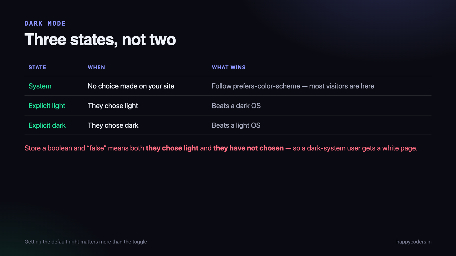
- System. The user has not chosen on your site, so follow their operating system. This is the default and it is what most visitors will be in.
- Light, explicitly. They chose light on your site, and that should win even if their OS is dark.
- Dark, explicitly. The same in the other direction.
The mistake is storing a single boolean. Then “false” means both “they chose light” and “they have not chosen”, which are different things — and a user whose system is dark gets a light site because your default said so.
Define the palette as tokens
Everything else depends on this. Colours are declared once as custom properties and used everywhere through those names. Nothing in the page should contain a colour literal.
/* light is the base, declared on bare :root */
:root {
  --bg:        #F6F7FB;
  --surface:   #FFFFFF;
  --text:      #12131A;
  --text-muted:#5A6075;
  --line:      #E3E6F0;
  --accent:    #3B63F6;
  color-scheme: light;
}

/* the system default, when the user has not chosen on our site */
@media (prefers-color-scheme: dark) {
  :root:not([data-theme="light"]) {
    --bg:        #0C0E15;
    --surface:   #141822;
    --text:      #ECEEF6;
    --text-muted:#A0A7BC;
    --line:      #242938;
    --accent:    #7D9BFF;
    color-scheme: dark;
  }
}

/* an explicit choice on our site wins in both directions */
:root[data-theme="dark"] {
  --bg:        #0C0E15;
  --surface:   #141822;
  --text:      #ECEEF6;
  --text-muted:#A0A7BC;
  --line:      #242938;
  --accent:    #7D9BFF;
  color-scheme: dark;
}

body { background: var(--bg); color: var(--text); }
Three blocks, and the order matters. The bare block is the complete light palette. The media query redefines tokens for a dark system, but only when the user has not explicitly chosen light — that is what the :not([data-theme="light"]) is doing. The last block lets an explicit dark choice win over a light system.
The color-scheme property is doing real work too: it tells the browser to render form controls, scrollbars and the default background in the matching scheme. Without it you get dark text in white native dropdowns.
The rule that prevents the most common bug: every token must be declared in the bare
:rootblock before any media query redefines it. A colour whose only definition lives inside a media query simply does not exist in the other state, and you get one theme’s text on the other theme’s background.
The toggle
<button id="theme-toggle" aria-label="Switch theme" aria-pressed="false">
<span aria-hidden="true">☾</span>
</button>const root = document.documentElement;
const btn = document.getElementById('theme-toggle');
const KEY = 'theme';
function systemPrefersDark() {
return window.matchMedia('(prefers-color-scheme: dark)').matches;
}
function currentlyDark() {
const saved = localStorage.getItem(KEY);
if (saved === 'dark') return true;
if (saved === 'light') return false;
return systemPrefersDark();
}
function apply(dark) {
root.setAttribute('data-theme', dark ? 'dark' : 'light');
btn.setAttribute('aria-pressed', String(dark));
btn.firstElementChild.textContent = dark ? '\u2600' : '\u263E';
}
btn.addEventListener('click', () => {
const dark = !currentlyDark();
localStorage.setItem(KEY, dark ? 'dark' : 'light');
apply(dark);
});
// follow the system while the user has not chosen on our site
window.matchMedia('(prefers-color-scheme: dark)')
.addEventListener('change', e => {
if (!localStorage.getItem(KEY)) apply(e.matches);
});
apply(currentlyDark());Twenty lines. The last listener is the part most implementations omit: if somebody has not chosen on your site and their laptop switches to dark at sunset, your page should follow without a reload.
Stopping the flash
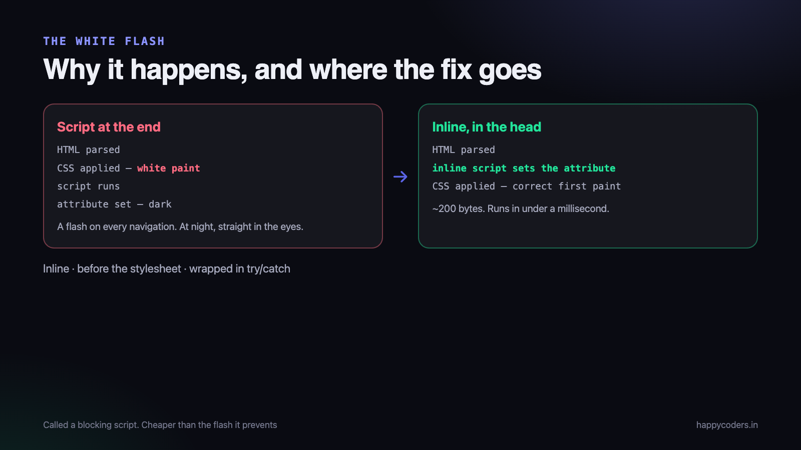
This is the bug everyone ships. The page loads, paints white using the default CSS, and then your JavaScript runs and switches it to dark. The result is a white flash on every navigation, which on a dark-mode site at night is genuinely unpleasant.
The cause is ordering: the script runs after the first paint. The fix is to set the attribute before anything renders, with a small inline script in the head.
<!doctype html>
<html lang="en">
<head>
  <meta charset="utf-8">
  <script>
    // must be inline, and must be before the stylesheet
    (function () {
      try {
        var s = localStorage.getItem('theme');
        var dark = s === 'dark' ||
                   (!s && matchMedia('(prefers-color-scheme: dark)').matches);
        document.documentElement.setAttribute('data-theme', dark ? 'dark' : 'light');
      } catch (e) { /* private mode: fall through to the CSS default */ }
    })();
  </script>
  <link rel="stylesheet" href="/style.css">
</head>
Three requirements, all of which people break:
- Inline. An external file is another request, and the paint may happen first.
- Before the stylesheet. So the attribute is already on the element when the CSS is applied.
- Wrapped in try/catch.
localStoragethrows in some privacy configurations, and an exception here stops the rest of the page.
It is often called a blocking script and treated as a performance problem. It is about 200 bytes and it runs in under a millisecond — far cheaper than the flash it prevents.
The details that make it feel finished
Do not animate the switch
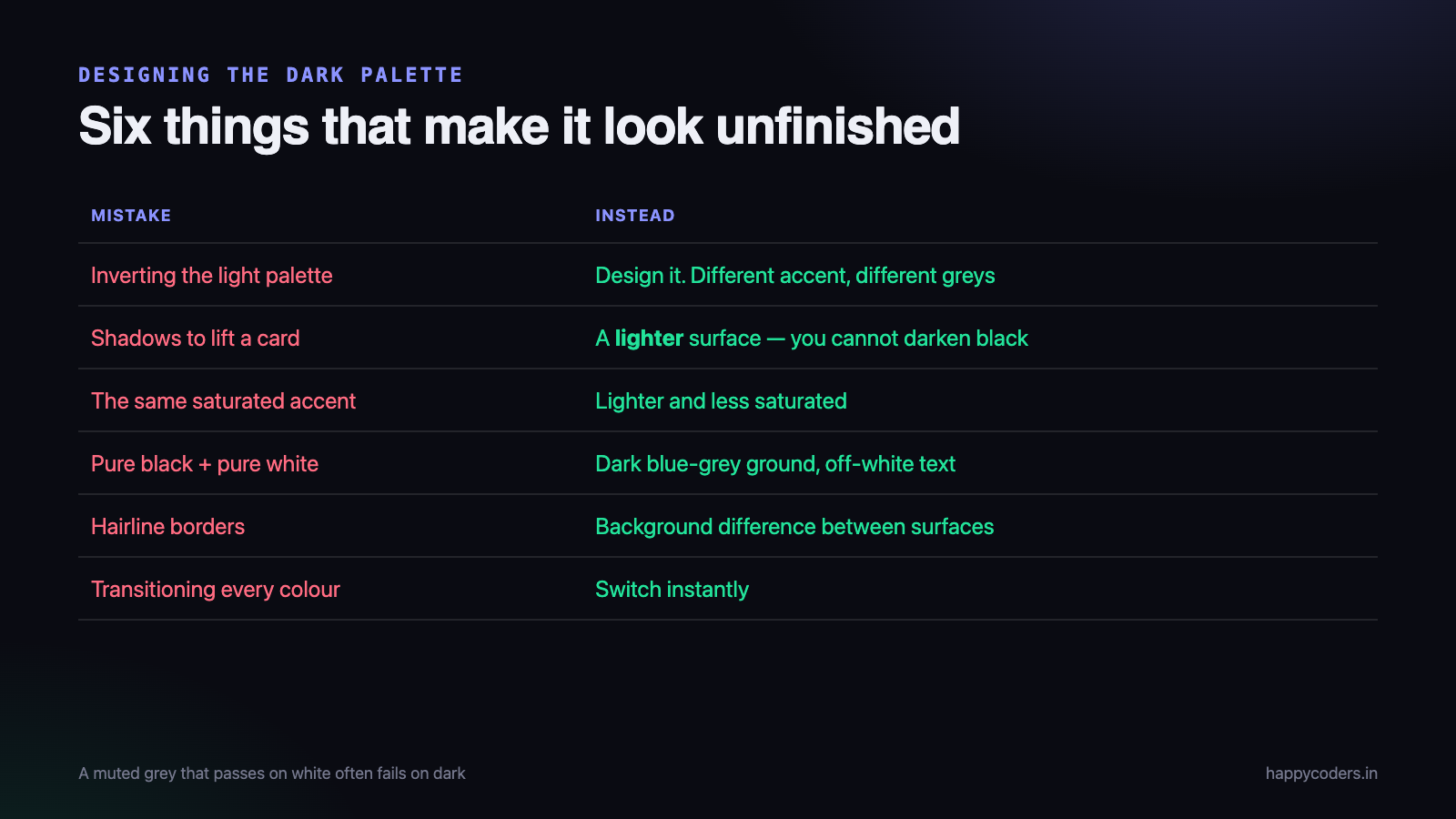
A transition on every background and colour looks appealing and produces a slow smear across the whole page while a hundred elements interpolate. Switch instantly. If you must animate, limit it to a couple of properties and keep it under 150ms.
Darken images, do not invert them
Pure white images glare against a dark background. A small filter helps, and inversion never does — it turns photographs into negatives.
:root[data-theme="dark"] img:not([src$=".svg"]) {
  filter: brightness(.88) contrast(1.02);
}
Dark is not black
Pure black with pure white text has too much contrast and makes text appear to vibrate. Use a very dark blue-grey ground and slightly off-white text. Shadows also stop working on black — use a lighter surface colour to lift a card instead of a shadow.
Check contrast in both themes
A muted grey that passes on white frequently fails on a dark ground. Run both palettes through a contrast checker — 4.5:1 for body text is the threshold. This is the single most common accessibility failure in dark themes.
Update the browser chrome
<meta name="theme-color" content="#F6F7FB" media="(prefers-color-scheme: light)">
<meta name="theme-color" content="#0C0E15" media="(prefers-color-scheme: dark)">
This colours the address bar on mobile. Without it, a dark page sits under a white bar and looks unfinished.
Designing the dark palette, not inverting the light one
The most common way a dark mode looks cheap is that somebody took the light palette and flipped the lightness of every colour. It produces a technically dark page that feels wrong, and the reasons are specific.
Elevation replaces shadow
On a light background, a card is lifted off the page with a shadow. On a dark background a shadow is invisible — you cannot make black darker. Dark interfaces signal elevation by making the surface lighter than the thing behind it: the page is #0C0E15, a card is #141822, a dialog on top of the card is lighter again.
This is why a dark theme needs at least three background tokens where the light one needed two.
Saturated colours get louder
A brand blue that looks confident on white can glow unpleasantly on near-black, because the contrast against the ground is much higher. Accent colours usually need to be lighter and less saturated in dark mode, not the same value. That is why the token blocks above declare a different accent rather than reusing one.
Borders stop working
A one-pixel #E3E6F0 border is a clear boundary on white and disappears entirely on dark. Dark themes lean on background differences between surfaces rather than lines, and where a line is needed it has to be lighter than instinct suggests.
Text weight reads heavier
Light text on a dark ground appears bolder than the same weight the other way round — an optical effect, not a rendering bug. If your body text is 500 weight in light mode, 400 often looks closer to correct in dark. It is a small adjustment that makes a surprising difference to how finished the page feels.
What people actually use it for
Worth knowing, because it changes what to prioritise. Dark mode is not mainly about battery life, and on an LCD it saves none. The two real reasons are reading at night in a dark room, where a white page is physically uncomfortable, and matching the rest of the operating system, where a single white site among dark applications stands out as jarring.
Both reasons point at the same priority: getting the default right matters more than the toggle. A visitor whose system is dark should never see your light theme at all, and the toggle is there for the minority who want to disagree with their own OS setting.
It also means the flash is not a cosmetic issue. Somebody reading at night gets a full-screen white flash straight in the eyes on every navigation, which is the one bug in this article that people genuinely complain about.
Where to store the choice
localStorage is the right answer for most sites. It is per-device, which is usually what people expect, and it needs no server.
Two situations where it is not enough:
- You render on the server. The server cannot read localStorage, so it cannot render the correct theme. Use a cookie instead — the server sees it on the request and can set the attribute in the HTML it sends, and the flash never happens at all.
- You have accounts and want it to follow the user. Save it on the profile, and keep localStorage as the fast path so the page is correct before the profile loads.
And wrap every read and write in try/catch. Private windows, cleared site data and browsers configured to block storage all cause it to throw or return nothing, and the page must still render correctly with no stored value.
Retrofitting it onto an existing site
Adding dark mode to a site that was never built for it is mostly a find-and-replace exercise, and the order that works is:
- Find every colour literal. Search the stylesheets for
#,rgb(andhsl(. On a mature site this is a few hundred results and most of them are the same eight colours repeated. - Group them into tokens. Four greys that differ by two per cent are one token. Aim for fewer than fifteen names in total — background, surface, raised surface, text, muted text, line, accent, and the semantic set for success, warning and error.
- Replace literals with
var()in light mode only, and ship that. Nothing changes visually, and this is the step that carries all the risk. Do it on its own. - Then add the dark block. Once every colour goes through a token, dark mode is one block of overrides and an afternoon.
- Walk every page in dark and fix the leftovers — inline styles in old templates, colours inside SVG files, third-party widgets, emails previewed in an iframe.
The mistake is doing steps 3 and 4 together. Then when something looks wrong you cannot tell whether the tokenisation broke it or the dark palette did, on a change that touched every page of the site.
Budget most of the time for step 5 rather than the CSS. The theme itself is quick; the long tail of hard-coded colours in places nobody remembers is what takes the week.
A note on the toggle itself
Small thing, frequently wrong: the icon should show what you will get, not what you currently have. A page in light mode shows a moon, because pressing it gives you dark. Half of all implementations show a sun on a light page, which is a description rather than a button, and users hesitate over it every time.
Give it a real aria-label and keep aria-pressed accurate, so a screen reader announces the state rather than reading out a moon character. And put it somewhere consistent — header or footer, the same place on every page. A theme toggle that moves is one people stop looking for.
Testing it
- First visit with the system set to dark. The site should already be dark, with no toggle interaction.
- Choose light, then set the system to dark. Your choice must win.
- Reload on every page. Watch for the flash. Throttle the network in dev tools to make it obvious.
- Change the system theme with the page open and no choice saved. It should follow live.
- Open a private window. No errors, no blank page.
- Read the whole site in dark — forms, tables, code blocks, disabled buttons, error states. The bugs are always in the states nobody looked at.
That last one finds the most. Empty states, validation messages and anything with a hard-coded colour deep in an old stylesheet are where dark mode breaks.
One more, easy to miss: if the site has a print stylesheet, make sure dark mode does not reach it. A page printed with a near-black background wastes an entire cartridge and is usually unreadable. Force light colours inside the print media query, regardless of the theme.
The short version
- Three states: system, explicit light, explicit dark.
- All colours as custom properties, declared in bare
:rootfirst. - Media query for the system default, guarded against an explicit light choice.
- An attribute on the root element for the explicit choice.
- Inline script in the head, before the stylesheet, in try/catch.
- Set
color-schemeandtheme-color. - Do not animate. Do not invert images. Do not use pure black.
- Check contrast in both, and read every state.
The whole thing is about thirty lines of CSS and twenty of JavaScript. The parts worth care are the default state and the inline script — everything else is colours.
If you are building front-end components without reaching for a framework, we have similar walkthroughs for a modal dialog and an image carousel.