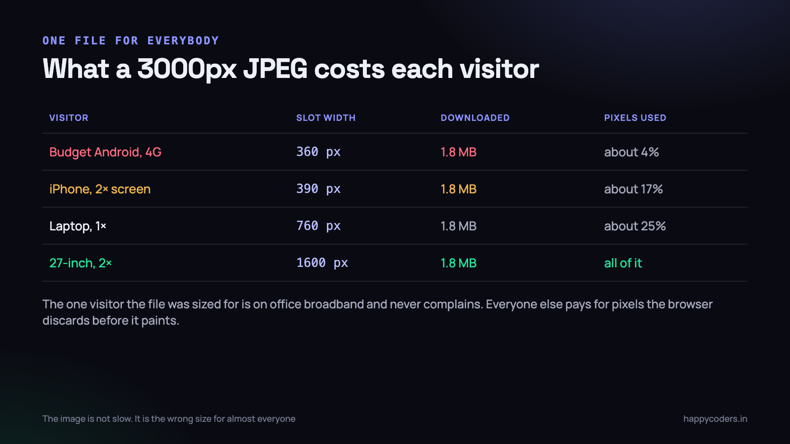
Open the network tab on almost any Indian business site and you will find the same thing: a hero image somewhere between 1.5 MB and 4 MB, served identically to a ₹8,000 Android phone on a patchy 4G connection and to a designer on a 27-inch display in the office.
It is not a subtle bug. It is usually the single largest thing the page downloads, it blocks the moment the visitor decides whether to stay, and it costs the visitor real money in data. And it is one of the few performance problems that can be fixed completely in an afternoon, with markup, without touching the framework.
Why one file for every screen stops working
A photograph exported at 3000 pixels wide looks perfect. It looks perfect everywhere, which is exactly why the problem survives review. Nobody opens a page and says “this image is too sharp.”
What actually happens is this. The browser downloads all 1.8 MB, decodes it into memory — roughly width × height × 4 bytes, so a 3000×1700 photograph occupies about 20 MB of RAM while it is being decoded — and then scales it down to fit a 360-pixel slot. On a phone with 3 GB of RAM and four other tabs open, that decode is not free either. Scrolling stutters and nobody knows why.
The fix is to produce several versions of the image and let the browser choose. That is all responsive images are. The confusing part is that there are two different mechanisms for it, they look similar, and most tutorials mix them up.
srcsetandsizesare for the same image at different sizes. The browser chooses. Use this 90% of the time.<picture>is for different images, or different formats. You choose, with conditions. Use it for art direction and for format fallback.
srcset: telling the browser what exists
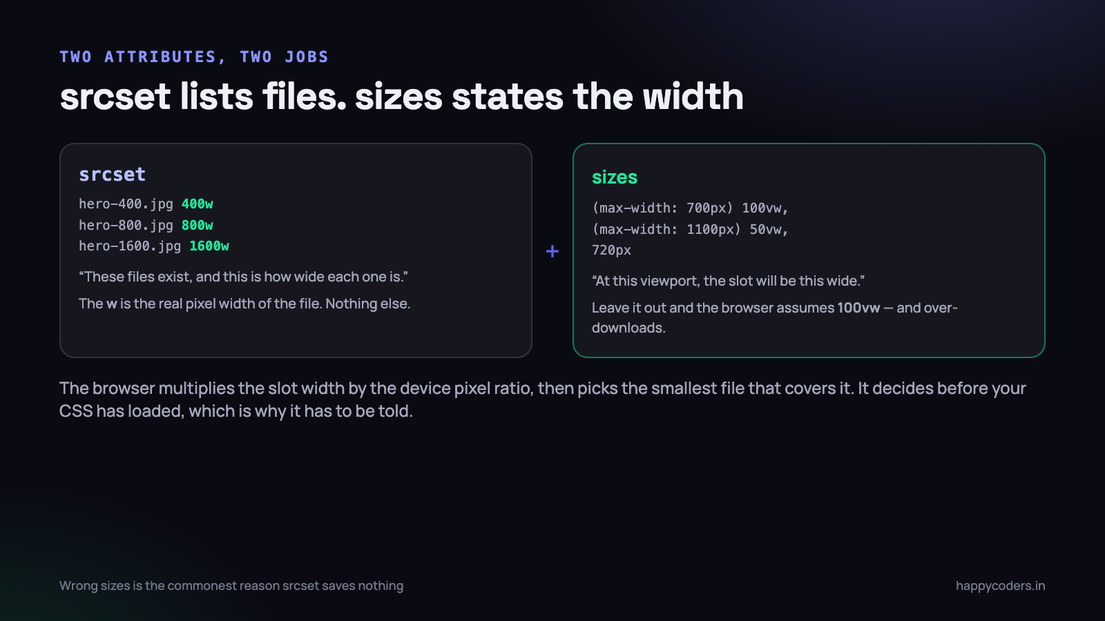
The srcset attribute is a comma-separated list of files, each labelled with its real width in pixels. That is the whole of it.
<img src="hero-800.jpg"
     srcset="hero-400.jpg   400w,
             hero-800.jpg   800w,
             hero-1200.jpg 1200w,
             hero-1600.jpg 1600w"
     sizes="(max-width: 700px) 100vw, 720px"
     width="1600" height="900"
     alt="Team reviewing a project timeline">
The w is not a media query and it is not a screen width. It is the actual pixel width of that file. If hero-800.jpg is really 812 pixels wide, write 812w — or better, regenerate it at exactly 800.
The src attribute stays. It is the fallback for anything that does not understand srcset, and it is what an email client or an old feed reader will pick up. Point it at a middle size, never the largest one.
What the browser actually does with that list
It works out how wide the image will be displayed in CSS pixels, multiplies by the device pixel ratio, and picks the smallest file whose width is at least that number.
So a 390-pixel-wide slot on a 3× iPhone needs 1170 real pixels, and the browser takes hero-1200.jpg. The same slot at 720 CSS pixels on a 1× laptop needs 720, and it takes hero-800.jpg. You never write that logic. You only supply the files and the slot width.
Browsers are also allowed to take a smaller file than the calculation demands — on a slow connection, or when the image is already in cache. That is a feature. You are describing options, not issuing orders.
The x descriptor, and when it is right
There is a second, simpler form using 1x and 2x instead of widths:
<img src="logo.png"
     srcset="logo.png 1x, logo@2x.png 2x"
     width="180" height="48" alt="Happy Coders">
This says “the display size is fixed; only the pixel density varies.” It is correct for logos, icons and avatars — anything that renders at the same CSS size on every screen. It is wrong for a hero or a content image, whose slot width changes with the layout.
A useful rule: if the image has a fixed width in your CSS, use x descriptors. If its width is a percentage, use w descriptors and sizes.
How many sizes are enough
Four is almost always the right answer, and more than six is a waste of disk and build time. A sensible default set is 400, 800, 1200 and 1600 pixels, which covers a small phone, a phone at 2×, a tablet and a large desktop at 2×. Add 2400 only if the image is genuinely full-bleed on a wide screen.
The spacing matters more than the count. Steps of roughly 1.5× are close enough that the browser rarely has to take a file much bigger than it needs, and far enough apart that you are not storing six near-identical files. Generating every 100 pixels is a thing people try once.
sizes: the attribute that decides whether any of this works
This is where most implementations quietly fail. Developers add srcset, see no improvement, and conclude that responsive images are overrated.
The browser selects the image before it has your CSS. The preload scanner runs over the raw HTML while the stylesheet is still in flight, precisely so the download can start early. At that moment it has no idea that your image sits in a 720px column. So if you do not tell it, it assumes the image fills the whole viewport — 100vw — and dutifully picks the largest file in the list.
The sizes attribute is your promise about how wide the slot will be, expressed as a list of media conditions with a fallback at the end:
sizes="(max-width: 700px) 100vw,
       (max-width: 1100px) 50vw,
       720px"
Read it as: below 700px the image is full width; between 700 and 1100 it is half the viewport; above that it is a fixed 720 pixels. The first matching condition wins, exactly like CSS media queries, so order matters and the last entry has no condition.
sizesmust agree with your CSS. When somebody changes the layout from a 720px column to a 900px one, thesizesattribute is the thing nobody updates, and the images quietly go soft. Put the number in one template partial, not in forty templates.
If your layout is genuinely simple — a single column that is always full width — then sizes="100vw" is correct and honest. Write it anyway, so the next person can see it was a decision.
picture: for format fallback and art direction
The <picture> element does something different. It does not let the browser choose on your behalf; it gives an ordered list of options and the browser takes the first one it can use.
Format fallback
<picture>
  <source srcset="hero-800.avif 800w, hero-1600.avif 1600w"
          sizes="(max-width: 700px) 100vw, 720px" type="image/avif">
  <source srcset="hero-800.webp 800w, hero-1600.webp 1600w"
          sizes="(max-width: 700px) 100vw, 720px" type="image/webp">
  <img src="hero-800.jpg"
       srcset="hero-800.jpg 800w, hero-1600.jpg 1600w"
       sizes="(max-width: 700px) 100vw, 720px"
       width="1600" height="900" alt="Team reviewing a project timeline">
</picture>
Best format first. A browser that understands AVIF stops at the first source. One that does not falls through to WebP, and anything ancient lands on the img. Note that the img is not optional — it carries the alt text, the dimensions and the fallback, and picture does nothing without it.
Art direction
The other use is when the phone should get a genuinely different picture, not a smaller one. A wide landscape shot with the subject on the right becomes useless at 360 pixels; the subject is a smudge. Crop a square version for narrow screens:
<picture>
  <source media="(max-width: 700px)" srcset="hero-square-800.jpg">
  <img src="hero-wide-1600.jpg" width="1600" height="900"
       alt="Team reviewing a project timeline">
</picture>
This is the one case where you overrule the browser, because the decision is editorial rather than technical. Use media for art direction and type for formats; do not reach for picture just to serve a smaller file, because srcset already does that with less markup.
WebP and AVIF: what they are actually worth
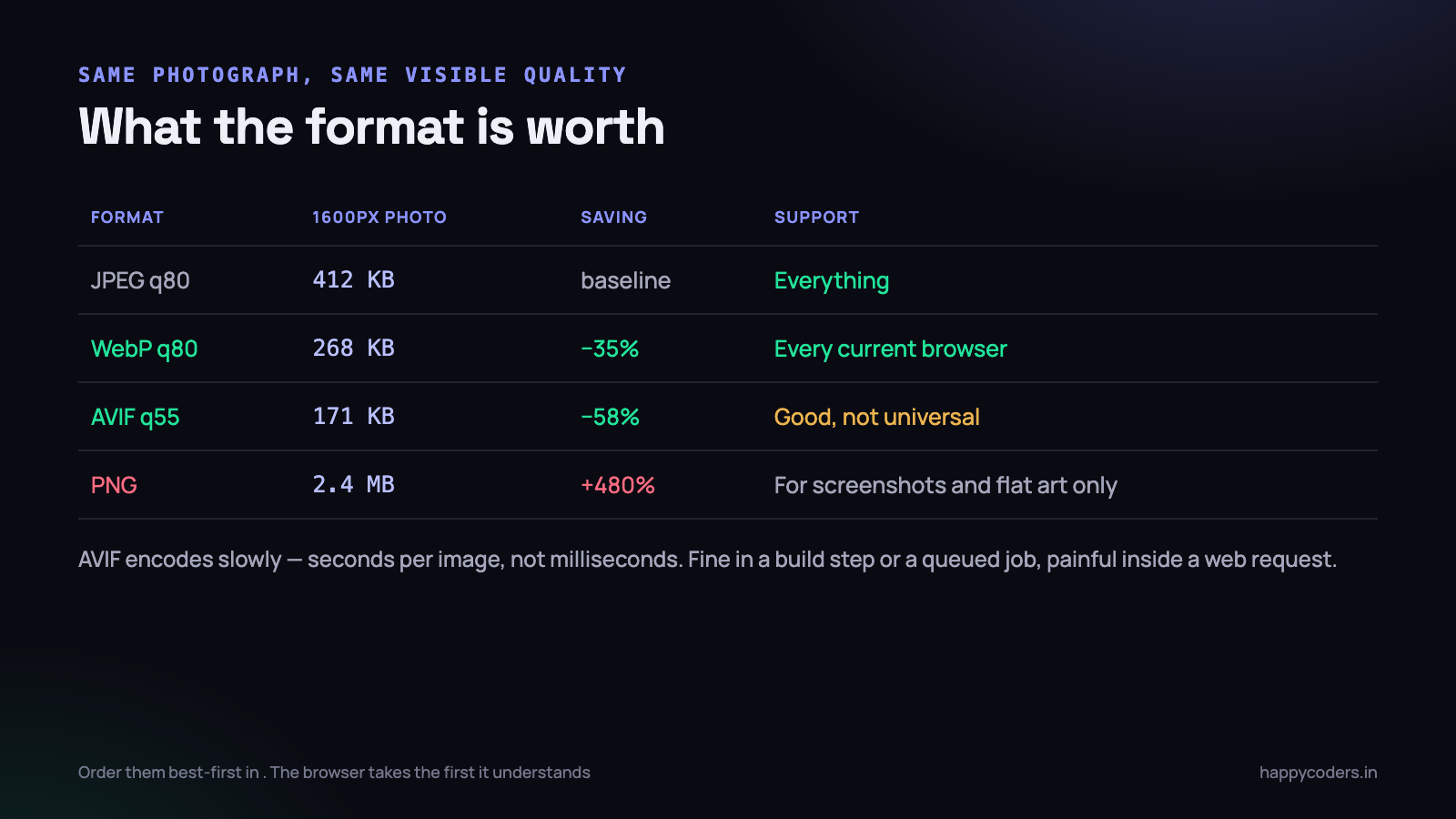
Both are modern formats that compress photographs substantially better than JPEG at the same perceived quality. The numbers vary by image, but the shape is consistent:
- WebP saves roughly 25–35% against a well-tuned JPEG. Every browser in current use supports it, including Safari since 2020. There is no longer a reason to avoid it.
- AVIF saves roughly 50–60%, and holds up better at low quality settings — it degrades into softness rather than into blocks. Support is good but not universal, so keep a fallback.
- PNG is not a photograph format. A photo saved as PNG is typically five times larger than the JPEG. Keep PNG for screenshots, flat illustration and anything needing sharp edges or real transparency.
- SVG beats all of them for logos, icons and diagrams with text, because it is resolution-independent and usually a few kilobytes.
The catch with AVIF is encoding time. A 1600px photograph takes a few seconds to encode well, against tens of milliseconds for JPEG. That is fine in a build step, in a deploy script or in a queued job. It is not fine inside a web request while a user waits, and it will surprise you the first time a client bulk-uploads two hundred product photographs.
Generating the files
On a server, the command line tools are the quickest route and they parallelise well:
# WebP, quality 80
cwebp -q 80 hero-1600.jpg -o hero-1600.webp

# AVIF, quality 55 (the scales are not comparable across formats)
avifenc --min 20 --max 35 hero-1600.jpg hero-1600.avif

# Resize first, then encode each size
for w in 400 800 1200 1600; do
  convert hero.jpg -resize ${w}x -quality 82 hero-${w}.jpg
  cwebp -q 80 hero-${w}.jpg -o hero-${w}.webp
done
In a PHP application, do it when the file is uploaded and store the results, rather than on every request. Imagick and GD both write WebP; AVIF needs a recent Imagick build, so check before you promise it.
<?php
// generate the sizes once, at upload time
$sizes = [400, 800, 1200, 1600];

foreach ($sizes as $w) {
    $img = new Imagick($original);
    $img->resizeImage($w, 0, Imagick::FILTER_LANCZOS, 1);
    $img->stripImage();                 // drop EXIF: smaller, and no GPS

    $img->setImageFormat('jpeg');
    $img->setImageCompressionQuality(82);
    $img->writeImage("{$base}-{$w}.jpg");

    $img->setImageFormat('webp');
    $img->setImageCompressionQuality(80);
    $img->writeImage("{$base}-{$w}.webp");

    $img->destroy();
}
stripImage()is worth a line of its own. Camera photographs carry EXIF data that can include GPS coordinates. Stripping it makes the file smaller and stops you publishing the location of somebody’s house along with their profile photograph.
Stop the page jumping: width and height
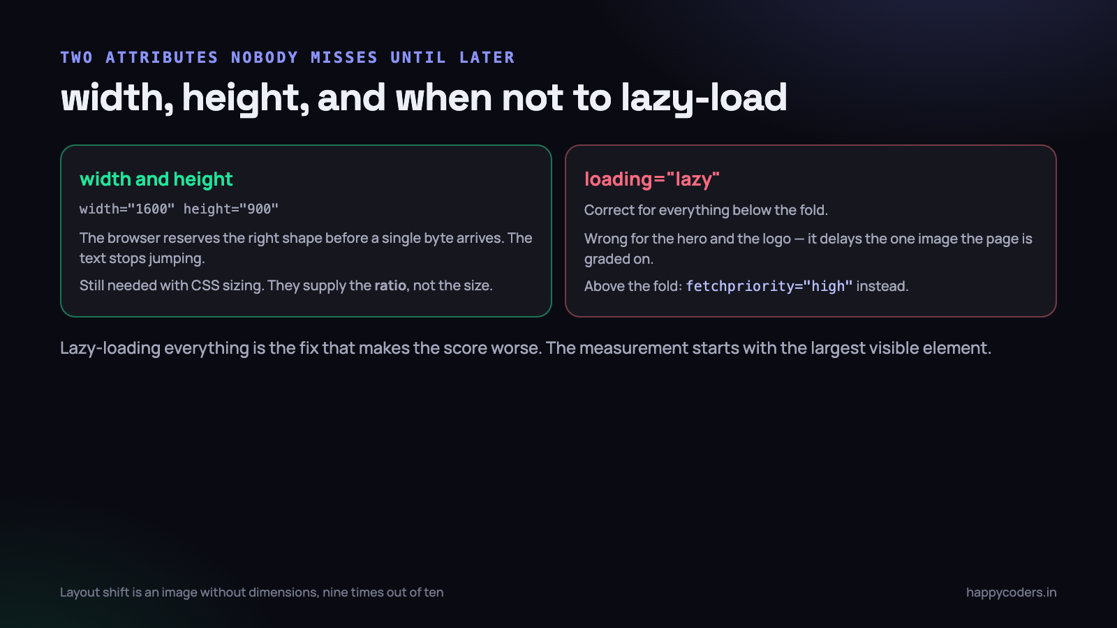
Put width and height attributes on every single image. Not CSS — the HTML attributes, with the real pixel dimensions.
Without them, the browser does not know how much space to reserve, so it lays out the text first and then shoves it down when the image arrives. That is the effect where you go to tap a link and the page moves under your thumb. It is measured as Cumulative Layout Shift, it is a ranking signal, and it is almost always caused by images with no dimensions.
Modern browsers use the two attributes to compute an aspect ratio and reserve a correctly shaped box, even when your CSS resizes the image completely. So this combination is correct and is what you want:
<img src="hero-800.jpg" width="1600" height="900" alt="...">

<style>
img { max-width: 100%; height: auto; }
</style>
The attributes supply the ratio. The CSS supplies the actual size. Dropping height: auto is the classic mistake — the image then renders squashed to exactly 900 pixels tall.
Lazy loading, and the two images that must not be lazy
loading="lazy" tells the browser to defer an image until it is near the viewport. On a long page with twenty images it is a genuine win, it is one attribute, and it needs no JavaScript library.
But applying it to everything makes the page measurably worse, and this is a mistake almost everyone makes once.
- Never lazy-load the hero. It is usually the Largest Contentful Paint element — the exact thing being timed. Lazy-loading it adds a round trip to your headline metric.
- Never lazy-load the logo or anything else visible without scrolling.
- Do lazy-load everything below the fold: gallery thumbnails, testimonial photographs, the footer map, images inside a long article.
- Use
fetchpriority="high"on the hero instead, to push it ahead of the other early downloads.
<!-- above the fold -->
<img src="hero-800.jpg" fetchpriority="high" width="1600" height="900" alt="...">

<!-- below the fold -->
<img src="team-800.jpg" loading="lazy" decoding="async"
     width="1200" height="800" alt="...">
A practical rule that survives contact with a CMS: lazy-load nothing in the first screen of markup, and lazy-load everything after it. If you cannot tell where that boundary is in a template, load the first two images eagerly and the rest lazily.
What WordPress does for you, and what it does not
A large share of Indian business sites run on WordPress, so it is worth knowing exactly where the line falls.
WordPress does quite a lot automatically. On upload it generates several sizes — thumbnail, medium, large and whatever your theme registers — and since version 4.4 it writes srcset and sizes into the markup for images inserted through the editor or rendered through the_post_thumbnail(). Since 5.5 it adds loading="lazy", and since 6.3 it is reasonably good about not lazy-loading the first image. Recent versions also add width and height.
What it does not do is fix these:
- Images hard-coded in a theme template with a plain
<img src>. Nosrcset, no dimensions, no lazy loading. This is where most of the damage lives. - A generated
sizesvalue that does not match your layout. WordPress guesses from the registered image size, and the guess is often100vw. Filterwp_calculate_image_sizesand give it the truth. - CSS background images. They are invisible to all of this. A hero set with
background-imagegets none of it — useimage-set(), or make it a realimg. - Formats. WordPress 6.x still writes JPEG by default. WebP and AVIF need a plugin or a filter.
- The original file. A 6000px camera JPEG stays on disk forever. Set a sensible maximum on upload and save yourself the storage bill.
The last point about page builders deserves saying plainly: several popular builders output their own image markup and discard WordPress’s. Before blaming the CMS, view source on a real page and look at what is actually in the img tag.
Checking your work
Two checks, both in the browser, both about a minute.
- Open DevTools, disable cache, reload. Sort the network panel by size. Anything over about 200 KB that is not a video deserves a reason. Then narrow the window to 400px, reload, and confirm a smaller file is now being fetched. If the same file loads at every width, your
srcsetis not doing anything. - Hover the image in the Elements panel. Chrome shows “intrinsic” size against “rendered” size. Intrinsic 3000 × rendered 720 is precisely the bug this article is about, stated as two numbers.
Then run the page through PageSpeed Insights on the mobile tab. “Properly size images” and “Serve images in next-gen formats” are the two audits this work removes, and the savings it reports are usually the largest single number on the page.
What to do on Monday morning
You do not need a project for this. You need about two hours, spent in this order.
- Find the worst offender. Load your own home page on a throttled connection with the network tab open, sorted by size. It will be one image, and it will be obvious.
- Fix that one image properly. Four widths, a WebP for each,
srcsetplus a truthfulsizes,widthandheight, andfetchpriority="high"if it is the hero. Measure before and after so you have a number to show. - Add
widthandheightto every image in your templates. Boring, mechanical, and it removes most of your layout shift in one commit. - Add
loading="lazy"below the fold only. Leave the top of the page eager. - Move generation to upload time. Whatever produces your images — a build script, an upload handler, a queued job — make it emit every size and a WebP, so nobody has to remember again.
- Cap the upload size. Nobody needs the 6000px original on a website. Resize on the way in.
The last step is the one that makes the rest stick. Responsive images are not hard; they just have to be automatic, because the moment a human has to remember to export four sizes, somebody will upload a 4 MB photograph on a Friday evening and the problem will be back.