An app preview is the strangest video you will ever make. It is fifteen seconds long, it plays with the sound off, it has no narrator, and a stranger decides whether to install your app based on the first three seconds of it. Everything you know about making a product demo applies in reverse.
It is also one of the few pieces of marketing where the platform sets hard rules and rejects you for breaking them. A preview that would be fine on your website will be sent back by App Review, and the rejection holds the entire release, not just the video. So the rules come first.
What the two stores actually require
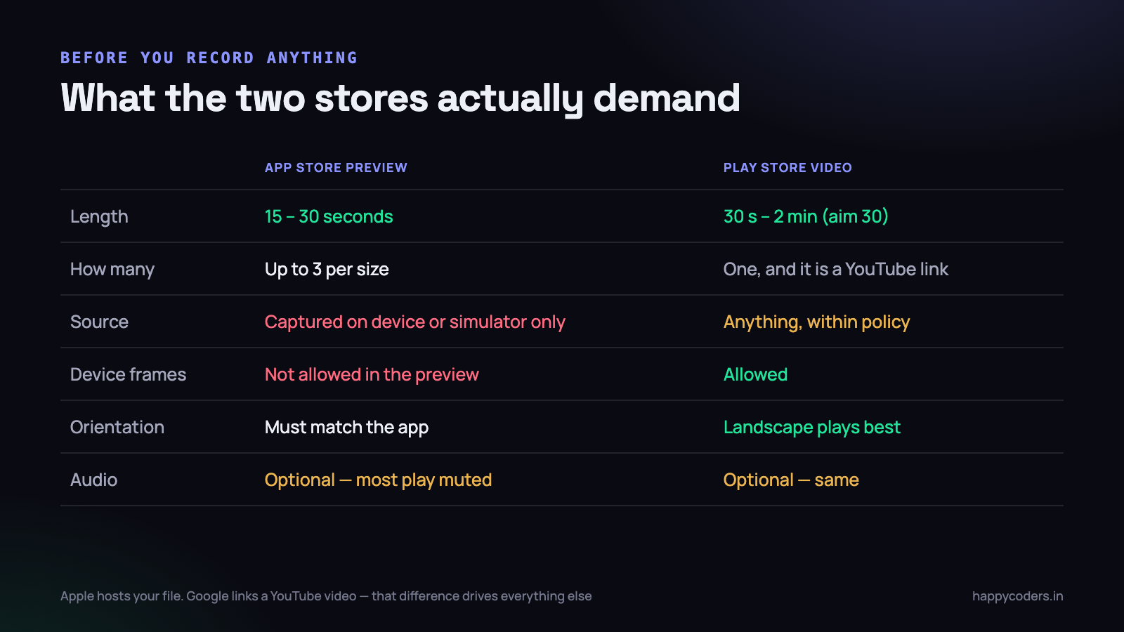
The requirements differ more than most people expect, because the two stores do fundamentally different things with your file. Apple hosts it and plays it inside the product page. Google does not host anything — it links a YouTube video and plays it in an embedded player.
The App Store
An app preview is fifteen to thirty seconds long. You can supply up to three per device size, and they appear before your screenshots on the product page. The critical constraint is the one people fall foul of: the footage must be captured from the app running on a device or simulator. Not a screen recording of a mirrored window, not an animation of your interface, not a montage of people using phones.
The second constraint catches nearly everybody the first time. No device frames. You cannot show your app inside a picture of an iPhone, and you cannot show a hand holding a phone. The preview is presented inside a device frame by the store itself, so a frame inside a frame looks wrong and is rejected.
Resolution must match the device size you are submitting for, and the orientation must match what the app supports. If your app is portrait only, a landscape preview is a rejection.
Google Play
Play is considerably looser. The promo video is a YouTube link, it can be up to two minutes, and device frames are allowed. Because it is YouTube, it must not be age-restricted or have ads enabled, and the link must be to a specific video rather than a channel or a playlist.
Looser rules do not mean a longer video is better. The same thirty-second discipline applies, and on a phone the Play listing shows the video above the screenshots where a slow start is just as costly.
Aim for one video that satisfies Apple — fifteen to thirty seconds, no frames, captured on device — and use the same file on Play. It is far easier than producing two, and Play accepts everything Apple does.
Capturing a phone screen from a Mac
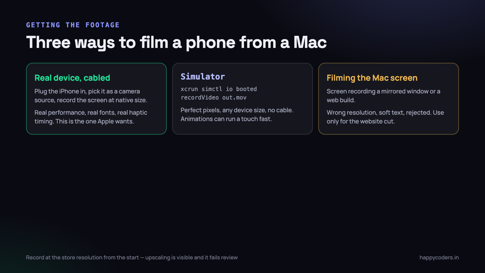
There are three ways to get the footage, and only two of them are acceptable to Apple.
A real device, over a cable
Plug the iPhone into the Mac with a lightning or USB-C cable, open QuickTime Player, choose New Movie Recording, and select the phone as the camera source. The phone screen appears on your Mac and records at its native resolution, with the phone’s audio.
This is the best footage you can get, and it is what Apple has in mind. Everything is real: the frame rate the app actually achieves, the real keyboard, the real system fonts, the way the list decelerates when you flick it. If your app has any performance issue, this is where you find out, which is uncomfortable and useful.
- Put the phone in Do Not Disturb and check the battery and signal indicators — a low battery warning mid-take is a re-record.
- Clean the notification centre before you start. A banner from a personal chat is both embarrassing and a rejection risk.
- Use a real account with realistic data. More on that below, but it is the most common reason a preview looks amateur.
- Keep your finger movement slow and deliberate. On a fifteen-second video, a fast swipe reads as a glitch.
The simulator
A one-line command records the booted simulator directly:
xcrun simctl io booted recordVideo --codec h264 preview.movPress Ctrl+C to stop. The output is exactly the right resolution for whichever device you booted, which solves the size problem for every device class without owning every device. For an app that needs to ship previews for three screen sizes, this is the practical route.
The trade-off is that the simulator is not the phone. Animations can run slightly differently, scrolling physics feel synthetic, and anything that relies on the camera, the accelerometer or real network latency will not behave. For a form-driven or list-driven app the difference is invisible. For a game or anything with motion, record on a device.
Screen recording the Mac, which is the one that fails
The obvious approach is to mirror the phone to the Mac, or run a web build, and record the Mac screen. It produces a file quickly and it is almost always wrong: the resolution does not match any device size, so you end up upscaling, and upscaled interface text is visibly soft in a way App Review notices.
Use Mac screen recording for the website version and the LinkedIn version, where nobody is checking dimensions. Do not submit it.
The fifteen seconds that work
With no narration and no time, the structure is brutal. Every second you spend on something that is not the product working is a second of your total budget.
Start with the app already doing its job
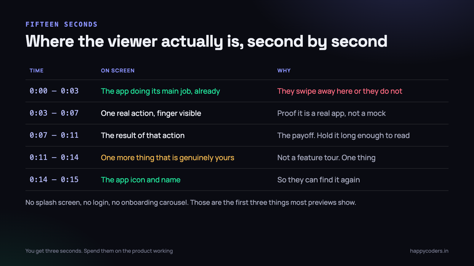
The single most common mistake is opening with a splash screen, a logo animation, a login form or an onboarding carousel. Those are three to five seconds of a fifteen-second video spent on the part of your app nobody wants. Start after all of it, with the main screen populated and something happening.
If your app is a delivery tracker, second zero is a map with a driver moving on it. If it is an invoicing app, second zero is a finished invoice. Show the state the user is trying to reach.
One real action, with a visible finger
Between three and seven seconds, perform one interaction and let the viewer see the touch indicator or the finger. This matters more than it sounds: it is the proof that this is a real running app rather than a designer’s mockup, and viewers can tell the difference instantly.
Hold the result long enough to read
The payoff needs about four seconds on screen. This feels far too long while you are editing and is exactly right when somebody watches it once, cold, on a phone. If the result is a number, a chart or a confirmation, give the eye time to land on it.
One more thing, then the icon
Three seconds for a second capability, chosen because it is genuinely yours rather than because it is next in the menu. Then one second of the app icon and name, so somebody who watched without sound knows what to search for.
That is the whole video. Resist adding a fifth thing. A preview that shows two things clearly outperforms one that shows six things at double speed, and the second kind is what most teams produce.
Text on screen instead of narration
Previews play muted by default in both stores. Any information that exists only in the audio does not exist. So the words go on the screen.
Short overlaid captions work, with rules of their own:
- Three words, not a sentence. “Scan any bill”, not “Simply scan any bill using your camera and we will extract the details”.
- Large type. The preview plays in a small frame on a product page. Text sized for a laptop is unreadable there.
- At most three overlays in fifteen seconds. Four is a slideshow.
- Never cover the thing you are demonstrating. Place text in dead space — the top area or an empty half of the screen.
- No prices, no store badges, no “Download now”. These are explicit rejection reasons, not stylistic advice.
You can add background music, and it is worth doing for the small proportion of viewers with sound on, but it must be licensed for commercial use. A track lifted from a video you liked is a rejection and potentially a copyright claim on the Play side where the file lives on YouTube.
One preview or three
Apple lets you supply up to three previews per device size, and they play in order. Most apps should ship one. Three previews is a commitment to keeping three videos current through every redesign, and the second and third are watched by a small fraction of the people who watch the first.
There are two situations where more than one earns its place. The first is an app with two genuinely different audiences — a delivery app used by customers and by riders, say — where one preview cannot serve both. The second is an app whose value only makes sense as a sequence, where the first preview shows the outcome and the second shows the setup that produces it.
Device sizes are a separate question and not optional in the same way. If you ship for iPhone and iPad, the store wants assets for both, and a portrait phone video stretched onto an iPad listing looks exactly as poor as it sounds. This is the strongest practical argument for recording on the simulator: booting a second device and running the same command again is five minutes, and buying a second device is not.
If your app is localised, the preview can be too. Text overlays are the only part that needs changing, so keep the edit project with the overlay layers separate rather than flattened — a Tamil or Hindi version is then twenty minutes of work rather than a re-record. Do not machine-translate three-word overlays and ship them unchecked; short phrases are exactly where translation tools go wrong.
Why previews get rejected
Review is not judging your edit. It is checking one thing: that the video is the app. Nearly every rejection is a version of that.
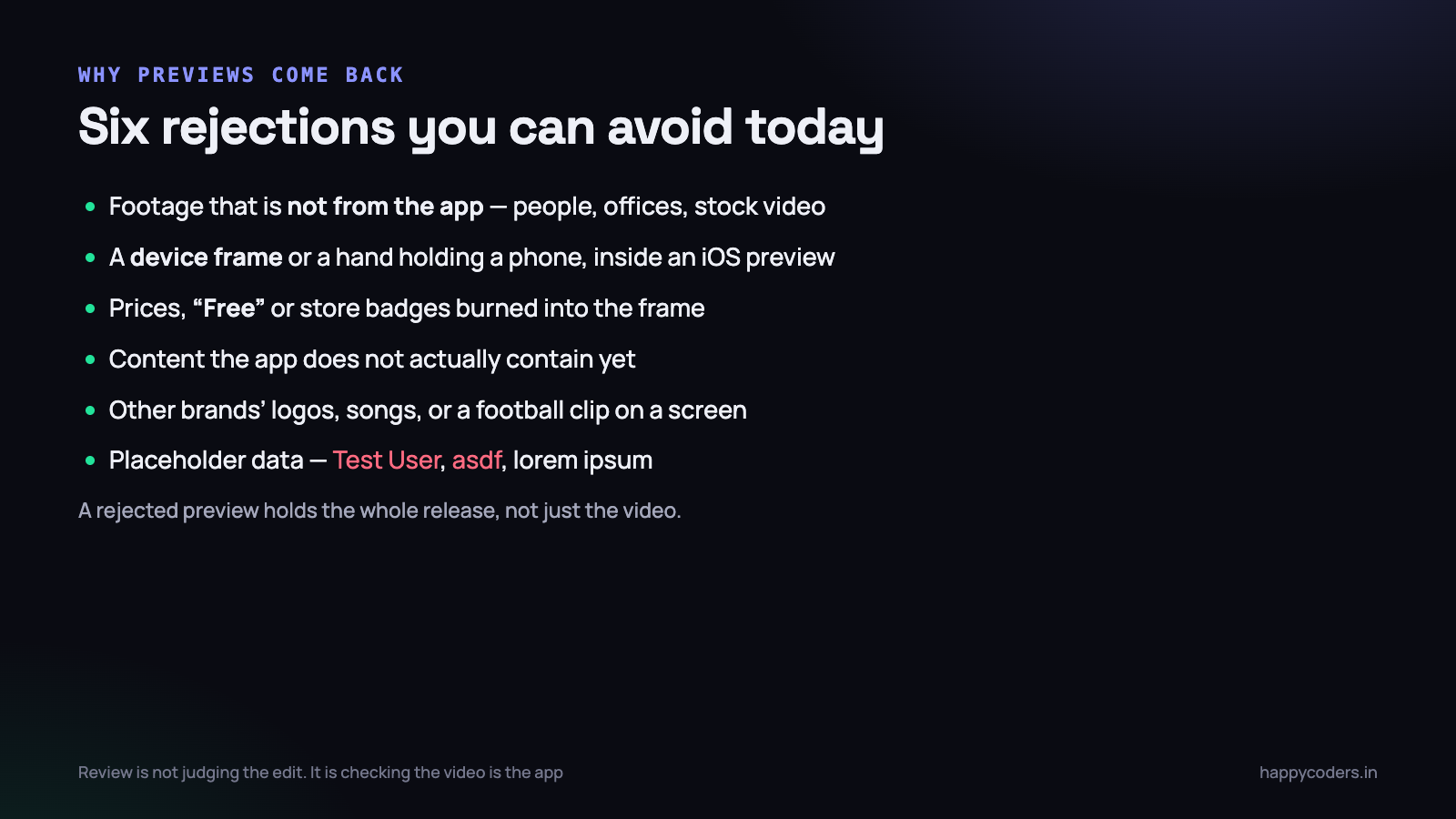
Footage that is not from the app
People in an office, a stock shot of a city, a founder talking to camera, an animated explainer of your workflow. All fine on your website. None of them allowed in an iOS preview, which must be captured app footage.
Device frames and hands
Already mentioned, and worth repeating because it is the most frequent single cause. The preview is displayed inside a device frame by the store. Yours must not contain one.
Placeholder data
“Test User”, “asdf”, lorem ipsum and an empty state with a dotted rectangle. This is sometimes rejected outright as misrepresenting the app, and even when it passes it is the difference between a preview that looks like a product and one that looks like a college project. Spend an hour creating a believable account: real-sounding names, plausible amounts in rupees, a sensible spread of dates.
Showing something the app does not do
A screen that is behind a feature flag, a capability shipping next month, a server-rendered mock. Review installs the build and looks for what the video showed. If it is not there, the video comes back.
Content that belongs to somebody else
A brand logo in your test data, a song playing, a cricket clip inside a video player you are demonstrating. Use content you own or content that is clearly generic.
Mismatched dimensions
The most boring rejection and the easiest to avoid. Record at the exact resolution for the device size you are submitting, from the start. Do not record once and scale to three sizes afterwards — the scaled ones look soft and frequently fail the dimension check anyway. If you ship for iPhone and iPad, record a set on each, which is where the simulator route earns its place.
If you have been through App Review before, the pattern is familiar: the rejections are almost never about quality and almost always about a rule you did not read. Our engineering notes on four Mac App Store rejections cover the same lesson from the desktop side.
Reusing the same footage
The good news about the discipline above is that fifteen seconds of clean, high-resolution, well-lit app footage is unusually reusable. Capture more than you need — record each interaction two or three times, and record a few actions you do not plan to use — and you have a small library rather than a single file.
- The website hero. The same clip, silent, looping, often in a device frame — which is allowed everywhere except the iOS preview itself.
- LinkedIn. Take the payoff moment, add a burned-in caption explaining what just happened, post it as a fifteen-second square video.
- The Play listing. Same file, uploaded to YouTube, linked from the console.
- Sales replies. A prospect asks whether the app does X. Send eight seconds of it doing X rather than three paragraphs.
- Release notes and changelogs. A short clip beside each meaningful change dates the feature and makes the note worth opening.
Keep the originals at full resolution in one folder, named by what they show rather than by the date. invoice-approve-portrait-2026-09.mov is findable next March. ScreenRecording_09-18.mov is not.
A longer walkthrough is a different video with a different job, and the structure for that one is covered in our note on recording a product demo. Do not try to make one video do both.
What to do on Monday morning
Give this half a day, not a week. The constraint is what makes it quick.
- Write the fifteen seconds on paper first. Second zero to three, three to seven, seven to eleven, eleven to fourteen, fourteen to fifteen. One line each.
- Build a believable account in a test environment. Real names, rupee amounts that make sense, a month of plausible history.
- Decide device or simulator. Motion or camera involved, use a device. Forms and lists, use the simulator and get every size for free.
- Put the phone in Do Not Disturb, clear the notifications, check the battery indicator.
- Record each of the four moments separately, two or three takes each. Do not attempt one continuous fifteen seconds.
- Cut it to length, add at most three short text overlays, and leave the audio out.
- Read the rejection list once more before you upload. No frames, no badges, no prices, no placeholder names, nothing the app cannot do.
Then watch it once on a phone, held at arm’s length, with the sound off, as though you had never seen the app. If you cannot say what it does after fifteen seconds, the structure is wrong and no amount of polish will fix it.
HappyRec is a free screen recorder for macOS. It will not capture an iPhone for you — that is QuickTime or the simulator — but it handles the website cut, the LinkedIn clip and the longer walkthrough that lives alongside the store preview.