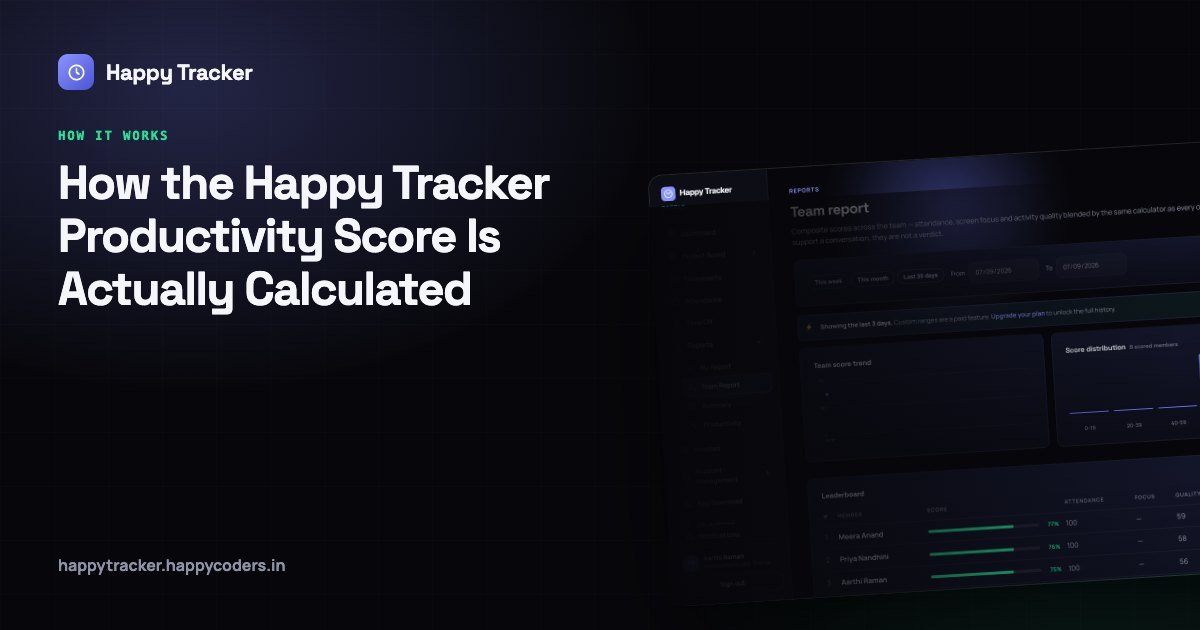
A single number out of a hundred is a dangerous thing to put next to somebody’s name. It invites comparison, it flattens context, and once a team believes it is being graded on it they will optimise for the number rather than for the work. Every company that has ever tried to measure knowledge work has run into this.
We built one anyway, because the alternative is worse. Without a measurement, managers form impressions from who looks busy in the office, who replies to messages fastest, and who happens to sit near them. That is not neutral — it systematically favours the visible over the effective, and it is invisible to the people it disadvantages.
So we built a score, and then we built it so that every part of it is visible, so nobody has to take the final number on trust. This post is the full explanation of how it works, what it cannot see, and how to use it without doing damage.
It starts with activity blocks
Every few minutes the desktop tracker closes one block and opens another. Each block records the application that was in front, the title of its window, and how much real keyboard and mouse input there was during that stretch.
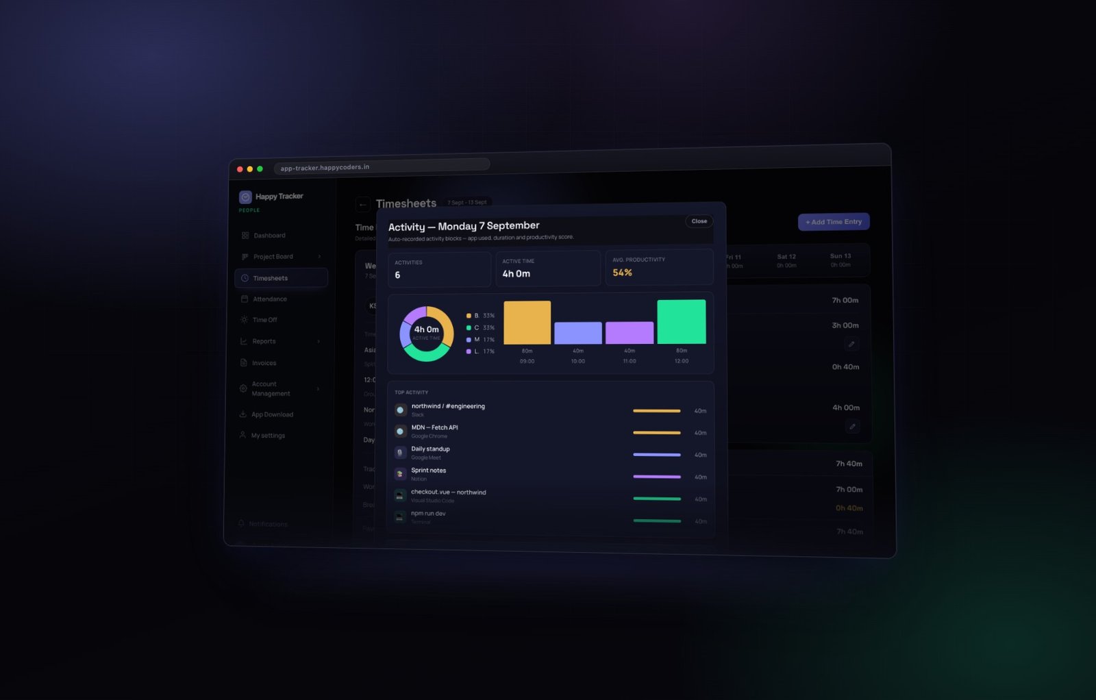
Each block then gets two things: a score, from the amount of input, and a category, from the application — coding, design, communication, browsing, meetings, or general.
Everything else in this post is those blocks rolled up. There is no second data source, nothing entered by hand, and nothing inferred from anywhere else. If you understand the block, you understand the whole system.
It counts activity, never keystrokes. Nothing anybody types is recorded. The score knows there was typing; it does not know what was typed, and there is no setting anywhere that changes that.
Four measurements, not one
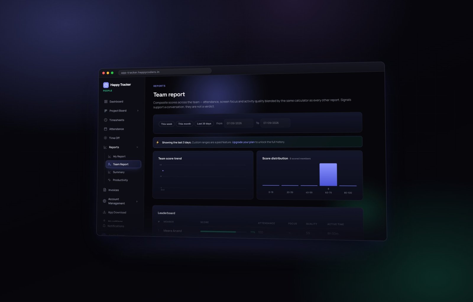
The team score is a blend of four separate measurements, and the report deliberately shows all four alongside the total rather than collapsing them into it.
Attendance
How consistently somebody turned up and tracked, measured against the work schedule. Approved leave and company holidays are excluded, so somebody on leave you granted yourself is never punished for it.
This is the most directly controllable of the four, and the fairest. It measures a habit rather than an outcome, and habits are reasonable things to expect. If somebody’s attendance is low, the conversation is straightforward and does not require anybody to defend how they think.
Focus
How long somebody stayed in one application before switching. Long uninterrupted stretches score well; constant switching does not.
This is the measurement people misread most often, and misreading it does real damage. A low focus score means a lot of switching. For a developer deep in one codebase that is worth a look — and the cause is usually the meeting calendar or a chat channel, not their concentration. For a manager who lives in email, chat and calls all day, low focus is simply an accurate description of the job.
Read focus as a property of somebody’s working conditions, not of their character.
Quality of time
The share of tracked time that landed in productive categories rather than in browsing or idle.
Because it depends on how applications are categorised, this is the measurement most worth sanity-checking before you rely on it. A browser used for research reads as browsing. A video call taken in a browser reads the same way. Neither is a fair reading of the hour.
Both can be corrected. Every block in the activity timeline has a dropdown, so an owner or admin can reclassify one as a meeting, a break or learning, and the scores recalculate. If a whole team’s quality score looks low, check the categorisation before you check the team.
Active time
The raw input time behind the tracked hours. Always lower than tracked time — for everybody, in every company, without exception — because thinking, reading, listening and talking are all work and none of them move a mouse.
A day at eighty percent active is a day of heavy typing, not a day of unusually good work. If your team’s active time suddenly rises, the most likely explanation is a change in the kind of work rather than a change in effort.
Why we kept the parts visible
Most products in this category ship a single number and keep the formula private. We did the opposite, for three reasons.
- A single number cannot be acted on. “Your score is 68” tells a person nothing about what to change. “Your focus dropped because you had eleven meetings” tells them something, and tells their manager something too.
- An opaque score invites suspicion. People assume the worst about formulas they cannot see, and they are often right to.
- The parts disagree usefully. High attendance with low focus is a different problem from low attendance with high focus, and a blended number hides exactly the distinction a manager needs.
What the score deliberately does not measure
This section is the one to read before you use the number in any decision.
- Judgement. The decision not to build something is often the most valuable hour of the week, and it scores zero.
- Difficulty. Two hours on a hard problem and two hours on an easy one look identical.
- Quality of output. The score cannot see whether the code worked, whether the design was good, or whether the client was happy.
- Whether it was the right work. Somebody can score beautifully on a task that should have been cancelled.
- Helping other people. An hour spent unblocking three colleagues shows as communication, and often as low activity.
A day spent reviewing somebody else’s design, thinking through an architecture and talking three people through a problem will always score lower than a day of heavy typing. In most companies the first day was worth more. The score is not wrong; it is measuring something narrower than value, and it is your job to remember which.
How to read it fairly
- Compare somebody to their own history, never to the person beside them. Different roles produce different scores for entirely legitimate reasons, and cross-comparison is where most of the unfairness in productivity measurement comes from.
- Look at a month, not an afternoon. One low day means nothing at all — somebody had a bad night, a long meeting, or a difficult problem.
- Treat a sustained drop as a question, not a verdict. Over a few weeks it usually means blocked, overloaded, or something outside work. All three deserve a conversation and none of them is a performance problem yet.
- Never read the ranking out in a group meeting. Nothing destroys the usefulness of a measurement faster than turning it into a public league table.
- Open it before a one to one, to find the thing worth asking about — then ask an open question rather than presenting a number.
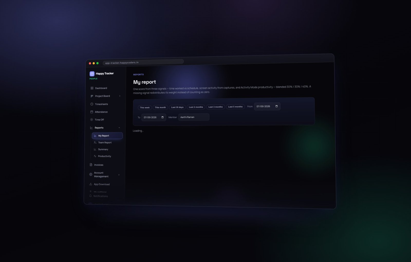
Every employee has this view of themselves: the score trend across the range, where their time went by category, and their own tasks ranked by time spent. That is not a courtesy, it is structural. A measurement somebody cannot see is a measurement they cannot act on, and one they have every reason to resent.
Three ways teams use it well
Finding the meeting problem
The most common genuinely useful finding. A team’s focus scores drop and communication time rises, and the cause turns out to be a recurring meeting nobody has questioned in six months. The score did not identify a lazy team; it identified a calendar.
Spotting somebody drowning quietly
A steady decline in one person’s own numbers over three or four weeks, with rising communication and falling active time, is very often somebody who has taken on too much and has not said so. It is the kind of thing that is obvious in hindsight and easy to miss in the moment.
Seeing where a project actually went
Rolled up by project rather than by person, the same data answers a different question: which work absorbed the team. That is usually more actionable than anything about individuals, and far less contentious.
And two ways teams use it badly
As a target
The moment a number becomes a target, people optimise for the number. Set a minimum productivity score and you will get one — achieved by keeping a document open and moving a mouse, not by doing better work.
As evidence in a performance conversation
The score is a signal that something is worth asking about. It is not evidence of anything on its own, and presenting it as evidence teaches people that the tool is used against them. Once they believe that, every number in the system becomes less reliable, because people start managing the tool instead of using it.
Where the same data shows up elsewhere
The blocks feed three other places, each answering a different question.
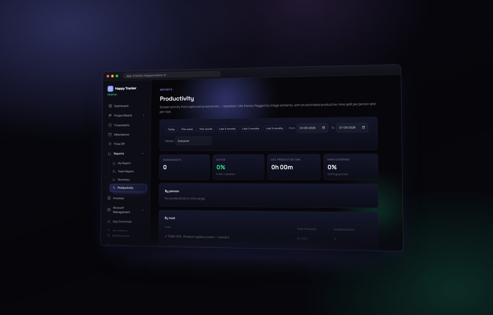
- The productivity report — evidence rather than scores. Time by person and by task, with the screenshot count for each. This is the report for a client conversation.
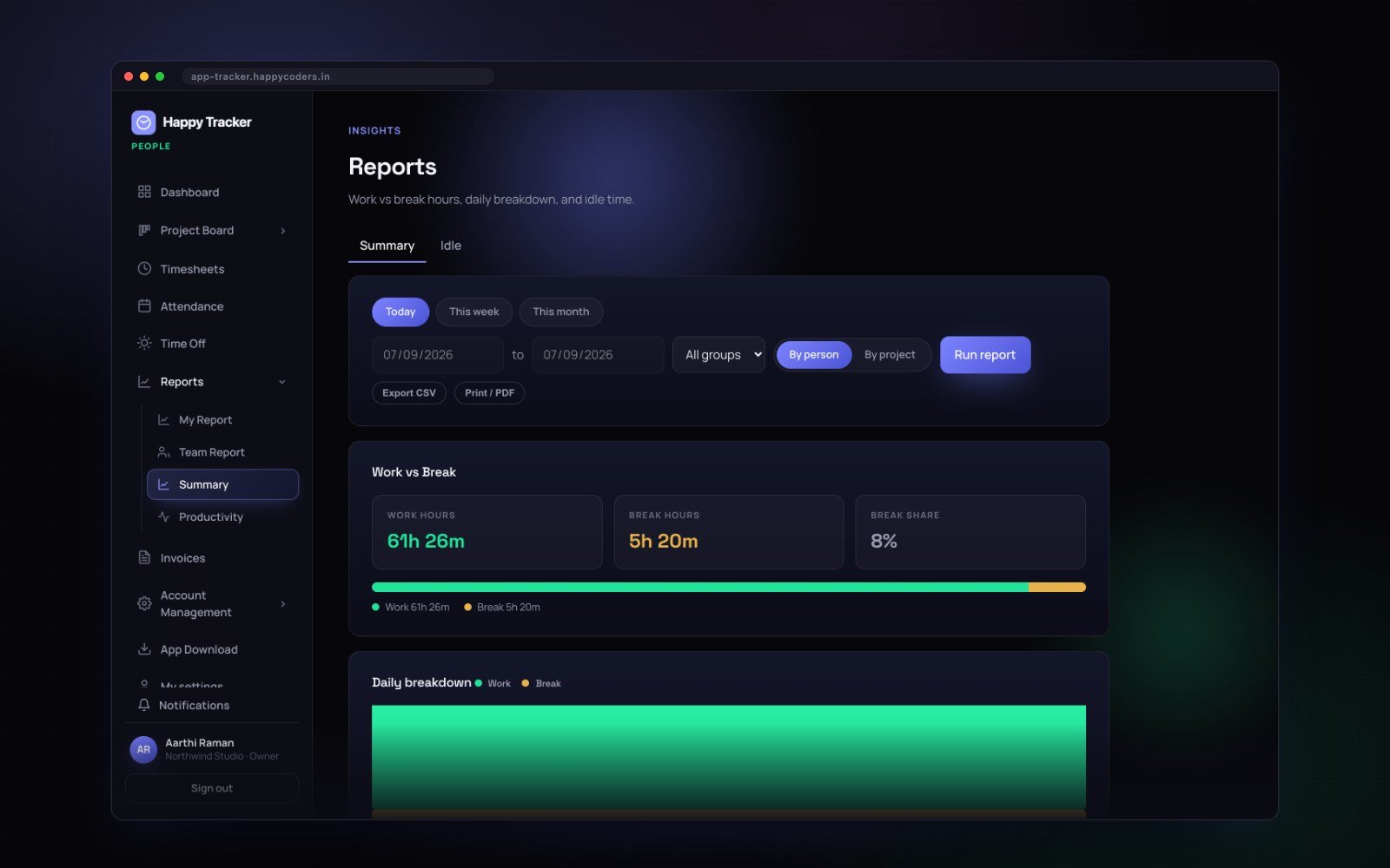
- The summary report — hours rather than activity. Work against break, billable against internal, for payroll and billing.
- The board — per-task rollups, which is how estimate against actual is measured without anybody logging time twice.
Common questions
Why is my active time so much lower than my hours?
Because thinking, reading, listening and talking do not move a mouse. This is normal for everybody. If active time equalled tracked time, something would be wrong.
Can I improve my score by moving the mouse?
Marginally, and it would be obvious over a month because the categories would not match the work. It is also the clearest possible sign that the score is being used badly by whoever made somebody feel they needed to.
Why did my score change when nothing changed?
Usually a change in the mix of work — a week with more meetings, or more review. Check the category breakdown in My Report before assuming anything went wrong.
Can a manager see the formula?
They can see all four inputs on the same screen as the score, which is the practical version of the same thing.
A worked example
Two people on the same team, same month. It is worth walking through because the numbers look damning until you read them properly.
Priya, a developer
Score 78. Attendance high, focus high, quality high, active time high. She spent most of the month in one codebase with few meetings. This is roughly what a productive month looks like for a role that involves long stretches of one kind of work.
Suresh, a tech lead
Score 54. Attendance high, focus low, quality medium, active time low. He spent the month in reviews, calls, and helping four people unblock themselves.
Read naively, Suresh had a bad month. Read properly, Suresh had a month that made Priya’s month possible, and the score cannot see that because reviewing somebody else’s work does not move a mouse very much.
What a good manager does with this
Nothing, to Suresh. But it is worth asking whether he is doing too much of it — a tech lead whose active time is low every month for six months is a tech lead who has stopped building, which may or may not be what anybody intended.
And it is worth checking whether the review load is spread. If one person is the bottleneck for every review in the team, that is a system problem the score has just made visible.
How the score behaves over time
Three patterns are worth recognising, because they mean different things.
- Stable, with weekly wobble. Normal. Weeks differ; that is what weeks do.
- A step change. Something changed — a new project, a new manager, a change in role. Ask what, rather than why the number moved.
- A slow decline over a month or more. The one worth acting on. Usually blocked, overloaded, or something outside work.
What is almost never meaningful is a single day, or a difference of a few points between two people. If you find yourself explaining a four-point gap, you are over-reading the instrument.
Common questions
Why is my active time so much lower than my hours?
Because thinking, reading, listening and talking do not move a mouse. This is true for everybody. If active time equalled tracked time, something would be wrong.
Can I improve my score by moving the mouse?
Marginally, and it would be obvious over a month because the categories would not match the work. It is also the clearest possible sign that the score is being used badly by whoever made somebody feel they needed to.
Why did my score change when nothing changed?
Usually a change in the mix of work — a week with more meetings, or more review. Check the category breakdown in My Report before assuming anything went wrong.
Can a manager see the formula?
They can see all four inputs on the same screen as the score, which is the practical version of the same thing.
Is the score used for anything automatically?
No. Nothing in the product acts on it. It does not gate access, trigger alerts or affect anybody’s account. It is a number on a report, and what happens next is entirely a human decision.
The honest summary
This score measures input activity, categorised by application, against a work schedule. It is a good instrument for spotting changes and finding problems in how a team’s time is being spent. It is a poor instrument for judging individuals, and a terrible one for ranking them.
The companies that get value from it use it to fix systems — too many meetings, a project quietly absorbing the team, one person carrying too much. The ones that get nothing from it use it to rank people, and end up with a team who have learned to look busy.
You can see all of it, including your own score, on the free plan — up to five users, no card.