A site that feels instant on your machine can take eleven seconds on a customer’s phone. That is not an exaggeration or a worst case — it is the normal gap between a developer on office fibre with a warm cache and a real person on a three-year-old Android handset with four bars of 4G that are really 3G.
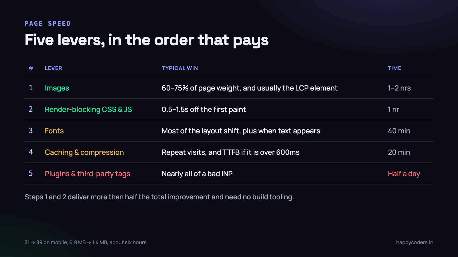
The good news is that page speed is one of the most predictable pieces of work in front-end development. The wins are almost always in the same five places, in almost always the same order, and most sites get the large majority of the available improvement from the first two. What follows is that order, with the real numbers from a site we spent about six hours on earlier this year.
Measure before you touch anything
The single most common mistake is optimising by instinct. Somebody reads that minification helps, spends a morning setting up a build step, saves 40KB of JavaScript, and the page still takes nine seconds because there is a 3MB photograph at the top of it.
Take three measurements before you change a line, and write them down somewhere you can find them again.
Lighthouse, in the browser, throttled
Chrome DevTools, Lighthouse tab, Mobile, and leave the throttling on. That throttling is not pessimism — it simulates a slow 4G connection and a CPU about four times slower than your laptop, which is a fair approximation of a mid-range Android phone. Running Lighthouse in desktop mode on an unthrottled connection produces a nice score and tells you nothing.
Lighthouse is a lab test. It runs once, in a controlled environment, and it is excellent for comparing before and after because the conditions are identical each time.
PageSpeed Insights, for the field data
Paste the URL into PageSpeed Insights and look at the top section, not the bottom one. If your site has enough traffic, the top shows real measurements from real Chrome users over the last 28 days — actual phones, actual networks, actual people. That is the data Google uses, and it can disagree with your lab score in both directions.
A real phone on a real network
Then do the thing almost nobody does: open the site on a phone, on mobile data, away from your office, with the cache cleared. Not your own phone if yours is the newest one in the team — borrow a handset that costs twelve thousand rupees, because that is what a large share of your visitors are holding.
This single test has changed more of our priorities than any tool. Numbers tell you what is slow. Standing at a bus stop watching a page take nine seconds tells you whether anybody would wait.
Test the pages that matter, not the home page. Most sites are optimised on the home page and abandoned on the product page, the search results and the contact form — which are the three pages where money is actually made or lost.
Core Web Vitals, in plain words
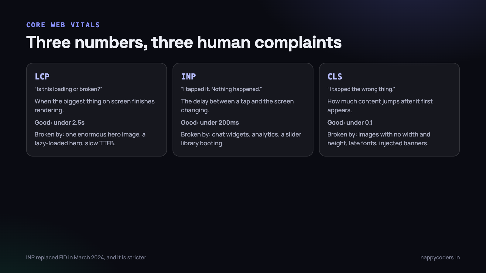
Three numbers, and each one corresponds to something a human being actually experiences. It is worth understanding what they mean rather than treating them as an arbitrary exam.
LCP: when does the page look like it has arrived
Largest Contentful Paint measures the moment the biggest thing in the viewport finishes rendering. On most pages that is the hero image, the main heading, or the first paragraph block. Under 2.5 seconds is good; over 4 seconds is failing.
This is the number that corresponds most closely to the feeling of “is this site loading or is it broken”. It is also the one most often ruined by a single enormous image, which is why images come first in the list below.
INP: does the page respond when I touch it
Interaction to Next Paint measures the delay between a tap and the screen visibly changing. It replaced First Input Delay in March 2024, and it is stricter, because it measures every interaction on the page rather than just the first one. Under 200 milliseconds is good; over 500 is failing.
A bad INP feels like a phone that has hung. The user taps the menu, nothing happens, they tap again, and now the menu opens and closes. The cause is almost always JavaScript occupying the main thread — a chat widget booting, an analytics script, a slider library initialising over a hundred elements.
CLS: does the page move while I am reading it
Cumulative Layout Shift measures how much content jumps around after it first appears. Under 0.1 is good; over 0.25 is failing.
This is the metric behind the most infuriating experience on the mobile web: you go to tap a link, an image above it finally loads, the page shifts down, and you have tapped an advertisement instead. Four causes account for nearly all of it — images without width and height attributes, a web font swapping in at a different size, a banner or cookie notice injected at the top after load, and content inserted by JavaScript above the fold.
Lever one: images
On a typical business website, images are 60 to 75 per cent of the page weight, and the hero image is usually the LCP element. This is where the first hour goes, every time.
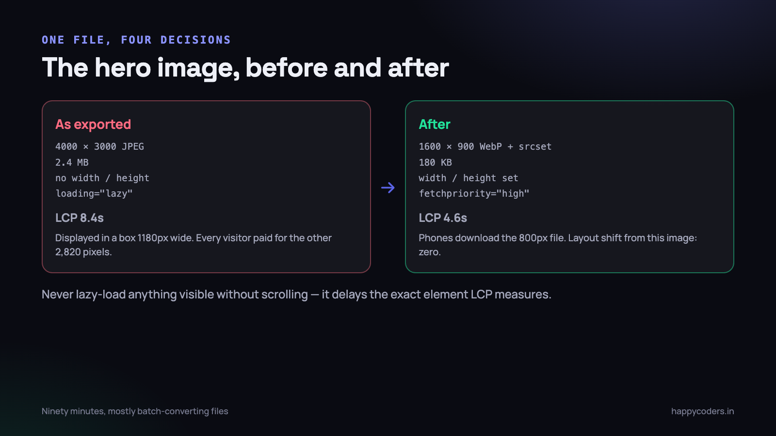
The site we rescued had a 2.4MB hero photograph, 4000 pixels wide, displayed in a box 1180 pixels wide on a desktop and 360 on a phone. Every visitor downloaded the full four thousand pixels. That one file was more than a third of the page.
Resize to the size actually displayed
Nothing else in this article is as cheap as this. An image shown at 800 pixels wide needs to be at most 1600 pixels wide, for a high-density screen, and usually less. Exporting at the camera’s resolution because “it will scale down” means every visitor pays for pixels their screen cannot show.
Use a modern format
WebP is supported everywhere and is typically 25 to 35 per cent smaller than an equivalent JPEG. AVIF is smaller again, at the cost of slower encoding. The picture element lets you offer both and fall back cleanly:
<picture>
  <source type="image/avif" srcset="/img/hero-800.avif 800w, /img/hero-1600.avif 1600w"
          sizes="(max-width: 700px) 100vw, 1180px">
  <source type="image/webp" srcset="/img/hero-800.webp 800w, /img/hero-1600.webp 1600w"
          sizes="(max-width: 700px) 100vw, 1180px">
  <img src="/img/hero-1600.jpg"
       alt="Team reviewing a project board"
       width="1600" height="900"
       fetchpriority="high"
       decoding="async">
</picture>
Three details in that snippet do most of the work. srcset plus sizes lets the browser download an 800-pixel file on a phone instead of a 1600-pixel one. width and height reserve the correct space before the file arrives, which is the main fix for layout shift. And fetchpriority="high" tells the browser this is the important image, which typically pulls LCP forward by a few hundred milliseconds on a slow connection.
Lazy-load everything except the hero
loading="lazy" on images below the fold is one attribute and saves a great deal on a long page. But putting it on the hero image is actively harmful — it delays the very element LCP is measuring, and we have seen it add a full second on its own. Never lazy-load anything visible without scrolling.
The result on our test site: 6.9MB down to 1.4MB, and LCP on throttled mobile from 8.4 seconds to 4.6. That was about ninety minutes of work, most of it batch-converting files.
Lever two: render-blocking CSS and JavaScript
After images, this is where the time goes. Every stylesheet link and every ordinary script tag in the head stops the browser from painting anything until that file has been fetched and processed. On a connection with 300 milliseconds of latency, four blocking files in the head cost well over a second before a single pixel appears.
<!-- blocks rendering: the browser stops here -->
<script src="/js/slider.js"></script>

<!-- does not block: fetched in parallel, runs after the HTML is parsed -->
<script src="/js/slider.js" defer></script>

<!-- does not block, runs as soon as it arrives, order not guaranteed -->
<script src="/js/analytics.js" async></script>
The rule is simple. Use defer for anything that touches the page — it keeps execution order and runs after parsing. Use async for independent third-party scripts that do not care when they run. A plain script tag in the head should be rare enough that you can justify each one.
For CSS, the honest first step is to find out how much of it you are actually using. Chrome DevTools has a Coverage tab: record a page load and it shows the unused percentage of every file. The figures are routinely brutal — a site using six icons from Font Awesome ships 280KB to get them, and a Bootstrap build where 92 per cent of the rules never match anything on the page is completely normal.
- Delete the frameworks you use a fraction of. Six icons is six inline SVGs, not a 280KB font file and a stylesheet.
- Split CSS by template if your build allows it, so the contact page does not load the rules for the blog.
- Inline the critical CSS — the rules needed for what is visible without scrolling — and load the rest asynchronously. Worth doing last, because it is the fiddliest item here and needs re-checking whenever the design changes.
On our site this stage took LCP from 4.6 seconds to 3.1 and, more noticeably, moved First Contentful Paint to 1.2 seconds. The page started appearing early, which changes the perception even before the numbers change.
Lever three: fonts
Web fonts cause two distinct problems, and the second one is worse than people expect.
The first is delay. A @import or a stylesheet link to a font service means the browser must fetch a CSS file, parse it, discover the font file URL, and fetch that too — two sequential round-trips before any text can be drawn in the right typeface. The second is layout shift: when the real font finally arrives and it is a different size from the fallback, every line of text re-flows, and the CLS number jumps.
/* self-hosted, subset, and it never blocks the text */
@font-face {
  font-family: "Inter";
  src: url("/fonts/inter-400.woff2") format("woff2");
  font-weight: 400;
  font-display: swap;          /* show fallback text immediately */
  unicode-range: U+0000-00FF;  /* latin only, if that is all you need */
}

body {
  /* a fallback with similar metrics keeps the shift small */
  font-family: "Inter", "Segoe UI", system-ui, sans-serif;
}
<!-- and preload the one weight used above the fold -->
<link rel="preload" href="/fonts/inter-400.woff2" as="font"
type="font/woff2" crossorigin>Four rules cover almost every case. Self-host the files, so there is one round-trip instead of two. Use WOFF2 only. Ship two weights, not seven — every extra weight is another file, and a designer who specified five of them will not notice four are missing. And set font-display: swap so text is readable immediately in a fallback face.
On the rescue site, fonts were the whole CLS story: 0.34 down to 0.05, which took it from failing to comfortably passing. The work was forty minutes.
Lever four: caching and compression
This one costs almost nothing and is skipped astonishingly often, because it lives on the server rather than in the code. Two settings, and both are a few lines of configuration.
# nginx: compress text, cache hashed assets for a year
gzip on;
gzip_types text/css application/javascript image/svg+xml application/json;
# brotli, if the module is available, is 15-20% better again

location ~* \.(css|js|woff2|jpg|png|webp|avif|svg)$ {
    add_header Cache-Control "public, max-age=31536000, immutable";
}

location ~* \.(html)$ {
    add_header Cache-Control "public, max-age=0, must-revalidate";
}
The word immutable is doing real work: it tells the browser not to even send a revalidation request. This is safe only if your asset filenames change when their content does — app.7f3c9a.css rather than app.css?v=3. If your files have stable names, use a short max-age instead, or you will ship a change that nobody sees for a week.
Compression is close to free and routinely forgotten on shared hosting. Gzip on a CSS file is typically a 70 to 80 per cent reduction; Brotli is a little better again.
While you are on the server, look at Time to First Byte. If TTFB is over about 600 milliseconds, no amount of front-end work will save the page, because the browser is waiting before it has even seen the HTML. On a database-driven site the cause is usually one slow query on a page that runs on every request, or the absence of any page caching at all. Our rescue site had both: TTFB of 1.9 seconds dropped to about 300 milliseconds with a page cache and one missing index, and LCP came down to 2.2 seconds as a direct consequence.
If your TTFB is the problem, the fix is not in this article. It is in the index your query is missing or in the caching layer you have not put in yet.
Lever five: plugins and third-party scripts
This is last in the order of work, but it is often the largest single number on a WordPress site, and it is the hardest politically because somebody installed each one on purpose.
Most plugins load their CSS and JavaScript on every page, whether or not the page uses them. A contact form plugin adds its stylesheet to your blog posts. A slider plugin adds 180KB to a page with no slider on it. Thirty-four active plugins is not unusual on a site that has been running for three years, and the aggregate is frequently more than a megabyte of code that runs on every single request.
Third-party scripts are the same problem with someone else’s server involved. A live chat widget is commonly 300 to 500KB and, worse, it occupies the main thread while it initialises — which is why it is so often the reason INP is bad. Three analytics tools where one would do, a heatmap recorder, a pop-up service and two remarketing tags will together cost more than everything else on this list.
- List every plugin and third-party tag and, next to each, write the person who asked for it and what decision it informs. Anything with a blank second column can go today.
- Deactivate in a staging copy and measure. Not by feel — run Lighthouse before and after each one, because the surprises are large in both directions.
- Load what survives late. A chat widget does not need to exist until the visitor has been on the page for a few seconds or has scrolled. Loading it on an interaction or a timer routinely fixes INP on its own.
Removing nine plugins and deferring the chat widget took INP on our site from 420 milliseconds to 140, and the Lighthouse mobile score from 31 to 89. It also took the longest of any stage, because most of the time was spent asking people whether they still needed things.
What is not worth your time
Equally useful to know, because these absorb whole afternoons and move nothing.
- Minifying HTML. A few kilobytes before compression, and compression was going to handle it anyway.
- Sprite sheets and concatenating every file. That advice is from the HTTP/1.1 era. Under HTTP/2, requests are cheap and one giant bundle is worse, because a one-line change invalidates the whole file for every returning visitor.
- Shaving kilobytes of JavaScript while an unoptimised image sits at the top of the page. Check the waterfall and work on the biggest bar.
- Chasing 100 out of 100. Going from 89 to 97 is usually days of work for a difference no human perceives. Going from 31 to 89 is an afternoon and changes whether people stay.
The Indian mobile reality, specifically
Two things about the local audience that change the priorities compared with advice written for a different market.
First, the device matters more than the connection. Data is cheap and 4G coverage is broad, so bandwidth is frequently adequate — but a handset in the eight-to-fifteen-thousand rupee band has a CPU several times slower than a developer laptop. That makes JavaScript execution, not file size, the dominant cost. A 200KB script that parses and runs in 90 milliseconds on your machine can take half a second on that phone, and during that time nothing on the page responds to touch.
Second, connections are variable rather than uniformly slow. Somebody on a train or in a lift drops from 4G to something much worse within a minute. Build a page that becomes usable in stages — readable text first, images filling in after.
The prioritised checklist
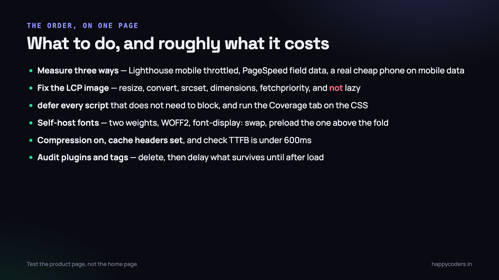
- Record a baseline. Lighthouse mobile with throttling, the PageSpeed field data, and one real phone on mobile data. Write the numbers down.
- Fix the LCP image. Resize it, convert it, add
srcset, add width and height, addfetchpriority="high", and make sure it is not lazy-loaded. - Fix every other image. Resize, convert,
loading="lazy"below the fold, dimensions on all of them. - Add
deferto every script that does not need to block, and move what is left out of the head. - Run the Coverage tab and delete the CSS and JS frameworks you use a fraction of.
- Self-host fonts, two weights, WOFF2,
font-display: swap, preload the one used above the fold. - Turn on compression and set cache headers for static assets.
- Check TTFB. Over 600ms means the work is on the server, not in the browser.
- Audit plugins and third-party tags, remove what nobody can justify, and delay the rest until after load.
- Re-measure the same three ways, and put the before and after numbers in the project notes so the next person can see what was already done.
Steps two and three alone usually deliver more than half the total improvement, and they are the two that require no build tooling, no server access and no meetings.
What to do on Monday morning
Ninety minutes, on the page that earns the most money rather than the home page.
- Run Lighthouse on mobile with throttling and screenshot the result. This is your before, and you will want it when somebody asks what changed.
- Open the Network tab, sort by size, and look at the top five rows. On nearly every site they are images, and on many sites the first one is larger than everything else put together.
- Fix that one file. Resize, convert to WebP, add dimensions and
fetchpriority. Half an hour at most. - Re-run Lighthouse. If LCP has moved by more than a second, you have just proved to yourself and to whoever signs your invoices that the rest of the list is worth doing.
- Book the remaining items as one task with a number attached to it — “mobile score 31 to 85” is a task that gets approved; “performance improvements” is one that gets postponed.
Six hours of focused work took the site in these examples from a 31 to an 89, from 6.9MB to 1.4MB, and from a page people abandoned to one that is usable on a bus. None of it was clever. It was done in the right order, which is the only part that is easy to get wrong.